


")


This is a Quick Tip on how to build a Thermometer Chart in Tableau, so less reading and more jumping in. We are going to spend 5 minutes or less building our Thermometer Chart in Tableau.
Note: As always never choose a data visualisation type and try to fit your data into it, instead, understand your data and choose the best visualization for your data consumers.
Data
Load the following data into Tableau Desktop / Public.
Country,Path,Value
United States,1,0.9
United States,101,0.9
Canada,1,0.5
Canada,101,0.5
United Kingdom,1,0.7
United Kingdom,101,0.7
France,1,0.3
France,101,0.3
Note: we require path and duplicate lines for densification. See our tutorial on Data Densification for more information. Click here
Calculations
We will start by creating the following calculated fields.
Path (bin)
- Right-click on Path.
- Go to Create, and select Bins…
- In the Edit Bins window:
- Set New field name to Path (bin).
- Set Size of bins to 1.
- Click OK.
Index
INDEX()-1TC_Value
WINDOW_MAX(MAX([Value]))TC_Thermometer
[Index]*[TC_Value]TC_Size
IF [TC_Thermometer] = 0 THEN
    1
ELSE
    0
END
TC_Size (Background)
IF [TC_Thermometer] = 0 THEN
    1
ELSE
    0
END
TC_Color
IF [Index]/100 < [TC_Value] THEN
    [Index]
ELSE
    NULL
END
Calculated Fields
Now that we have created our Calculated Fields, we will build our Worksheet.
- Change the Mark Type to Line.
- Drag Country onto Columns.
- Drag Path (bin) onto Rows.
- Right-click on this object and ensure that Show Missing Values is selected.
- Drag this object onto the Path Mark.
- Drag TC_Thermometer onto Rows.
- Right-click on this object and select Edit Table Calculation.
- Under Nested Calculation select Index.
- Under Compute Using select Specific Dimensions.
- Check Country and Path (bin) and ensure that Country is on top.
- Set At the level to Deepest.
- Set Restarting every to Country.
- Under Nested Calculation select TC_Value.
- Under Compute Using select Specific Dimensions.
- Check Path (bin) only.
- Drag TC_Size onto the Size Mark.
- Right-click on this object, go to Compute Using and select Path (bin).
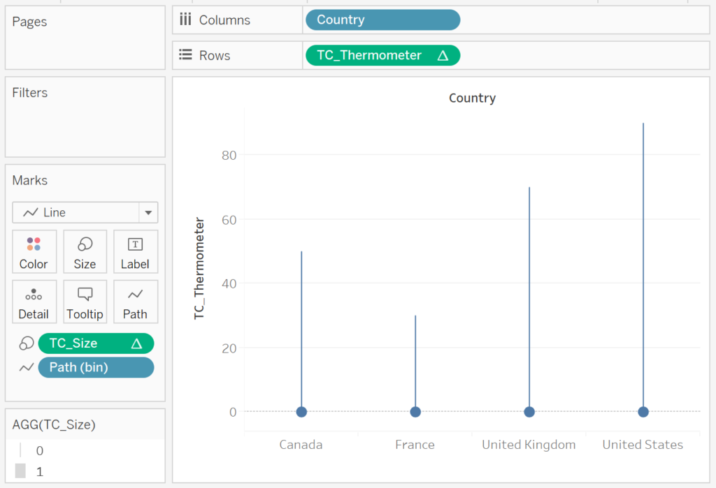
If all goes well, you should see the following:
Now, we will add a background shape
- Drag Index onto Rows to the left of TC_Thermometer.
- In the Index Mark Panel, replace the TC_Size with TC_Size (Background).
- Right-click on the TC_Thermometer in Rows and select Dual Axis.
- Right-click on the TC_Thermometer Axis Header and select Synchronize Axis.
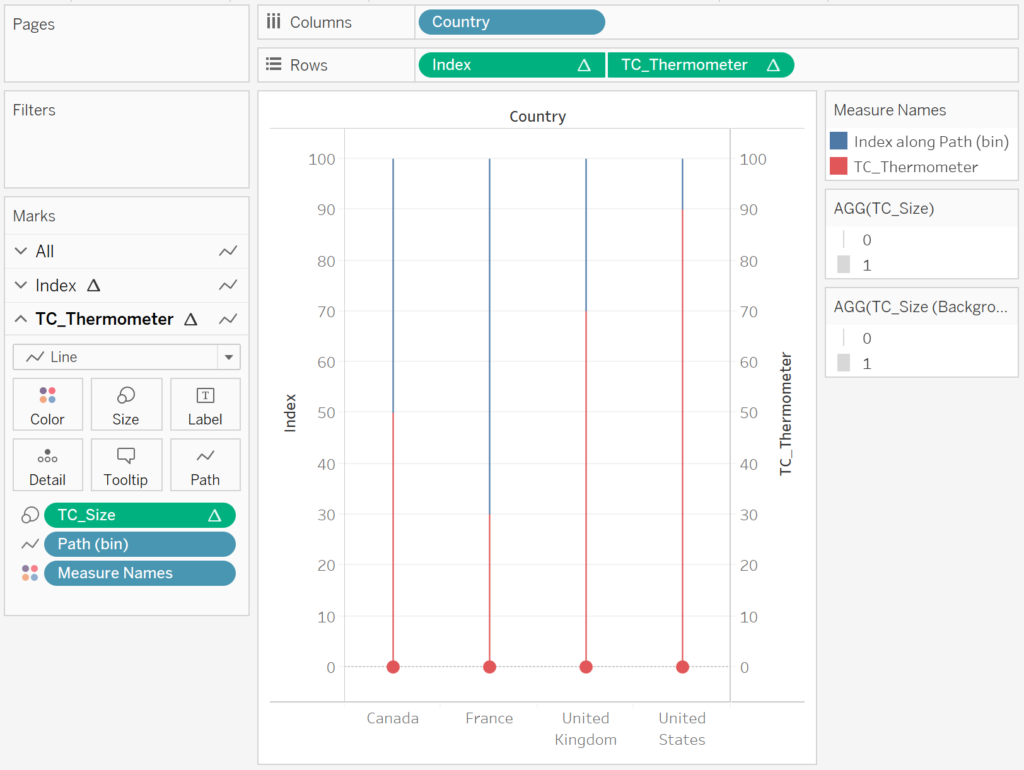
You should now have the following:
Now we will adjust the cosmetics:
- Hide the headers.
- Set Row Divider to None.
- Set Column Divider to None.
- Set Zero Line to None.
- Set Grid Lines to None.
- Adjust the Size of TC_Size.
- Adjust the Size of TC_Size (Background).
- Adjust the Color.
- Add a Tooltip.
- Add a Label.
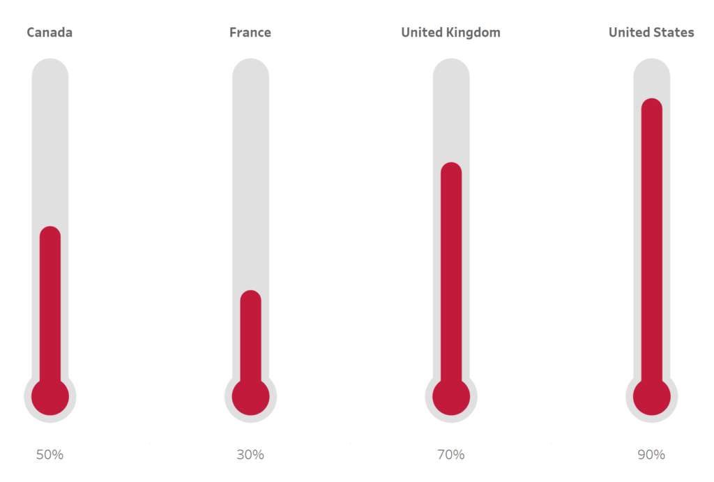
You would like to end up with the following data visualisation.
and boom, we are done, nice, simple and quick. You find my Waterfall Chart Dashboard on Tableau Public at
https://public.tableau.com/profile/toan.hoang#!/vizhome/ThermometerCharts/ThermometerCharts
Summary
I hope you all enjoyed this article as much as I enjoyed writing it. Do let me know if you experienced any issues recreating this Visualisation, and as always, please leave a comment below or reach out to me on Twitter @Tableau_Magic.
If you like our work, do consider supporting us on Patreon, and for supporting us, we will give you early access to tutorials, exclusive videos, as well as access to current and future courses on Udemy:
- Patreon: https://www.patreon.com/tableaumagic
Also, do be sure to check out our various courses:
- Creating Bespoke Data Visualizations (Udemy)
- Introduction to Tableau (Online Instructor-Led)
- Advanced Calculations (Online Instructor-Led)
- Creating Bespoke Data Visualizations (Online Instructor-Led)


I have followed ur steps..but I didn’t get the final view which looks like thermometer chart.
Can you publish what you have onto Tableau public, I will have a look.
Toan,
Thx for the chart, size field is giving issues, could you pls give download option to the workbook
After a lot of thought about this, I decided to not make my workbooks downloadable. What issues are you facing with the size field?
Thx, IF you give 0 for the size it doesnt work so I have changed the value and achieved the final look.
Very interesting, I will have a look at my work and let you know.
Thx Toan
TC_Size or TC_Size (Background),If I change to the following formula, I can resize.
IF [TC_Thermometer] = 0 THEN
2
ELSE
1
END
Hi Jiang, sorry but what error are you seeing? As long as the values are different, you should be able to resize. 2 and 1, or, 1 and 0, should not make a difference here.
If I use 1 and 0, I can only adjust the size of the bottom circle, can not adjust the line, 2 and 1 does not exist this problem
GENIUS! THX Jiang…
Your welcome 🙂
How do we incorporate the logic in our data set.
You have used a predefined data.
Please can you tell us how to add this data to our data set.
What all is required.
Also how do we see the percentages below the thermometers
Lovely effect, thanks for sharing. Followed the instructions and it worked beautifully
Hi – Is there a way to add the target line as well ?
You should be able to add a reference line, I assume that this world work for a target?
Thanks for the reply. You couldn’t imagine how happy I am seeing your reply 🙂
I added the reference line (Per Pane) but it is over entire space and intersect with the Thermometer chart. is there anyway to just show a line like (-2%) like it shows in actual thermometer or like a Gantt line chart acting as ?
Hi there, I am not sure that it would be possible, have you tried annotating your marks, that might be another solution.
I followed your steps, and when I try to edit the table calculation for the TC_Thermometer, I am getting the following error message:
COUNT is being called with (numerical bin), did you mean (table)?
Not sure how to fix it