


")


I actually wrote this tutorial a few years ago, but when I migrated to Tableau Magic, I did not bring this across for some reason. In this Quick Tip (QT) we are going to build a US Hex Map in Tableau, in under 5 minutes.
Note: This is an alternative type of data visualisation, and sometimes pushed for by clients. Please always look at best practices for data visualisations before deploying this into production.
Data
We will start by loading the following data into Tableau Desktop / Tableau public.
Note: If you have Tableau Desktop, you can use the Sample data source, but if you are using Tableau Public, download and load the following data source.
I also want you to load the following separate data source:
Note: This will contain the X and Y locations for each individual state.
Worksheet
Before we start with our worksheet, save the following Hexagon image into our Shapes folder:

We will now build our worksheet:
- From the Orders Data Source
- Drag Sales onto the Colour Mark
- From the Hexagon-Map
- Drag Column onto the Columns Shelf; right-click on this Pill and convert it to a Dimension
- Drag Row onto the Rows Shelf; right-click on this Pill and convert it to a Dimension
- Drag Code onto the Label Mark
- On the Hexagon-Map you should see a link next to State, click on the Link icon to set this as a blend condition.
You should see the following:

We will now apply the Shape and adjust the Cosmetics:
- Change the Mark Type to Shape
- Click on the Shape Mark and select More Shape…
- Apply our Hexagon Shapes, if you need help working with Customer Shapes, check our article: Here
- Adjust the Size of our Shape
- Drag Code from the Hexagon-Map Data Source onto the Label Mark
- Click on the Label Mark and select the following:
- Show mark labels
- Allow labels to overlap other marks
- Align Horizontal and Vertical to Center
- Click on the Label Mark and select the following:
We are almost there and should be seeing the following:

Now we will make some light cosmetic adjustments
- Hide the Row and Column Dividers
- Hide the Axis Headers
- hide the Zero Line
- Hide the Grid Lines
- Adjust the Tool Tip
- Adjust the Colour to suit your taste
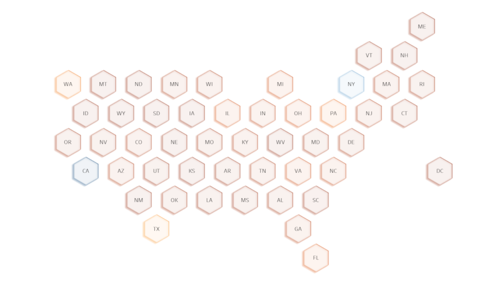
We now have our final data visualisation:
and boom, we are done with this Tableau Quick Tip, and I hope you had some seriously good fun; as always, you can find my data visualisation on Tableau Public at https://public.tableau.com/profile/toan.hoang#!/vizhome/UnitedStatesHexMap/HexMaps
Summary
I hope you all enjoyed this article as much as I enjoyed writing it and as always do share the love. Do let me know if you experienced any issues recreating this Visualization, and as always, please leave a comment below or reach out to me on Twitter @Tableau_Magic. Do also remember to tag me in your work if you use this tutorial.
 Table Calculation")


