


")


I was challenged a few years back to draw an interactive Venn Diagram, not just have two transparent circles, which is not too difficult, but having two circles as well as the overlap all being selectable. As you can imagine, the mathematics is going to be quite difficult, but we will go through the steps to drawing out this visualization in Tableau.
Note: As always never choose a data visualisation type and try to fit your data into it, instead, understand your data and choose the best visualization for your data consumers.
Data
Load the following data into Tableau Desktop / Public.
| Category | Path |
| A | 1 |
| A | 361 |
| B | 1 |
| B | 361 |
| AnB | 1 |
| AnB | 361 |
Note: we need two records for each stage as we are going to be drawing polygons and using densification to get more points on our canvas.
Calculated Fields
With our data set loaded into Tableau, we are going to create the following Parameter, Calculated Fields and Bins:
P_Overlap
- Go to Create Parameter.
- In Data type select Integer.
- In Allowable values select List and enter the following values:
- Add a Value of 50 and Display as to Small.
- Add a Value of 45 and Display as to Medium.
- Add a Value of 40 and Display as to Large.
- Add a Value of 35 and Display as to Maximum.
- Set the Current value to Medium.
Note: We will use this parameter to control the amount of overlap between our two circles.
Path (Bins)
- Right click on Path, go to Create and select Bins…
- In the Edit Bins dialogue window:
- Set New field name to Path (bin).
- Set Size of bins to 1.
- Click Ok.
Index
INDEX()-1Zero
0TC_Category
WINDOW_MAX(MAX([Category]))TC_Circle Distance from Center
WINDOW_MAX(SIN([P_Overlap]*PI()/180))X
IF [TC_Category] = "A" THEN
    IF [P_Overlap] <= [Index] AND [Index] < (180-[P_Overlap]) THEN
        2*SIN([P_Overlap]*PI()/180)- SIN([Index]*PI()/180) - [TC_Circle Distance from Center]
    ELSE
        SIN([Index]*PI()/180) - [TC_Circle Distance from Center]
    END
ELSEIF [TC_Category] = "B" THEN
    IF [P_Overlap] <= [Index] AND [Index] < (180-[P_Overlap]) THEN
        (2*SIN([P_Overlap]*PI()/180)- SIN([Index]*PI()/180) - [TC_Circle Distance from Center]) * -1
    ELSE
        (SIN([Index]*PI()/180) - [TC_Circle Distance from Center]) * -1
    END
ELSE
    IF [P_Overlap] <= [Index] AND [Index] < (180-[P_Overlap]) THEN
        SIN([Index]*PI()/180)-SIN([P_Overlap]*PI()/180)
    ELSEIF (180+[P_Overlap]) <= [Index] AND [Index] < (360-[P_Overlap]) THEN
        SIN([Index]*PI()/180)+SIN([P_Overlap]*PI()/180)
    ELSE
        0
    END
END
Y
IF [TC_Category] = "AnB" THEN
    IF [Index] < [P_Overlap] THEN
        COS([P_Overlap]*PI()/180)
    ELSEIF [Index] > (360-[P_Overlap]) THEN
        COS((360-[P_Overlap])*PI()/180)
    ELSEIF [Index] > (180-[P_Overlap]) AND [Index] < (180+[P_Overlap]) THEN
        COS((180-[P_Overlap])*PI()/180)
    ELSE
        COS([Index]*PI()/180)
    END
ELSE
    COS([Index]*PI()/180)
END
Suffice to say, what we are doing with the X and Y Calculated fields looks quite crazy, however:
- We are finding the point where we bend the circle in as opposed to being completed. This is based on the P_Outer parameter and how we are drawing our outer circle components.
- We have individual logical to draw the A, A and
AnB parts of our Venn Diagram.
I would suggest going through each line to try and understand what is going on here. But using these created Calculated Fields, we are now going to build our Worksheet.
Worksheet
We are going to start building our Worksheet:
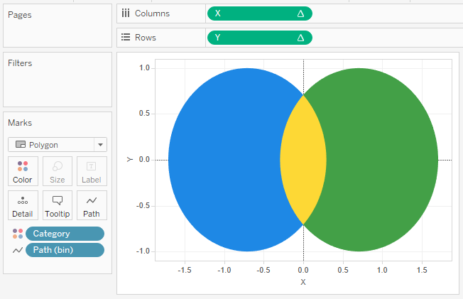
- Change the Mark Type to Polygon.
- Drag Category onto Color.
- Drag Path (Bins) onto Rows.
- Right-click on the object and ensure that Show Missing Values is checked.
- Once confirmed or checked, drag this object onto Path.
- Drag X onto Columns.
- Right-click on the object, go to
Compute Using and select Path (Bins).
- Right-click on the object, go to
- Drag Y onto Rows.
- Right-click on the object, go to
Compute Using and select Path (Bins).
- Right-click on the object, go to
You should now see something like the following:
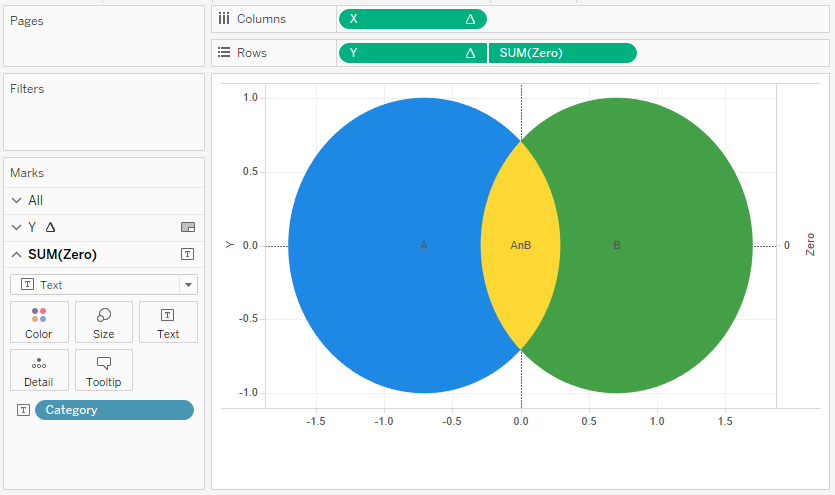
All that hard work creating the Calculated Fields to make sure our Worksheet is simple, well sort of, but we are not finished yet.
- Drag Zero onto Rows.
- Right-click on SUM(Zero) and Select Dual Axis.
- In the Marks Panel, go to Y and remove the Measure Names from Color.
- In the Marks Panel, go to SUM(Zero).
- Remove Measure Names from Color.
- Change the Mark Type to Text.
- Drag Category from Color to Text.
You should not see the following:
We have gone a long way and the only think left to do is to adjust the cosmetics of the Venn Diagram:
- Hide the Headers.
- Remove Grid and Zero lines.
- Adjust the Labels.
- Adjust the Tooltips.
and with these finishing touches, you should finally have the following:
and boom, we are done with probably the most complicated article I will most likely write, but now we have a Venn Diagram that can be selectable. Granted, the mathematics involved is very tricky but I hope you can see that the options for drawing in Tableau are endless.
You can see and interact with my visualisation on Tableau Public at https://public.tableau.com/profile/toan.hoang#!/vizhome/VennDiagrams_0/VennDiagrams
Summary
I hope you all enjoyed this article as much as I enjoyed writing it, if so, please do share this article with fellow Tableau addicts and spread the love. Do let me know if you experienced any issues recreating this Visualisation, and as always, please leave a comment below or reach out to me on Twitter @Tableau_Magic.
If you like our work, do consider supporting us on Patreon, and for supporting us, we will give you early access to tutorials, exclusive videos, as well as access to current and future courses on Udemy:
- Patreon: https://www.patreon.com/tableaumagic
Also, do be sure to check out our various courses:
- Creating Bespoke Data Visualizations (Udemy)
- Introduction to Tableau (Online Instructor-Led)
- Advanced Calculations (Online Instructor-Led)
- Creating Bespoke Data Visualizations (Online Instructor-Led)
 Table Calculation")


Hi
Pls share your venn-diagrams twbx file or downloadable file
Hi Hari, you should be able to rebuild the entire Venn Diagram using the tutorial. If you are having issues, please let me know. Kind Regards, Toan
Hi
Thanks for Venn Diagram. If there is no data for one Category B, then the other Category circle A should have been full circle.
Is it possible.
I am not sure if this tutorial will handle that use case, but it is possible, it requires additional math.
Since we have selected Polygon, size option disabled in Marks card.
Can we control size with match ? if yes, pls give hint how can we control size of circle based Category data.
I’m not good at math, i will try based on your hint
Yes, this is because we are drawing the shape ourselves.it will be a lot tougher to do this, and personally, it will take me ages to figure out the math as the intersection would have to be sized based on two different categories.
Tip from an ex-Maths teacher. The simple Venn diagram tool is just microsoft Paint.
Draw 2 or 3 overlapping circles with a drawing tool and maybe a box around them.
you can shade each section with the paint big brush tool with your choice of colour with just a click of the mouse or touch of finger on an interactive whiteboard.
Tip 2, for harder questions show the class the answers as shaded diagrams and get them to work out the set expressions needed to describe them. See how long it takes them to work out what you did.