

I had this one on my radar for so long now, literally, ever since I ventured in Bespoke Data Visualisations in Tableau. A student requested this tutorial, so I thought I would share this with everyone. Enjoy.
Note: This is an alternative type of data visualisation, and sometimes pushed for by clients. Please always look at best practices for data visualisations before deploying this into production.
Data
We will start by loading the Sample Superstore data into Tableau.
Note: If you have Tableau Desktop, you can use the Sample data source, but if you are using Tableau Public, download and load the following data source.
Once your data is loaded into Tableau, right-click on the data source and click on Edit Data Source… with the Data Source Editor open, paste the following:
Path
1
202
Note: If you are using Tableau 2020.2 or great i.e. have access to new Relationship Model, you will need to double-click on the originally pasted data source to open up before pasting in the Path Data.
You should get an error as there is no joining column, however, click on Add new join clause, go to Create Join Calculation, type 1 and click OK. Do this for the right-hand side as well. Ensure that you have Inner join selected and you should see the following:

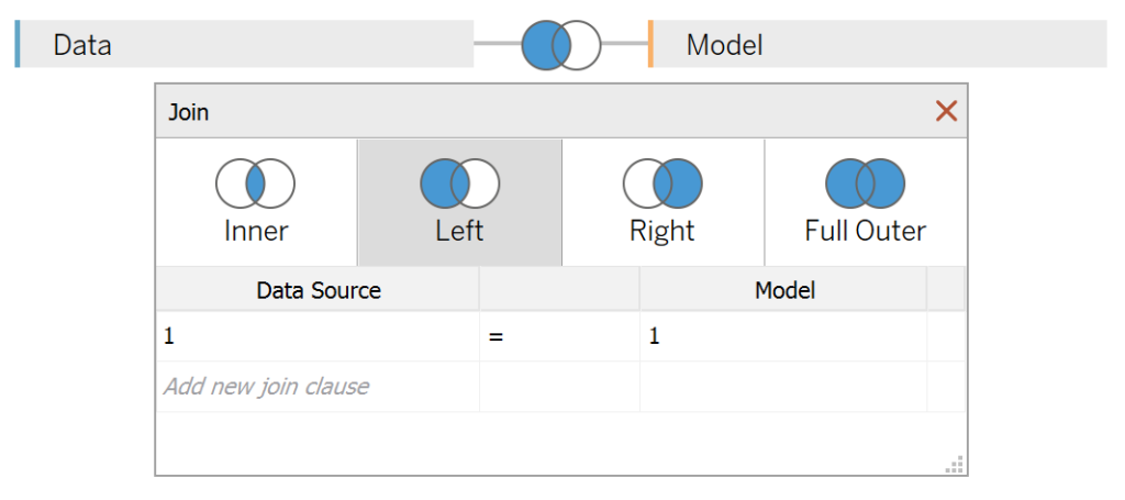
Note: we need additional records as we are going to be drawing lines and using densification to get more points on our canvas. For more information, check out our article on Data Densification.
Calculated Fields
With our data set loaded into Tableau, we are going to create the following Bin and Calculated Fields:
Path (bin)
- Right-click on Path, go to Create and select Bins…
- In the Edit Bins dialogue window:
- Set New field name to Path (bin).
- Set Size of bins to 1.
- Click Ok.
Index
INDEX()-1TC_Date Part
WINDOW_MAX(MAX(DATEPART('month', [Order Date])))-1TC_Segment Sales
WINDOW_SUM(SUM([Sales]))/2TC_Step Size
3.6/12TC_Previous Segment Sales
RUNNING_SUM([TC_Segment Sales])-[TC_Segment Sales]TC_Starting Point
[TC_Date Part]*[TC_Step Size]*100X
IF [Index] <= 100 THEN
    SIN(RADIANS(([Index]*[TC_Step Size])+[TC_Starting Point]))*([TC_Previous Segment Sales])
ELSE
    SIN(RADIANS(((201-[Index])*[TC_Step Size])+[TC_Starting Point]))*([TC_Segment Sales]+[TC_Previous Segment Sales])
END
Y
IF [Index] <= 100 THEN
    COS(RADIANS(([Index]*[TC_Step Size])+[TC_Starting Point]))*([TC_Previous Segment Sales])
ELSE
    COS(RADIANS(((201-[Index])*[TC_Step Size])+[TC_Starting Point]))*([TC_Segment Sales]+[TC_Previous Segment Sales])
END
With this done, let us start creating our data visualisation.
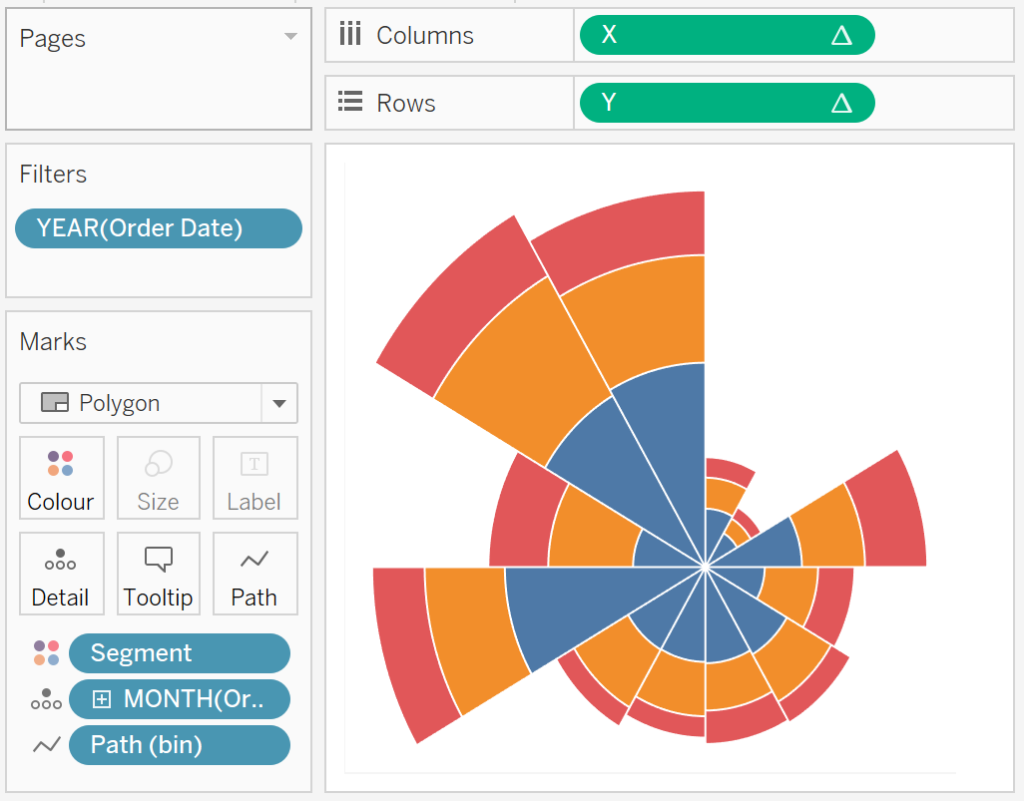
Worksheet
We will now build our first worksheet:
- Drag Order Date onto the Filter Shelf and select 2018.
- Change the Mark Type to Polygon.
- Drag Path onto the Columns Shelf.
- Right-click on this object and ensure that Show Missing Values is selected.
- Drag this object onto the Path Mark.
- Drag Segment onto the Colour Mark.
- Drag Order Date onto the Detail Mark.
- Right-click on this object, and convert this to a Discrete Month.
- Drag X onto Columns.
- Right-click on this object, go to Compute Using and select Path (bin).
- Drag Y onto Rows.
- Right-click on this object, go to Compute Using and select Path (bin).
If all goes well, you should now see the following:

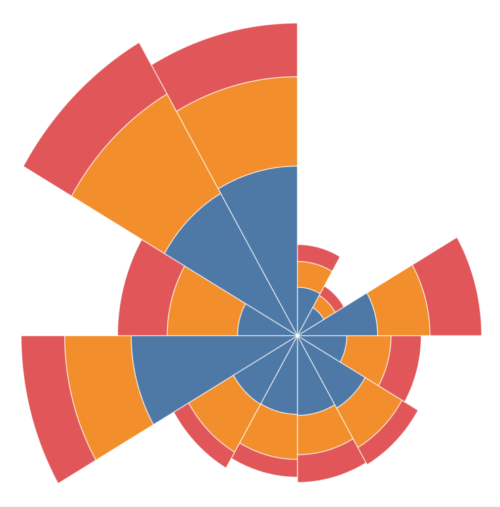
Cool huh…!!! However, this is not exactly what we are going for, and I want us to adjust the Table Calculations.
- Right-click on X and go to Edit Table Calculations…
- In Nested Calculations select TC_Segment Sales
- In Compute Using select Specific Dimensions, ensure that Segment and Path (bin) is checked and that Segment is on top.
- Set At the level to Deepest, and Restarting every to Segment.
- In Nested Calculations select TC_Previous Segment Sales.
- In Compute Using select Specific Dimensions, ensure that only Segment is selected.
- In Nested Calculations select TC_Segment Sales
Now we will do the same for the Y Table Calculation:
- Right-click on Y and go to Edit Table Calculations…
- In Nested Calculations select TC_Segment Sales
- In Compute Using select Specific Dimensions, ensure that Segment and Path (bin) is checked and that Segment is on top.
- Set At the level to Deepest, and Restarting every to Segment.
- In Nested Calculations select TC_Previous Segment Sales.
- In Compute Using select Specific Dimensions, ensure that only Segment is selected.
- In Nested Calculations select TC_Segment Sales
If all goes well, you should now see the following:

Now, we that said, we just need to adjust the Cosmetics, and we are done.
- Hide the Axis Headers.
- Hide the Zero Lines.
- Hide the Gridlines.
- Add Tooltips.
- Add a White Border.
You should now have the following:

and boom, we are done! I hope you enjoyed the random accidental art we saw throughout this tutorial, and as always, you can find this data visualisation on Tableau Public at https://public.tableau.com/profile/toan.hoang#!/vizhome/CoxcombCharts/CoxcombChart
Summary
I hope you all enjoyed this article as much as I enjoyed writing it and as always do share the love. Do let me know if you experienced any issues recreating this Visualisation, and as always, please leave a comment below or reach out to me on Twitter @Tableau_Magic. Do also remember to tag me in your work if you use this tutorial.
If you like our work, do consider supporting us on Patreon, and for supporting us, we will give you early access to tutorials, exclusive videos, as well as access to current and future courses on Udemy:
- Patreon: https://www.patreon.com/tableaumagic
Also, do be sure to check out our various courses:
- Creating Bespoke Data Visualizations (Udemy)
- Introduction to Tableau (Online Instructor-Led)
- Advanced Calculations (Online Instructor-Led)
- Creating Bespoke Data Visualizations (Online Instructor-Led)