
After the Barcelona vs Bayern Munich Semi-Finals for the Champions League 2020, I was browsing Twitter to see reactions and saw a circular KPI visualisation and thought that I would create this in Tableau; this ended up better looking than I expected so I hope you enjoy this tutorial.
Note: This is an alternative type of data visualisation, and sometimes pushed for by clients. Please always look at best practices for data visualisations before deploying this into production.
Data
We will start by loading the Sample Superstore data into Tableau Desktop / Tableau Public.
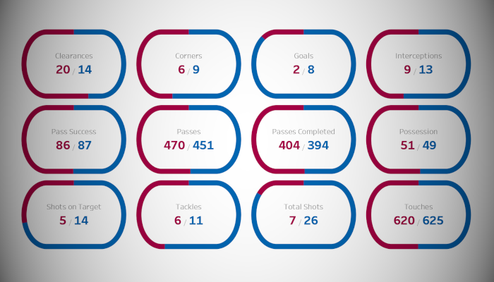
Metric,Team,Value
Total Shots,Barcelona,7
Corners,Barcelona,6
Passes,Barcelona,470
Passes Completed,Barcelona,404
Pass Success,Barcelona,86
Touches,Barcelona,620
Tackles,Barcelona,6
Clearances,Barcelona,20
Interceptions,Barcelona,9
Possession,Barcelona,51
Shots on Target,Barcelona,5
Goals,Barcelona,2
Total Shots,Bayern Munich,26
Corners,Bayern Munich,9
Passes,Bayern Munich,451
Passes Completed,Bayern Munich,394
Pass Success,Bayern Munich,87
Touches,Bayern Munich,625
Tackles,Bayern Munich,11
Clearances,Bayern Munich,14
Interceptions,Bayern Munich,13
Possession,Bayern Munich,49
Shots on Target,Bayern Munich,14
Goals,Bayern Munich,8
Once your data is loaded into Tableau, right-click on the data source and click on Edit Data Source… with the Data Source Editor open, paste the following:
Path
0
1080
Note: If you are using Tableau 2020.2 or great i.e. have access to new Relationship Model, you will need to double-click on the originally pasted data source to open up before pasting in the Path Data.
You should get an error as there is no joining column, however, click on Add new join clause, go to Create Join Calculation, type 1 and click OK. Do this for the right-hand side as well. Ensure that you have Inner join selected and you should see the following:

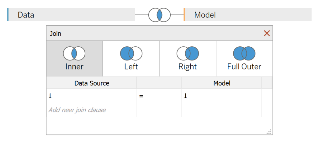
Note: we will be performing data densification to be able to draw our curves.
Calculated Fields
With our data set loaded into Tableau, we are going to create the following Bins and Calculated Fields:
@Columns Parameter
- Set the Name as @Columns
- Set the Data type as Integer
- Set the Current value as 4
@Curve Factor Parameter
- Set the Name as @Curve Factor
- Set the Data type as Integer
- Set the Available values as Range
- Set Minimum to 30
- Set Maximum to 180
- Set Step size to 30
- Set the Current value as 150
Path (bin)
- Right-click on Path, go to Create and select Bins…
- In the Edit Bins dialogue window:
- Set New field name to Path (bin)
- Set Size of bins to 1
- Click Ok
Index
INDEX()-1Metric Index
INDEX()-1Columns
[Metric Index]%[@Columns]Rows
IF ([Metric Index]%[@Columns]) < [@Columns]/2 THEN
    ROUND([Metric Index]/[@Columns],0)
ELSE
    ROUND([Metric Index]/[@Columns],0)-1
END
TC_Color
IF WINDOW_MAX(SUM([Team 1 Value])) / WINDOW_MAX(SUM([Value])) < [Index] / WINDOW_MAX([Index]) THEN
    "Barcelona"
ELSE
    "Bayern Munich"
END
Team 1 Value
IF [Team] = "Bayern Munich" THEN
    [Value]
ELSE
    NULL
END
Team 2 Value
IF [Team] = "Barcelona" THEN
    [Value]
ELSE
    NULL
END
X
IF [Index] < 180 THEN
    [Index]
ELSEIF [Index] >= 180 AND [Index] < 360 THEN
    180+SIN(RADIANS([Index]-180))*[@Curve Factor]
ELSEIF [Index] >= 360 AND [Index] < 720 THEN
    540-[Index]
ELSEIF [Index] >= 720 AND [Index] < 900 THEN
    SIN(RADIANS([Index]-180))*[@Curve Factor]-180
ELSE
    [Index]-1080
END
Y
IF [Index] < 180 THEN
    1
ELSEIF [Index] >= 180 AND [Index] < 360 THEN
    COS(RADIANS([Index]-180))
ELSEIF [Index] >= 360 AND [Index] < 720 THEN
    -1
ELSEIF [Index] >= 720 AND [Index] < 900 THEN
    COS(RADIANS([Index]-180))
ELSE
    1
END
Zero
0With this done, let us start creating our data visualisation.
Worksheet
We will now build our worksheet:
- Change the Mark Type to Line
- Drag Metric onto the Detail Mark
- Drag Path (bin) onto the Columns Shelf
- Right-click on this pill and ensure that Show Missing Values is selected
- Drag this pill onto the Path Mark
- Drag Columns onto the Column Shelf
- Right-click on this pill, go to Compute Using and select Metric
- Drag Rows onto the Row Shelf
- Right-click on this pill, go to Compute Using and select Metric
- Drag X onto the Columns Shelf
- Right-click on this pill, go to Compute Using and select Path (bin)
- Drag Y onto the Rows Shelf
- Right-click on this pill, go to Compute Using and select Path (bin)
If all goes well, you should now see the following:


We will now make some adjustments to the data visualisation:
- Drag TC_Color onto the Color Mark
- Right-click on this pill, go to Compute Using and select Path (bin)
- Drag Zero onto the Rows Shelf
- Right-click on this pill and select Dual Axis
- Note: If Measure Names is added to Color, please remove this.
- In the SUM(Zero) Marks Panel
- Change the Mark Type to Text
- Remove pills from the Color Mark
- Drag Team 1 Value and Team 2 Value onto the Text Mark
We should now see the following:


We will now adjust the cosmetics to get our final version of this data visualisation:
- Hide all Axis Headers
- Hide the Grid Lines
- Hide the Zero Lines
- Remove the Row and Column Dividers
- Format the Text
- Adjust the Color
- Adjust the Size
You want to end up with the following final data visualisation:


Note: be careful with the @Curve Factor parameter. You might want to play with the formula to make sure that the number of points in the curve is proportional to the number of points along the straight line.
and boom, we are done! I hope you enjoyed creating this data visualization and learned some cool techniques as well. As always, you can find this data visualisation on Tableau Public at https://public.tableau.com/profile/toan.hoang#!/vizhome/CircularKPIs/CircularKPIs
Summary
I hope you all enjoyed this article as much as I enjoyed writing it and as always do share the love. Do let me know if you experienced any issues recreating this Visualization, and as always, please leave a comment below or reach out to me on Twitter @Tableau_Magic. Do also remember to tag me in your work if you use this tutorial.
If you like our work, do consider supporting us on Patreon, and for supporting us, we will give you early access to tutorials, exclusive videos, as well as access to current and future courses on Udemy: https://www.patreon.com/tableaumagic