
Someone reached out to me and asked me if I could help him visualise several milestones in his career using my initial Half Circle Timelines tutorial. My previous tutorial had equal spacing, so this time, I ensure that the circles were spaced relative to the timeline and sized based on the duration.
Note: This is an alternative type of data visualisation, and sometimes pushed for by clients. Please always look at best practices for data visualisations before deploying this into production.
Data
To get started, load the following data into Tableau Public / Tableau Desktop
Activity,From,To
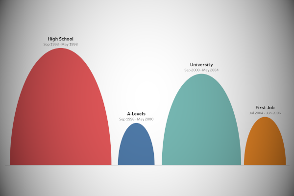
High School,06 Sep 1993,21 May 1998
A-Levels,07 Sep 1998,19 May 2000
University,18 Sep 2000,20 May 2004
First Job,07 Jul 2004,16 Jun 2006Once your data is loaded into Tableau, right-click on the data source and click on Edit Data Source… with the Data Source Editor open, paste the following:
Path
0
180
Note: If you are using Tableau 2020.2 or great i.e. have access to new Relationship Model, you will need to double-click on the originally pasted data source to open up before pasting in the Path Data.
You should get an error as there is no joining column, however, click on Add new join clause, go to Create Join Calculation, type 1 and click OK. Do this for the right-hand side as well. Ensure that you have Inner join selected and you should see the following:


Calculated Fields
With our data set loaded into Tableau, we are going to create the following Calculated Fields and Bins:
Path (bin)
- Right-click on Path, go to Create and select Bins…
- In the Edit Bins dialogue window:
- Set New field name to Path (bin)
- Set Size of bins to 1
- Click Ok
Index
// Index function to start at zero
INDEX()-1
TC_From
// Wrapping the from date in a Windows Function
WINDOW_MAX(MAX([From]))
TC_To
// Wrapping the to date in a Windows Function
WINDOW_MAX(MAX([To]))
TC_Radius
// Find the number of days between the two dates
// and then divide the number by 2 to get the radius
DATEDIFF("day", [TC_From], [TC_To])/2
TC_Center Date
DATEADD("day", [TC_Radius], [TC_From])TC_Center Date by Day
DATEDIFF("day", #01/01/1900#,[TC_Center Date])X
(COS(RADIANS([Index]))*[TC_Radius])+[TC_Center Date by Day]Y
SIN(RADIANS([Index]))*[TC_Radius]TC_Label Activity
IF [Index] = 90 THEN
    WINDOW_MAX(MAX([Activity]))
END
TC_Label From
IF [Index] = 90 THEN
    [TC_From]
END
TC_Label To
IF [Index] = 90 THEN
    [TC_To]
END
With this done, let us start creating our data visualisation.
Worksheet
We will now build our worksheet:
- Change the Mark Type to Polygon
- Drag Activity onto the Color Mark
- Drag Path (bin) onto the Columns Shelf
- Right-click on this pill and ensure that Show Missing Values is selected
- Drag this pill onto the Path Mark
- Drag X onto the Columns Shelf
- Right-click on this pill, go to Compute Using and select Path (bin)
- Drag Y onto the Rows Shelf
- Right-click on this pill, go to Compute Using and select Path (bin)
- Double click on the X-Axis Header and deselect Include Zero
If all goes well, you should now see the following:


We will now add a dual axis line in order to get our label onto of our half circles.
- Control Drag and Drop the Y-pill to the right (this will duplicate the pill with all settings)
- In the Y (2) Marks Panel
- Drag TC_Label Activity onto the Label Mark
- Right-click on this pill, go to Compute Using and select Path (bin)
- Drag TC_Label From onto the Label Mark
- Right-click on this pill, go to Compute Using and select Path (bin)
- Drag TC_Label To onto the Label Mark
- Right-click on this pill, go to Compute Using and select Path (bin)
- Click on the Label Mark
- In Marks to Label select Min/Max
- In Scope select Line/Pie
- Drag TC_Label Activity onto the Label Mark
You should now have the following:


Now, we will finish off our data visualisation:
- Right-click on the Y Pill in the Rows Shelf and select Dual Axis; right-click on the Y-Axis header and select Synchronized Axis.
- For the Line, select the Color Opacity to 0%
- Hide the Column and Row Dividers
- Hide the Grid Lines
- Disable the Tool Tips
- Edit the Label
You will want to end up with the following:


and boom, we are done! Now give this a try with your own personal timeline, and do let me know how it goes. I hope you enjoyed creating this data visualization and learned some cool techniques as well. As always, you can find this data visualisation on Tableau Public at https://public.tableau.com/profile/toan.hoang#!/vizhome/HalfCircleTimelineVersionTwo/HalfCircleTimelineVersionTwo
Summary
I hope you all enjoyed this article as much as I enjoyed writing it and as always do share the love. Do let me know if you experienced any issues recreating this Visualization, and as always, please leave a comment below or reach out to me on Twitter @Tableau_Magic. Do also remember to tag me in your work if you use this tutorial.
If you like our work, do consider supporting us on Patreon, and for supporting us, we will give you early access to tutorials, exclusive videos, as well as access to current and future courses on Udemy: https://www.patreon.com/tableaumagic