
Yes, I create this data visualisation a little while ago, and while hesitant about it, decided to write a nice, quick and simple tutorial about how you can create these in Tableau, so do enjoy and let me know how it goes?
Note: This is an alternative type of data visualisation, and sometimes pushed for by clients. Please always look at best practices for data visualisations before deploying this into production.
Data
Download and load the following data into Tableau Desktop / Tableau Public.
Note: If you have Tableau Desktop, just use your sample Superstore data source.
Calculated Fields
With our data set loaded into Tableau, we are going to create the following Calculated Fields:
Columns
RANDOM()Random
RANDOM()*1LOD_Bar Height
{FIXED [Region]: SUM([Sales])} / {FIXED : SUM([Sales])}Rows
[Random]*[LOD_Bar Height]Worksheet
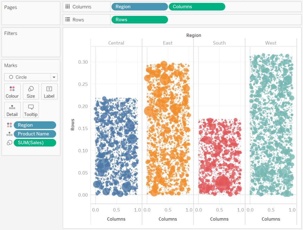
We will now build our first worksheet:
- Change the Mark Type to Circle.
- Drag Region onto the Color Mark.
- Drag Region onto Columns.
- Drag Product Name onto the Detail Mark.
- Drag Columns onto the Columns Shelf.
- Right-click on this object and select Dimension.
- Drag Rows onto the Rows Shelf.
- Right-click on this object and select Dimension.
- Drag Sales onto the Size Mark.
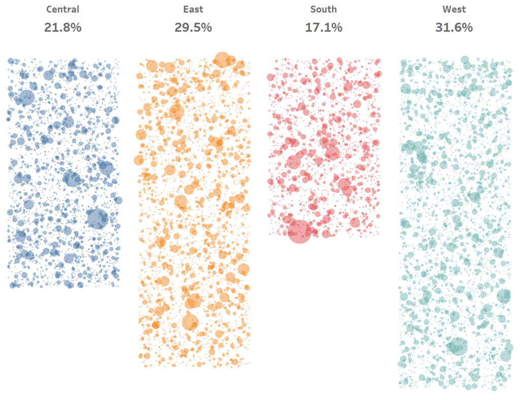
If all goes according to plan, you should see the following:

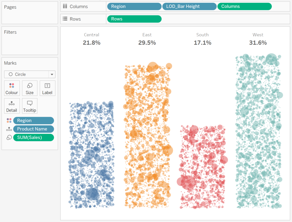
Now we will adjust the cosmetics:
- Draw LOD_Bar Height onto Columns and convert to a Discrete Dimension.
- Right-click on this object set the format to 1 Decimal Place Percentage.
- Select Hide the Field Labels for Columns.
- Format the Headers.
- Hide the Row Dividers.
- Hide the Column Dividers.
- Hide the Grid Lines.
- Hide the Zero Lines.
- Set the Opacity to 50%.
- Adjust the Size.
and if all goes well, you should now have the following:
Now to have some variation, swap the rows and columns:

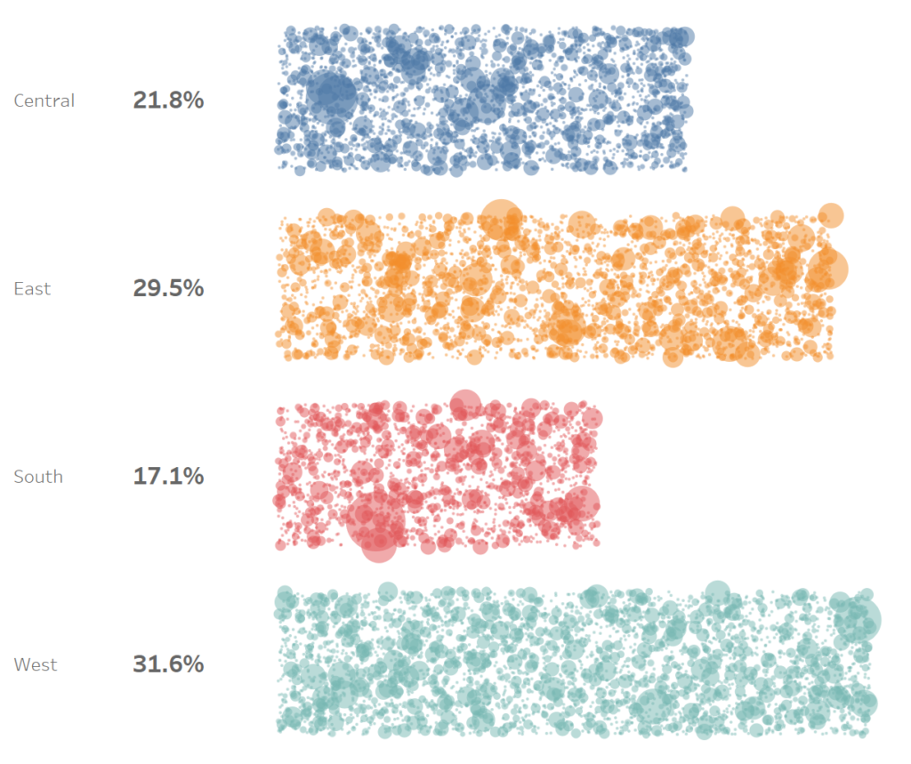
or you can reverse the direction:

and boom, we are done, you can find my data visualisation on Tableau Public at https://public.tableau.com/profile/toan.hoang#!/vizhome/JitterBarChart/JitterBarCharts
Summary
I hope you all enjoyed this article as much as I enjoyed writing it and as always do share the love. Do let me know if you experienced any issues recreating this Visualisation, and as always, please leave a comment below or reach out to me on Twitter @Tableau_Magic.
If you like our work, do consider supporting us on Patreon, and for supporting us, we will give you early access to tutorials, exclusive videos, as well as access to current and future courses on Udemy:
- Patreon: https://www.patreon.com/tableaumagic
Also, do be sure to check out our various courses:
- Creating Bespoke Data Visualizations (Udemy)
- Introduction to Tableau (Online Instructor-Led)
- Advanced Calculations (Online Instructor-Led)
- Creating Bespoke Data Visualizations (Online Instructor-Led)