


")


Just for some variety, check out this simple and fun blog about create Layered Area Charts in Tableau. We are literally using our data to draw the area chart using polygons, and then positioning them on the canvas. I hope you enjoy this and have loads of fun.
Note: This is an alternative type of data visualisation, and sometimes pushed for by clients. Please always look at best practices for data visualisations before deploying this into production.
Data
Download and load the following data into Tableau Desktop / Tableau Public.
Calculated Fields
With our data set loaded into Tableau, we are going to create the following Calculated Fields and Parameters:
X Distance Parameter
- Set Name as X Distance.
- Set Data type as Integer.
- Set Allowable values to Range.
- Set Minimum to 1.
- Set Maximum to 20.
- Set Current value to 20.
- Click OK.
Y Distance Parameter
- Set Name as Y Distance.
- Set Data type as Integer.
- Set Allowable values to Range.
- Set Minimum to 1.
- Set Maximum to 100.
- Set Current value to 50.
- Click OK.
Race Index
INDEX()TC_Estimate
WINDOW_SUM(SUM([Estimation]))Index
INDEX()+([Race Index]*[X Distance])Rows
(SUM([Estimation]) / TOTAL(SUM([Estimation])))+([Race Index]/[Y Distance])Worksheet
We will now build our worksheet:
- Change the Mark Type to Polygon.
- Drag Race onto the Colour Mark.
- Right-click on this object and select Sort.
- Set Sort by to Field.
- Set Sort Order to Ascending.
- Set Field Name to Estimation.
- Set Aggregation to Sum.
- Close the window.
- Drag Age onto Detail and manually sort:
- Start
- Under 1 year
- 1-4 years
- 5-9 years
- 10-14 years
- 15-19 years
- 20-24 years
- 25-34 years
- 35-44 years
- 45-54 years
- 55-64 years
- 65-74 years
- 85 years and over
- End
- Drag Index onto the Columns Shelf, right-click on this object and select Edit Table Calculations…
- In Nested Calculations select Index.
- In Compute Using select Specific Dimensions.
- Check Race and Age, and ensure that Race is on top.
- Set At the level to Deepest.
- Set Restarting every to Race.
- In Nested Calculations select Race Index.
- In Compute Using select Specific Dimensions.
- Ensure that only Race is checked.
- In Nested Calculations select Index.
- Draw Rows onto the Rows Shelf, right-click on this object and select Edit Table Calculations…
- In Nested Calculations select Rows.
- In Compute Using select Specific Dimensions.
- Check Race and Age, and ensure that Age is on top.
- Set At the level to Deepest.
- Set Restarting every to None.
- In Nested Calculations select Race Index.
- In Compute Using select Specific Dimensions.
- Ensure that only Race is checked.
- In Nested Calculations select Rows.
If all goes well, you should have the following:
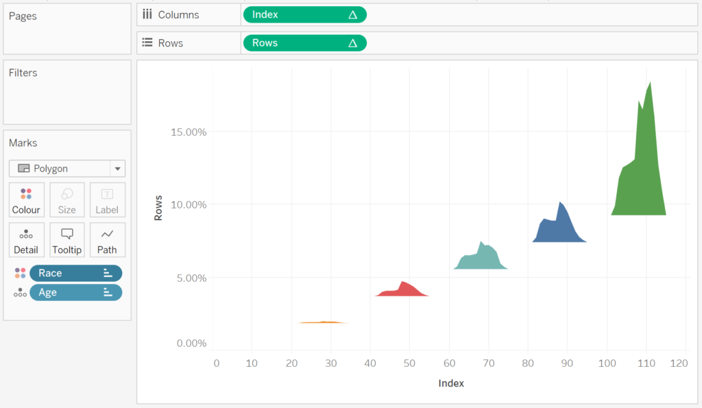
You can adjust the distances using the X Distance and Y Distance Parameter, so why not have some fun with that… however, we will now adjust the cosmetics.
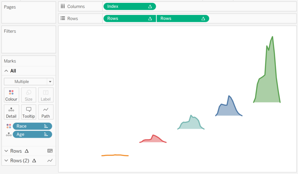
- Keeping the Ctrl (or Command) button pressed, click and drag Rows to the right to duplicate this object with all settings.
- In the Rows (2) Mark Panel, change the Mark Type to Line.
- Right-click on this object and select Dual Axis.
- Right-click on the Rows Axis header and select Synchronise Axis.
- In the Rows Mark Panel, click on Colour and change the Opacity to 50%.
- Now with the formatting:
- Set Row Divider to None.
- Set Column Divider to None.
- Set Grid Lines to None.
- Set Zero Lines to None.
If all goes well, you should now be looking at the following:
Now I want you to change the Parameter settings for the layered effect.
- Set X Distance to 4.
- Set Y Distance to 100.
Play around with the Parameters and tweak to your taste. As the last step, I want you to edit the Tooltips, and add a label at the end of the Line. You will want to end up with the following:
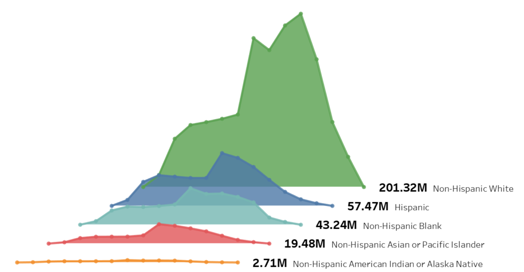
and boom, we are done, you can find my data visualisation on Tableau Public at https://public.tableau.com/profile/toan.hoang#!/vizhome/LayeredAreaChart/LayeredAreaChart
Summary
I hope you all enjoyed this article as much as I enjoyed writing it and as always do share the love. Do let me know if you experienced any issues recreating this Visualisation, and as always, please leave a comment below or reach out to me on Twitter @Tableau_Magic.
If you like our work, do consider supporting us on Patreon, and for supporting us, we will give you early access to tutorials, exclusive videos, as well as access to current and future courses on Udemy:
- Patreon: https://www.patreon.com/tableaumagic
Also, do be sure to check out our various courses:
- Creating Bespoke Data Visualizations (Udemy)
- Introduction to Tableau (Online Instructor-Led)
- Advanced Calculations (Online Instructor-Led)
- Creating Bespoke Data Visualizations (Online Instructor-Led)


 Area Chart")

Toan, Thanks for the tutorial on this! I followed along, and got mine to look just like yours, with one exception. I can’t get the label for the top calculation (Non-Hispanic White) to show up outside the mark like yours does. Mine appears to be centered on the mark. Any advice?
Hi Joe, it is a matter of playing with the axis and trying to get it to fit, send me an email to admin@tableau.toanhoang.com and I will forward you my workbook tonight.
Many thanks for the simple and clear instructions Toan. I have just easily replicated your example and look forward to bringing it in to practice within some of my own workbooks sometime soon …
Your welcome Sean.