

I thought I would have some fun and create a challenge for myself and create a Spiral Hex Chart in Tableau. Unfortunately, while I was not able to fully make this fully dynamic, I am able to give you the following piece of fun. I hope you enjoy this nice and quick tutorial.
Note: This is an alternative type of data visualisation, and sometimes pushed for by clients. Please always look at best practices for data visualisations before deploying this into production.
Data
Load the following data into Tableau Desktop / Tableau Public.
Rank,State,Sales
1,California,457688
2,New York,310876
3,Texas,170188
4,Washington,138641
5,Pennsylvania,116512
6,Florida,89474
7,Illinois,80166
8,Ohio,78258
9,Michigan,76270
10,Virginia,70637
11,North Carolina,55603
12,Indiana,53555
13,Georgia,49096
14,Kentucky,36592
15,New Jersey,35764
16,Arizona,35282
17,Wisconsin,32115
18,Colorado,32108
19,Tennessee,30662
20,Minnesota,29863
21,Massachusetts,28634
22,Delaware,27451
23,Maryland,23706
24,Rhode Island,22628
25,Missouri,22205
26,Oklahoma,19683
27,Alabama,19511
28,Oregon,17431
29,Nevada,16729
30,Connecticut,13384
31,Arkansas,11678
32,Utah,11220
33,Mississippi,10771
34,Louisiana,9217
35,Vermont,8929
36,South Carolina,8482
37,Nebraska,7465
38,New Hampshire,7293
39,Montana,5589
40,New Mexico,4784
41,Iowa,4580
42,Idaho,4382
43,Kansas,2914
44,District of Columbia,2865
45,Wyoming,1603
46,South Dakota,1316
47,Maine,1271
48,West Virginia,1210
49,North Dakota,920
Note: This is our fact data source and I put the rank in the data source, I know, I know, typically I would try to do this in Tableau. But for this tutorial, we will keep it in the data.
Once your data is copied into Tableau, right-click on the data source and click on Edit Data Source… with the Data Source Editor open, paste the following:
Item,X,Y
1,0,0
2,0.5,0.5
3,1,0
4,0.5,-0.5
5,-0.5,-0.5
6,-1,0
7,-0.5,0.5
8,0,1
9,1,1
10,1.5,0.5
11,2,0
12,1.5,-0.5
13,1,-1
14,0,-1
15,-1,-1
16,-1.5,-0.5
17,-2,0
18,-1.5,0.5
19,-1,1
20,-0.5,1.5
21,0.5,1.5
22,1.5,1.5
23,2,1
24,2.5,0.5
25,3,0
26,2.5,-0.5
27,2,-1
28,1.5,-1.5
29,0.5,-1.5
30,-0.5,-1.5
31,-1.5,-1.5
32,-2,-1
33,-2.5,-0.5
34,-3,0
35,-2.5,0.5
36,-2,1
37,-1.5,1.5
38,-1,2
39,0,2
40,1,2
41,2,2
42,2.5,1.5
43,3,1
44,3.5,0.5
45,4,0
46,3.5,-0.5
47,3,-1
48,2.5,-1.5
49,2,-2
50,1,-2
51,0,-2
52,-1,-2
53,-2,-2
54,-2.5,-1.5
55,-3,-1
56,-3.5,-0.5
57,-4,0
58,-3.5,0.5
59,-3,1
60,-2.5,1.5
61,-2,2
62,-1.5,2.5
63,-0.5,2.5
64,0.5,2.5
65,1.5,2.5
66,2.5,2.5
67,3,2
68,3.5,1.5
69,4,1
70,4.5,0.5
71,5,0
72,4.5,-0.5
73,4,-1
74,3.5,-1.5
75,3,-2
76,2.5,-2.5
77,1.5,-2.5
78,0.5,-2.5
79,-0.5,-2.5
80,-1.5,-2.5
81,-2.5,-2.5
82,-3,-2
83,-3.5,-1.5
84,-4,-1
85,-4.5,-0.5
86,-5,0
87,-4.5,0.5
88,-4,1
89,-3.5,1.5
90,-3,2
91,-2.5,2.5
92,-2,3
93,-1,3
94,0,3
95,1,3
96,2,3
97,3,3
98,3.5,2.5
99,4,2
100,4.5,1.5
Note: This is our model which will we use to draw the specific points on our canvas. I actually spent an evening staring at the stars and trying to figure out how we can do this in Tableau through some clever mathematics, but so far I still don’t have a way of doing it, if anyone has a suggestion, or can point me in the right direction, please let me know.
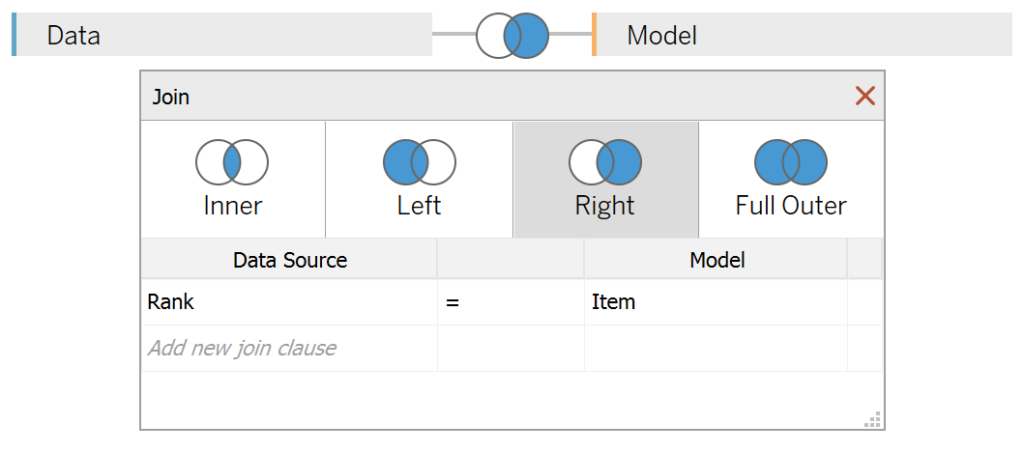
You should get an error as there is no joining column, however, select the Right Join, and on the left-hand side of the join select Rank, and on the right-hand side, select Item.

Calculated Fields
With our data set loaded into Tableau, we are going to create the following Calculated Fields and Bins:
Sales (bin)
- Right-click on Sales, go to Create and select Bins…
- In the Edit Bins dialogue window:
- Set New field name to Sales (bin).
- Set Size of bins to 10,000.
- Click Ok.
Worksheet
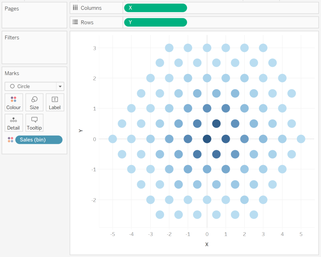
We will now build our first worksheet:
- Change the Mark Type to Circle.
- Drag X onto Columns.
- Right-click on the object and convert to Dimension.
- Drag Y onto Rows.
- Right-click on the object and convert to Dimension.
- Drag Sales (bin) onto Color.
You should now see the following:

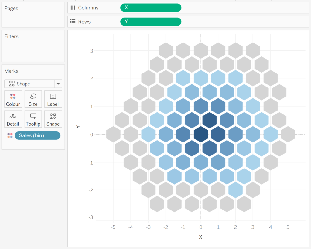
Now we are going to add our Shape, so please download the following file:
and save this file to the following location (on windows):
C:\Users\<user name>\Documents\My Tableau Repository\Shapes\<any directory>Once the file has been downloaded, we are going to finish off this data visualisation:
- Change the Mark Type to Shape Mark.
- Click on the Shape Mark and click on More Shapes.
- Assign the newly loaded shape to the Selected Data Item and click OK.
- Note: click Reload Shapes if your shape is not appearing.
- Click on the Color Mark and assign a Light Grey colour to Null.
You should now have the following:

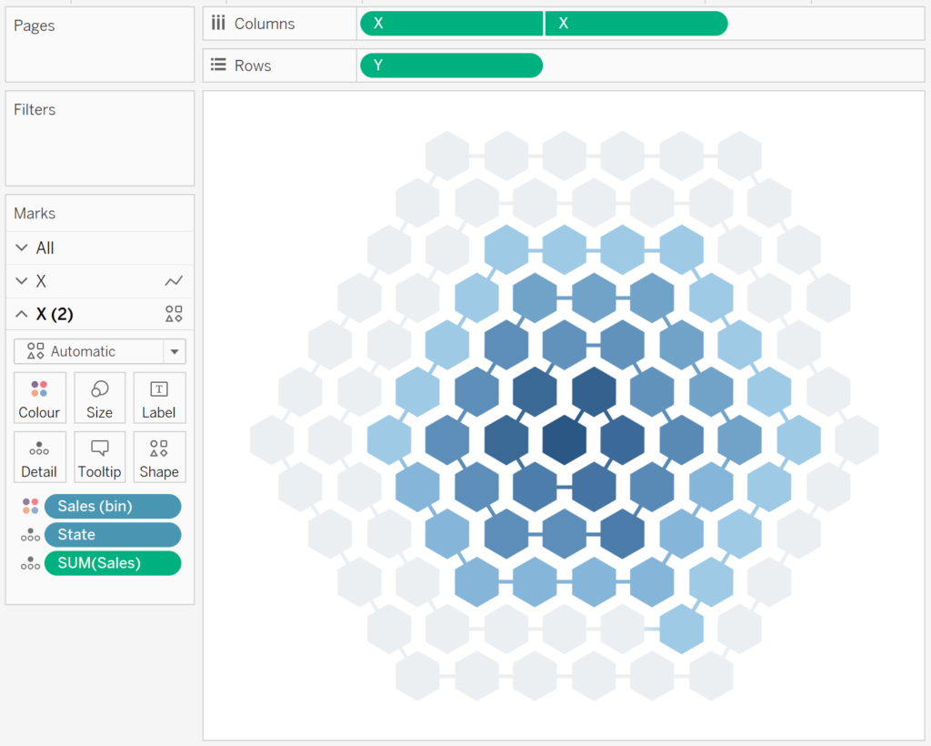
We will not add the final cosmetic touches:
- Drag Y again onto Rows and convert to Dimension.
- In the Y (2) Mark Panel, change the Mark Type to Line.
- Drag Item onto the Path Mark.
- Right-click on the second Y object in Rows and select Dual Axis.
- Right-click on the Axis Header and select Synchronise Axis.
- Hide the Y-Axis Header.
- Hide the X-Axis Header.
- Hide the Grid Lines.
- Hide the Zero Lines.
- Hide the Row Dividers.
- Hide the Column Dividers.
- Add some Tooltips.
You will hopefully end up with the following:
and boom, we are done, you can find my data visualisation on Tableau Public at https://public.tableau.com/profile/toan.hoang#!/vizhome/SpiralHexCharts/SpiralHexCharts
Summary
I hope you all enjoyed this article as much as I enjoyed writing it and as always do share the love. Do let me know if you experienced any issues recreating this Visualisation, and as always, please leave a comment below or reach out to me on Twitter @Tableau_Magic.
If you like our work, do consider supporting us on Patreon, and for supporting us, we will give you early access to tutorials, exclusive videos, as well as access to current and future courses on Udemy:
- Patreon: https://www.patreon.com/tableaumagic
Also, do be sure to check out our various courses:
- Creating Bespoke Data Visualizations (Udemy)
- Introduction to Tableau (Online Instructor-Led)
- Advanced Calculations (Online Instructor-Led)
- Creating Bespoke Data Visualizations (Online Instructor-Led)