

This is my last tutorial until I go on my August Tableau Magic break, and as such, I want to finish with a comprehensive tutorial on creating Ternary Plots in Tableau; going step-by-step, talking about the theory, and more importantly, going through the maths required. I hope you all enjoy this.
Note: This is an alternative type of data visualisation, and sometimes pushed for by clients. Please always look at best practices for data visualisations before deploying this into production.
Data
Load the following data into Tableau Desktop / Tableau Public.
Note: If you have Tableau Desktop. please use the Sample Superstore Data Source.
Ternary Plots
According to Wikipedia, a ternary plot, ternary graph, triangle plot, simplex plot, Gibbs triangle or de Finetti diagram is a barycentric plot on three variables which sum to a constant. It graphically depicts the ratios of the three variables as positions in an equilateral triangle. It is used in physical chemistry, petrology, mineralogy, metallurgy, and other physical sciences to show the compositions of systems composed of three species. In population genetics, it is often called a de Finetti diagram. In-game theory, it is often called a simplex plot. Ternary plots are tools for analyzing compositional data in the three-dimensional case.
In a ternary plot, the values of the three variables a, b, and c must sum to some constant, K. Usually, this constant is represented as 1.0 or 100%. Because a + b + c = K for all substances being graphed, any one variable is not independent of the others, so only two variables must be known to find a sample’s point on the graph: for instance, c must be equal to K − a − b. Because the three numerical values cannot vary independently—there are only two degrees of freedom—it is possible to graph the combinations of all three variables in only two dimensions.
How I translate this, is that we have dimensions which comprise of three metrics, a, b and c, and the dimension is plotted based on the degree of relative impact that these values have on the dimension.

Implementation Theory
We are going to build a Data Visualisation which will use City as our Dimension and the following three Metrics: Total Sales, Total Quantity and Total Number of Orders.
For each City:
- We are going to calculate the percentages for each metric against the total population.
- We are going to add these together to give us our total obtained Percentage.
- We are then going to divide the percentage for each metric against the obtained total to give us a percentage out of 100.
- These three values will be used to plot the X and Y coordinates for the Ternary plot.
We will now get started by creating our Calculated Fields.
Calculated Fields
With the Orders data loaded, let us create the following Calculated Fields:
Percentage of Total Orders
COUNTD([Order ID])/TOTAL(COUNTD([Order ID]))Percentage of Total Quantity
SUM([Quantity]) / TOTAL(SUM([Quantity]))Percentage of Total Sales
SUM([Sales]) / TOTAL(SUM([Sales]))Total Percentages
[Percentage of Total Orders]+[Percentage of Total Quantity]+[Percentage of Total Sales]Ternary Value: Quantity
[Percentage of Quantity]/[Total Percentages]Ternary Value: Orders
[Percentage of Orders]/[Total Percentages]Ternary Value: Sales
[Percentage of Sales]/[Total Percentages]So far we have not done anything too crazy, but we have built out our required values, and will now get to the trick stuff.
Y
SIN(RADIANS(60))*[Ternary Value: Quantity]The right side of the triangle will represent Quantity, and because this value is along a slope, we will use the above formula to Calculate the Y position.
X
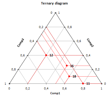
[Ternary Value: Orders]+([Y]/TAN(RADIANS(60)))We used the Ternary Value for Quantity to work out the height (or Y). the bottom of the triangle will represent the Ternary Value for Orders. But let us have a look at the diagram again:
You can see that the value along the bottom, the red line goes off at an angle, so to adjust our X value, we will use the Y value, and a 60-degree angle (angle of an equilateral triangle).
So for example, if you look at the Comp1 value of 0.6, it maps to 0.1 for Comp2 and 0.3 for Comp3 (this gives us a total of 1.0); now if we map this to X and Y absolute coordinates, you can see that the value for the dot is not actually 0.6 but slightly adjusted, and it is this value that we work out using the [Y]*TAN(RADIANS(60)) calculation.
Note: If you fancy a primer on Trigonometry, check out: https://www.mathsisfun.com/algebra/trigonometry.html
These are actually the only Calculated Fields that we need to create our Ternary Chart, however, we will also create the following:
Parameter Called Metric Parameter
- Set Name as Metric Parameter.
- Set Data Type as String.
- Set Allowable values as List:
- Set Value as Sales, Display as Sales.
- Set Value as Quantity, Display As Quantity.
- Set Value as Orders, Display As Orders.
- Click Ok.
Metric
IF [Metric Parameter] = "Sales" THEN
    SUM([Sales])
ELSEIF [Metric Parameter] = "Quantity" THEN
    SUM([Quantity])
ELSE
    COUNTD([Order ID])
END
Note: this will allow us to have a selector and to utilise the Metric value for Color or Size etc…
Color
IF [Ternary Value: Quantity]>[Ternary Value: Orders] AND [Ternary Value: Quantity]> [Ternary Value: Sales] THEN
    "Quantity"
ELSEIF [Ternary Value: Orders]> [Ternary Value: Quantity] AND [Ternary Value: Orders] >[Ternary Value: Sales] THEN
    "Orders"
ELSE
    "Sales"
END
With this done, let us create our worksheet:
Worksheet
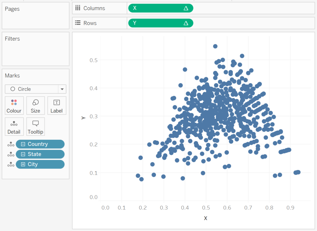
With all the calculations created, the Worksheet is actually pretty simple:
- Change the Mark Type to Circle.
- Drag X onto Columns.
- Drag Y onto Rows.
It is simple as that and you should now have the following:

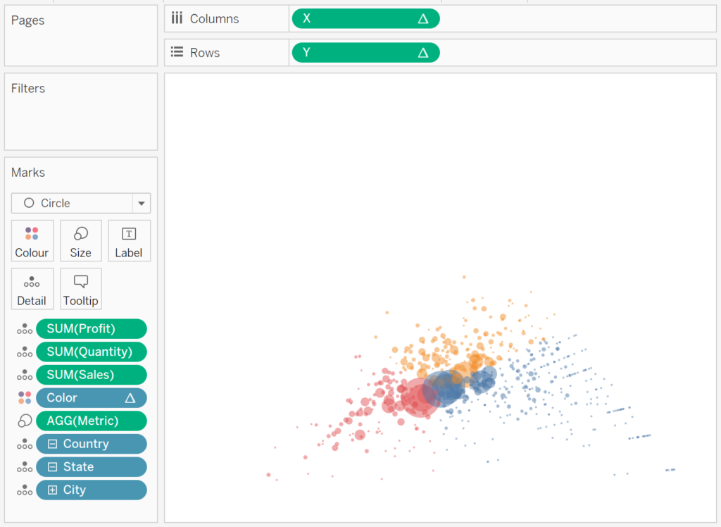
Now let us adjust the Visualisation:
- Drag Profit, Quantity and Sales and onto the Tooltip Mark.
- Drag Color onto the Color Mark, and adjust the Opacity.
- Drag Metric onto the Size Mark.
- Set the Grid Lines to None.
- Set the Row and Column Dividers to None.
- Set the Worksheet Color to None (this will make it transparent).
- Set the Y-Axis to be from 0 to 1.
- Set the X-Axis to be from 0 to 1.
If all goes well, you should now have the following:

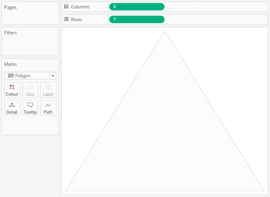
Now will create our triangle background worksheet, and will start by loading the following into Tableau Desktop / Tableau Public:
Metric,Path,X,Y
Sales,1,0,0
Quantity,2,0.5,0.866025404
Orders,3,1,0
Sales,4,0,0
In a New Worksheet:
- Change the Mark Type to Polygon.
- Drag X onto Columns.
- Right-click and convert to Dimension.
- Drag Y onto Rows.
- Right-click and convert to Dimension.
- Set the Background Color to light Grey.
- Set the Border Colour to a slightly darker Grey.
- Hide Grid Lines, Dividers, zero lines etc…
You should now see the following:
Now we will drag both of these onto a dashboard and place them on top of each other, Ternary Chart on top of the Triangle Shape, add some labels, and we should now have the following:

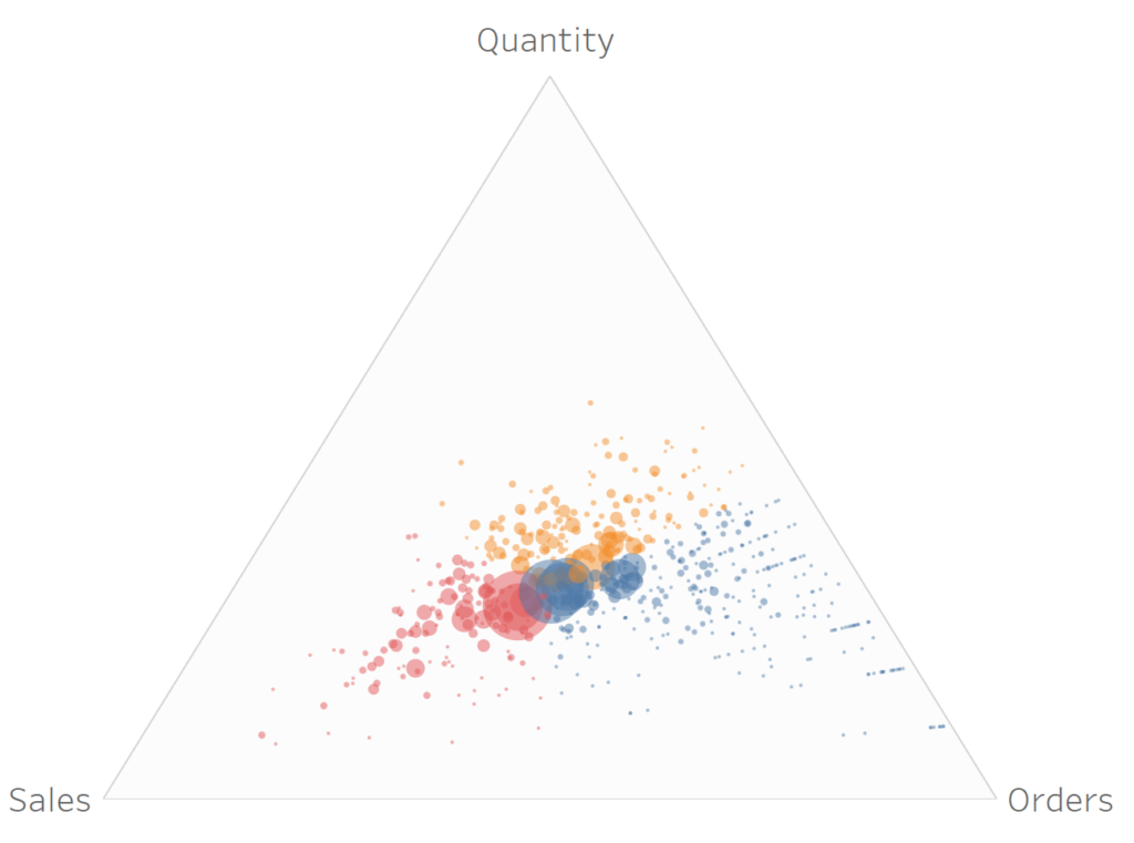
and with that said, we are done with creating this very cool looking Data Visualisation, and on a personal note, it is extremely rewarding to create such a data visualisation without the need to perform any data preparation, but out of the box Calculations. You can find this Data Visualisation on my Tableau Public Profile https://public.tableau.com/profile/toan.hoang#!/vizhome/TernaryChart_15628715360680/TernaryPlot
Summary
I hope you all enjoyed this article as much as I enjoyed writing it and as always do share the love. Do let me know if you experienced any issues recreating this Visualisation, and as always, please leave a comment below or reach out to me on Twitter @Tableau_Magic.
If you like our work, do consider supporting us on Patreon, and for supporting us, we will give you early access to tutorials, exclusive videos, as well as access to current and future courses on Udemy:
- Patreon: https://www.patreon.com/tableaumagic
Also, do be sure to check out our various courses:
- Creating Bespoke Data Visualizations (Udemy)
- Introduction to Tableau (Online Instructor-Led)
- Advanced Calculations (Online Instructor-Led)
- Creating Bespoke Data Visualizations (Online Instructor-Led)