
I saw this data visualisation by Alex Jones on Data Visualisation Trump’s Executive Time and the visual effect stuck with me. So, I eventually got around to writing this tutorial on created Tilted Bar Charts in Tableau.
Note: This is an alternative type of data visualisation, and sometimes pushed for by clients. Please always look at best practices for data visualisations before deploying this into production.
Data
We will start by loading the Sample Superstore data into Tableau Desktop / Tableau Public.
Note: If you have Tableau Desktop, you can use the Sample data source, but if you are using Tableau Public, download and load the following data source.
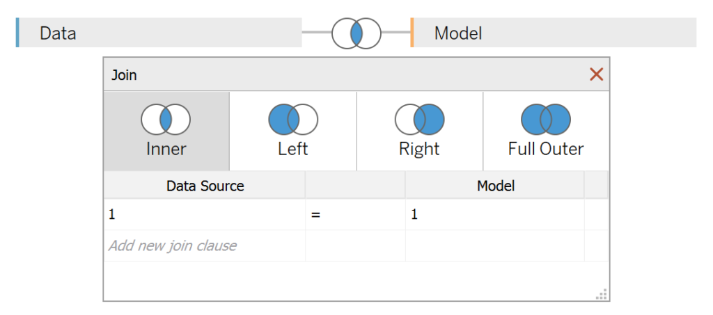
Once your data is loaded into Tableau, right-click on the data source and click on Edit Data Source… with the Data Source Editor open, paste the following:
Path
1
4
Note: If you are using Tableau 2020.2 or great i.e. have access to new Relationship Model, you will need to double-click on the originally pasted data source to open up before pasting in the Path Data.
You should get an error as there is no joining column, however, click on Add new join clause, go to Create Join Calculation, type 1 and click OK. Do this for the right-hand side as well. Ensure that you have Inner join selected and you should see the following:

Calculated Fields
With our data set loaded into Tableau, we are going to create the following Bins, Parameters and Calculated Fields:
Path (bin)
- Right-click on Path, go to Create and select Bins…
- In the Edit Bins dialogue window:
- Set New field name to Path (bin)
- Set Size of bins to 1
- Click Ok
@Bar Height Parameter
- Set Name as @Bar Height
- Set Data type as Float
- Set Allowable values as Range
- Set Minimum value as 0.1
- Set Maximum value as 1.5
- Set Step size as 0.1
- Set Current value to 1.2
@Degrees Parameter
- Set Name as @Degrees
- Set Data type as Integer
- Set Allowable values as Range
- Set Minimum value as -80
- Set Maximum value as 80
- Set Step size as 10
- Set Current value to 0
@Top X Parameter
- Set Name as @Top X
- Set Data type as Integer
- Set Allowable values as Range
- Set Minimum value as 1
- Set Maximum value as 50
- Set Step size as 1
- Set Current value to 10
@Dimension Parameter
- Set Name as @Dimension
- Set Data type as String
- Set Allowable values as List
- Set Value as Category
- Set Value as Sub-Category
- Set Value as State
- Set Value as Region
- Set Current value to State
Index (Path)
INDEX()Index (Dimension)
INDEX()Dimension
IF [@Dimension] = "Category" THEN
    [Category]
ELSEIF [@Dimension] = "Sub-Category" THEN
    [Sub-Category]
ELSEIF [@Dimension] = "State" THEN
    [State]
ELSEIF [@Dimension] = "Region" THEN
    [Region]
END
TC_Sales
WINDOW_SUM(SUM([Sales]))/2TC_Max Sales
WINDOW_MAX(SUM([Sales]))/2TC_Sales (Adjusted)
[TC_Sales]/[TC_Max Sales]Y-Adjustment (Tilt Value)
TAN(RADIANS([@Degrees]))*[TC_Sales (Adjusted)]X
IF [Index (Path)] = 1 OR [Index (Path)] = 4 THEN
    0
ELSE
    [TC_Sales (Adjusted)]
END
Y
IF [Index (Path)] = 1 THEN
    0 + [Index (Dimension)]
ELSEIF [Index (Path)] = 2 THEN
    0 + [Index (Dimension)] - [Y-Adjustment (Tilt Value)]
ELSEIF [Index (Path)] = 3 THEN
    [@Bar Height] + [Index (Dimension)] - [Y-Adjustment (Tilt Value)]
ELSEIF [Index (Path)] = 4 THEN
    [@Bar Height] + [Index (Dimension)]
END
Label Position
INDEX()+([@Bar Height]/2)With this done, let us start creating our data visualisation.
Worksheet
We will now build our worksheet:
- Change the Mark Type to Polygon
- Drag Dimension onto the Color Mark
- Drag Path (bin) onto the Rows Shelf
- Right-click on this pill and ensure that Show Missing Values is selected
- Drag this pill onto the Path Mark
- Drag X onto the Columns Shelf
- Right-click on this pill, go to Compute Using and select Path (bin)
- Drag Y onto the Rows Shelf
- Right-click on this pill, go to Compute Using and select Path (bin)
You should have the following:


We will now adjust the Table Calculations:
- Right-click on the X-pill and select Edit Table Calculation…
- In Nested Calculations, select TC_Max Sales
- In Compute Using select Specific Dimensions
- Ensure that Path (bin) and Dimension are both selected and that Path (bin) is on top
- In Nested Calculations, select TC_Max Sales
- Right-click on the Y-pill and select Edit Table Calculation…
- In Nested Calculations, select Index (Dimension)
- In Compute Using select Specific Dimensions
- Ensure that only Dimension is selected
- In Nested Calculations, select TC_Max Sales
- In Compute Using select Specific Dimensions
- Ensure that Path (bin) and Dimension are both selected and that Path (bin) is on top
- In Nested Calculations, select Index (Dimension)
You should now see the following:


We will adjust the cosmetics of our Data Visualisation:
- Drag Dimension onto the Filters Shelf
- Filter by Top using the @Top X by Sum of Sales
- Right-click on Dimensions on the Color Mark and select Sort
- Set Sort by to Field
- Set Sort Order to Ascending
- Set Field Name to Sales
- Set Aggregation to Sum
- Click on the Colour Mark
- Set the Opacity to 80%
- Set the Border to White
Finally we will add our Labels:
- Drag Label Position onto the Rows Shelf
- Right-click on this pill, go to Compute Using and select Dimension
- Right-click on the Label Position pill and select Dual Axis
- Right-click on the Axis-Header and select Synchronize Axis
- in the Label Position Marks Shelf
- Change the Mark Type to Circle
- Remove all items from this Mark Shelf
- Drag Dimension onto the Color and Label Mark
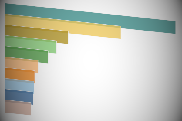
You will finally see the following:


Now, we need to add the final cosmetic touches:
- Fix the X-Axis so that your text is visible
- Hide the Axis Headers
- Hide the Row and Column Dividers
- Hide the Grid Lines
- Add more information to the Label
You are looking to have the following final data visualisation:


You can adjust the @Degree parameter to have fun with your data visualisation:


and boom, we are done! I hope you enjoyed creating this data visualization and learned some cool techniques as well. As always, you can find this data visualisation on Tableau Public at https://public.tableau.com/profile/toan.hoang#!/vizhome/TiltedBarCharts/TiltedBarCharts
Summary
I hope you all enjoyed this article as much as I enjoyed writing it and as always do share the love. Do let me know if you experienced any issues recreating this Visualization, and as always, please leave a comment below or reach out to me on Twitter @Tableau_Magic. Do also remember to tag me in your work if you use this tutorial.
If you like our work, do consider supporting us on Patreon, and for supporting us, we will give you early access to tutorials, exclusive videos, as well as access to current and future courses on Udemy: https://www.patreon.com/tableaumagic