
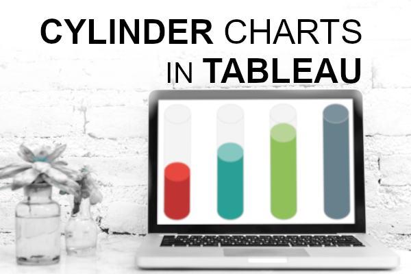
I was going through Google looking for data visualisation inspiration and came across a thread in the Tableau Forum which talks about creating a Cylinder Chart, and more interesting, if it is possible to do. As such, I thought that I would create the following tutorial for you all, so I hope you all enjoy and as always, let me know what you think.
Note: This is an alternative type of data visualisation, and sometimes pushed for by clients. Please always look at best practices for data visualisations before deploying this into production.
Data
Load the following data into Tableau Desktop / Public.
Segment,Type,Path,Value
Canada,Top,1,100
Canada,Top,361,100
Canada,Bottom,1,100
Canada,Bottom,361,100
France,Top,1,80
France,Top,361,80
France,Bottom,1,80
France,Bottom,361,80
United Kingdom,Top,1,60
United Kingdom,Top,361,60
United Kingdom,Bottom,1,60
United Kingdom,Bottom,361,60
United States,Top,1,40
United States,Top,361,40
United States,Bottom,1,40
United States,Bottom,361,40
Note: we need two records for each Metric as we are going to be drawing lines and using densification to get more points on our canvas. For more information, check out our article on Data Densification.
Calculated Fields
With our data set loaded into Tableau, we are going to create the following Calculated Fields and Bins:
Create Path (bin)
- Right click on Path, go to Create and select Bins…
- In the Edit Bins dialogue window:
- Set New field name to Path (bin).
- Set Size of bins to 1.
- Click Ok.
Index
INDEX()-1TC_Value
WINDOW_MAX(MAX([Value]))TC_Max Value
WINDOW_MAX(MAX([Value]))TC_Percentage
[TC_Value]/[TC_Max Value]TC_Type
WINDOW_MAX(MAX([Type]))X
COS(RADIANS([Index]))Y
IF [TC_Type] = "Bottom" THEN
    IF [Index] < 181 THEN
        SIN(RADIANS([Index]))/2*-1
    ELSE
        SIN(RADIANS([Index]))/2+[TC_Percentage]*5
    END
ELSE
    SIN(RADIANS([Index]))/2+[TC_Percentage]*5
END
So now that we have created a lot of Calculated fields, we will now put this together into a Worksheet.
Worksheet
We will now build our first worksheet:
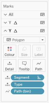
- Change the Mark Type to Polygon.
- Drag Segment onto Columns.
- Control and select Segment and Type and drag both items onto Color; ensure that Segment is on top.
- Drag Path (bin) onto Columns.
- Right-click on this object and ensure that Show Missing Values is selected.
- Drag this object onto Path.
- Drag X onto Columns.
- Right-click on this object, go to Compute Using and select Path (bin).
- Drag Y onto Rows.
- Right-click on this object, go to Compute Using and select Path (bin).
- Right-click on this object and select Edit Table Calculations.
- In Nested Calculations select TC_Max Value and go to Specific Dimensions.
- Tick Segment and Path (bin).
- Ensure that Segment is on top.
- In Nested Calculations select TC_Max Value and go to Specific Dimensions.
If all goes well you should not see the following:

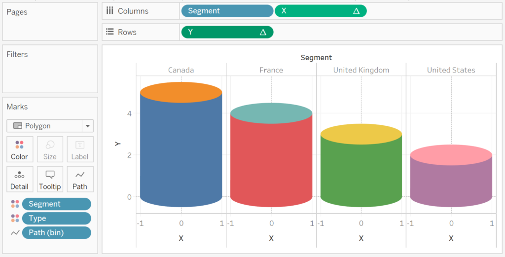
So now we are going to work on the cosmetics:
- Edit the Colors.
- Edit the X-Axis to be a fixed range and from -2 to 2.
- Hide the Axis Headers.
- Hide the Grid Lines.
- Hide the Zero Lines.
- Add a Tooltip.
You will want to have the following:

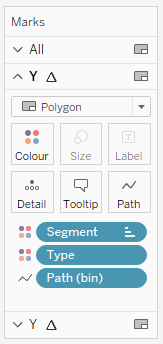
Now we are going to create the outline of the Cylinder.
- Drag Y onto Rows.
- Right-click on this object, go to Compute Using and select Path (bin).
- Right-click on the new Y object and select Dual Axis and Synchronize Axis.
- Edit the Color Mark.
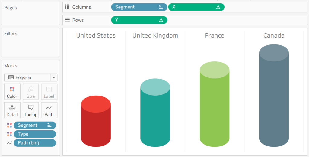
Edit: You want your Marks to look like the following:


You should now see the following:

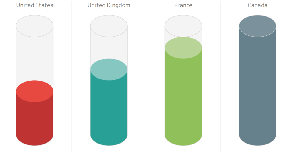
and boom we are done, this was a fun blog and you can see my version of this visualisation on Tableau Public at https://public.tableau.com/profile/toan.hoang#!/vizhome/CylinderCharts/CylinderChart
Summary
I hope you all enjoyed this article as much as I enjoyed writing it and as always do share the love. Do let me know if you experienced any issues recreating this Visualisation, and as always, please leave a comment below or reach out to me on Twitter @Tableau_Magic.
If you like our work, do consider supporting us on Patreon, and for supporting us, we will give you early access to tutorials, exclusive videos, as well as access to current and future courses on Udemy:
- Patreon: https://www.patreon.com/tableaumagic
Also, do be sure to check out our various courses:
- Creating Bespoke Data Visualizations (Udemy)
- Introduction to Tableau (Online Instructor-Led)
- Advanced Calculations (Online Instructor-Led)
- Creating Bespoke Data Visualizations (Online Instructor-Led)