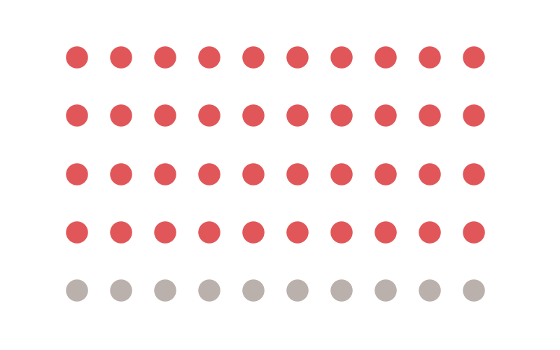
A friend messaged me to ask he could create a grid layout for different visualisations, for example, a 3×3 grid. I immediately thought about a Dot Matrix visualization and how I could create this in Tableau. In this seriously quick tutorial, I will go through the steps to create such a visualization.
The Data
The data for the example is simple.
Yep that is it, create this in Excel and paste it into Tableau.
Calculated Fields
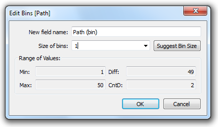
We will create a Path (bin) object by:
- Right click on Path
- Go to Create, Bins…
- In Edit [Path] set the Size of bins to 1
- Click Ok
The Path (bin) will allow us to use a table calculation to create additional data points between 1 and 50.
Note: we are using the Path (bin) to densificate data and give us more points to work with. One thing to make sure of is that you check the Show Missing Values.
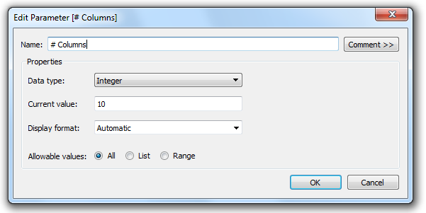
We will not create the following Parameter:
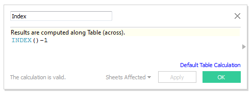
We will now create the following Calculated fields.
Index: We are going to use this to draw the individual points.
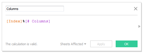
Columns: This will represent the Columns, the numbers of columns are controlled by the Parameter
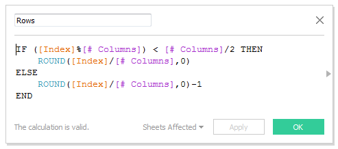
Rows: This will represent the rows, the numbers of rows controlled by the Parameter
Note: I would have loved to use the Floor function but it does not work on Table Calculations. As such, I had to produce a workaround.
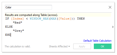
Color: This will test the value against total number and colour accordingly
Now that we have our Calculated Fields we are ready to build our worksheet.
The Worksheet
We will now drag our Calculated fields into a new worksheet to create our visualisation.
- Drag Path (Bin) onto the Details Mark
- Drag Columns onto Columns
- Right click on Columns, select Compute Using, select Path (Bin)
- Drag Rows onto Rows
- Right click on Rows, select Compute Using, select Path (Bin)
- Drag Color onto the Color Mark
- Right click on Color, select Compute Using, select Path (Bin)
- Click on Color and set the appropriate colours.
- Change the Mark Type to Circle
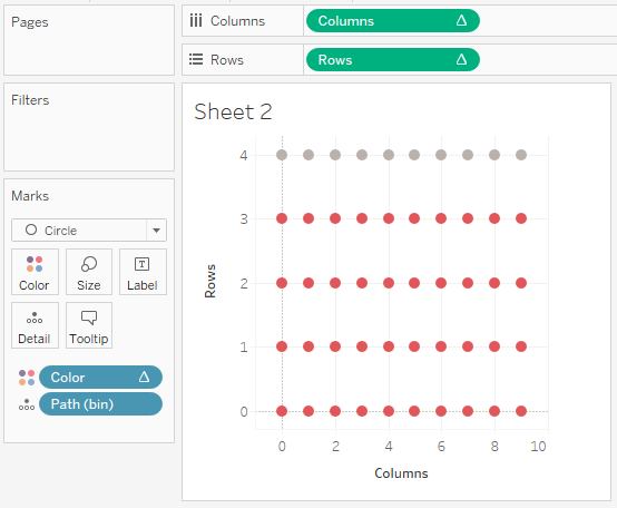
You should something like the following:
Now, on your own…
- Remove gridlines and borders
- Reverse the Rows Axis to put Red on top
- Hide Headers
- Play with sizes
And now you should have something like:
And that is a wrap. I hope you enjoyed this quick Dot Matrix blog. Do let me know how you get along @Tableau_Magic.
If you like our work, do consider supporting us on Patreon, and for supporting us, we will give you early access to tutorials, exclusive videos, as well as access to current and future courses on Udemy:
- Patreon: https://www.patreon.com/tableaumagic
Also, do be sure to check out our various courses:
- Creating Bespoke Data Visualizations (Udemy)
- Introduction to Tableau (Online Instructor-Led)
- Advanced Calculations (Online Instructor-Led)
- Creating Bespoke Data Visualizations (Online Instructor-Led)

