
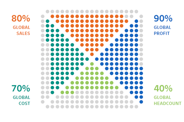
I regularly look through websites for design, Pinterest, and other resources for ideas and regularly post to my Facebook Group. After posting one image, I received several messages about creating this in Tableau, so I decided to have a drink and look into this, I hope you enjoy this tutorial.
Note: This is an alternative type of data visualisation, and sometimes pushed for by clients. Please always look at best practices for data visualisations before deploying into production.
Data
Load the following data into Tableau Desktop / Public.
Metric,Path,Percentage
Metric 1,1,0.8
Metric 1,100,0.8
Metric 2,1,0.9
Metric 2,100,0.9
Metric 3,1,0.4
Metric 3,100,0.4
Metric 4,1,0.7
Metric 4,100,0.7
Note: we need two records for each Metric as we are going to be drawing lines and using densification to get more points on our canvas. For more information, check out our article on Data Densification.
Calculated Fields
With our data set loaded into Tableau, we are going to create the following Calculated Fields and Bins:
Create Path (bin)
- Right click on Path, go to Create and select Bins…
- In the Edit Bins dialogue window:
- Set New field name to Path (bin).
- Set Size of bins to 1.
- Click Ok.
Index
INDEX()TC_Percentage
WINDOW_MAX(MAX([Percentage]))Rows
IF [Index] = 1 THEN
    1
ELSEIF [Index] <= 4 THEN
    2
ELSEIF [Index] <= 9 THEN
    3
ELSEIF [Index] <= 16 THEN
    4
ELSEIF [Index] <= 25 THEN
    5
ELSEIF [Index] <= 36 THEN
    6
ELSEIF [Index] <= 49 THEN
    7
ELSEIF [Index] <= 64 THEN
    8
ELSEIF [Index] <= 81 THEN
    9
ELSE
    10
END
Columns
IF [Rows] = 1 THEN
    0
ELSEIF [Rows] = 2 THEN
    [Index] - 3
ELSEIF [Rows] = 3 THEN
    [Index] - 7
ELSEIF [Rows] = 4 THEN
    [Index] - 13
ELSEIF [Rows] = 5 THEN
    [Index] - 21
ELSEIF [Rows] = 6 THEN
    [Index] - 31
ELSEIF [Rows] = 7 THEN
    [Index] - 43
ELSEIF [Rows] = 8 THEN
    [Index] - 57
ELSEIF [Rows] = 9 THEN
    [Index] - 73
ELSEIF [Rows] = 10 THEN
    [Index] - 91
END
Note: We are using Rows and Columns calculated fields to create our dot triangle.
Color
IF [Index] / WINDOW_MAX([Index]) < [TC_Percentage] THEN
    WINDOW_MAX(MAX([Metric]))
ELSE
    "Grey"
END
X
IF WINDOW_MAX(MAX([Metric])) = "Metric 1" THEN
    [Columns]
ELSEIF WINDOW_MAX(MAX([Metric])) = "Metric 2" THEN
    [Rows]
ELSEIF WINDOW_MAX(MAX([Metric])) = "Metric 3" THEN
    [Columns]
ELSE
    -[Rows]
END
Y
IF WINDOW_MAX(MAX([Metric])) = "Metric 1" THEN
    [Rows]
ELSEIF WINDOW_MAX(MAX([Metric])) = "Metric 2" THEN
    [Columns]
ELSEIF WINDOW_MAX(MAX([Metric])) = "Metric 3" THEN
    -[Rows]
ELSE
    -[Columns]
END
So now that we have created a lot of Calculated fields, we will now put this together into a Worksheet.
Worksheet
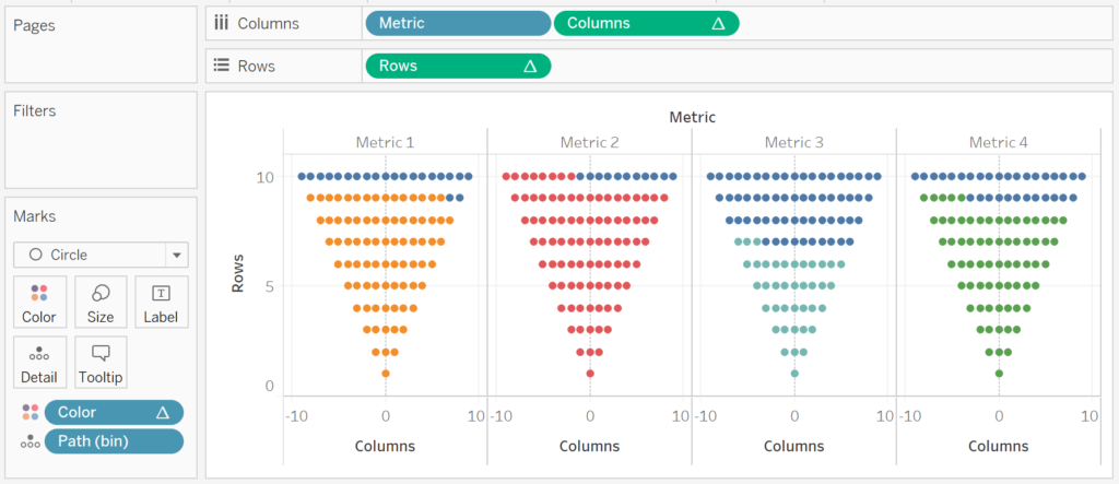
We will now build our first worksheet:
- Change the Mark Type to Circle.
- Drag Path (bin) to Columns.
- Right-click on the object, and ensure that Show Missing Values is selected.
- Drag this object onto the Detail Mark.
- Drag Metric onto Columns.
- Drag Columns object onto Columns.
- Right-click on the object, go to Compute Using and select Path (bin).
- Drag Rows object onto Rows.
- Right-click on the object, go to Compute Using and select Path (bin).
- Drag the Color object onto the Color Mark.
- Right-click on the object, go to Compute Using and select Path (bin).
If all goes well you should see something like the following:

Now that we have the basics, we will want to roate the Metrics around, and this is where our X and Y objects come in.
- Drag X on top of the Columns Pill in the Columns Shelf.
- This should replace the Columns object.
- Right-click on the object, go to Compute Using and select Path (bin).
- Drag Y on top of the Rows Pill in the Rows Shelf.
- This should replace the Rows object.
- Right-click on the object, go to Compute Using and select Path (bin).
You should see the following:

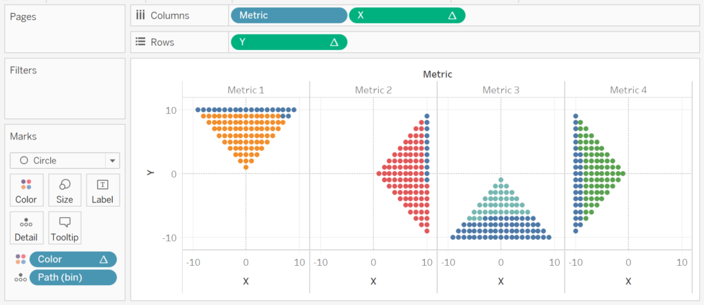
As you can see, we are almost there. At this point, go and have a look at the X and Y objects to see what we have done to rotate the dot matrix.
Now we will finish off the basic shape by dragging the Metric object from the Columns Shelf to the Detail Mark. We should now have the following:

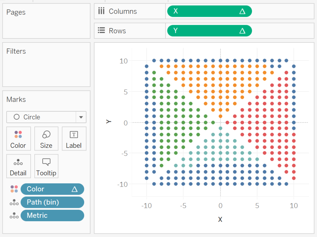
Now we will adjust the cosmetics to complete this data visualisation:
- Hide the Axis Headers.
- Hide the Grid Lines.
- Hide the Column Dividers.
- Hide the Row Dividers.
- Hide the Zero Line.
- Edit the Colors.
- Adjust the Tooltip.
You will want to have the following:


and boom we are done, I did not expect to be able to complete this tutorial as quickly as I did, but you can find my version of this visualisation on Tableau Public at
https://public.tableau.com/profile/toan.hoang#!/vizhome/DotQuadrantChart/DotQuadrantChart
Summary
I hope you all enjoyed this article as much as I enjoyed writing it and as always do share the love. Do let me know if you experienced any issues recreating this Visualisation, and as always, please leave a comment below or reach out to me on Twitter @Tableau_Magic.
If you like our work, do consider supporting us on Patreon, and for supporting us, we will give you early access to tutorials, exclusive videos, as well as access to current and future courses on Udemy:
- Patreon: https://www.patreon.com/tableaumagic
Also, do be sure to check out our various courses:
- Creating Bespoke Data Visualizations (Udemy)
- Introduction to Tableau (Online Instructor-Led)
- Advanced Calculations (Online Instructor-Led)
- Creating Bespoke Data Visualizations (Online Instructor-Led)