
After the United Kingdom 2017 General Election, on Thursday 8th June 2017, I had many conservations about our First Past The Post system (FPTP), and why we do not have a Proportional Representation (PR). In the UK FPTP system, we have 650 individual battlegrounds, each representing one seat, the party with the most seats wins. This means that a party could technically score second place in every battle but have zero seats in Parliament.
In this tutorial, we will walk through the creation of Double-Spaces Doughnut charts in Tableau.
Disclaimer: This tutorial goes through several techniques which will hopefully help you in your journey. However, and as always, try to find the most appropriate visualisation for specific data visualisation and dashboard requirements.
Data
We will start by loading the following data into Tableau.
| Party | Values | Type | Path | Position |
| Conservatives | 0.489 | Percentage of Seats | 1 | 1.3 |
| Conservatives | 0.489 | Percentage of Seats | 360 | 1.3 |
| Conservatives | 0.489 | Percentage of Seats | 1 | 1.5 |
| Conservatives | 0.489 | Percentage of Seats | 360 | 1.5 |
| Conservatives | 0.424 | Percentage of Votes | 1 | 1 |
| Conservatives | 0.424 | Percentage of Votes | 360 | 1 |
| Conservatives | 0.424 | Percentage of Votes | 1 | 1.2 |
| Conservatives | 0.424 | Percentage of Votes | 360 | 1.2 |
| Labour | 0.403 | Percentage of Seats | 1 | 1.3 |
| Labour | 0.403 | Percentage of Seats | 360 | 1.3 |
| Labour | 0.403 | Percentage of Seats | 1 | 1.5 |
| Labour | 0.403 | Percentage of Seats | 360 | 1.5 |
| Labour | 0.400 | Percentage of Votes | 1 | 1 |
| Labour | 0.400 | Percentage of Votes | 360 | 1 |
| Labour | 0.400 | Percentage of Votes | 1 | 1.2 |
| Labour | 0.400 | Percentage of Votes | 360 | 1.2 |
| Liberal Democrats | 0.018 | Percentage of Seats | 1 | 1.3 |
| Liberal Democrats | 0.018 | Percentage of Seats | 360 | 1.3 |
| Liberal Democrats | 0.018 | Percentage of Seats | 1 | 1.5 |
| Liberal Democrats | 0.018 | Percentage of Seats | 360 | 1.5 |
| Liberal Democrats | 0.074 | Percentage of Votes | 1 | 1 |
| Liberal Democrats | 0.074 | Percentage of Votes | 360 | 1 |
| Liberal Democrats | 0.074 | Percentage of Votes | 1 | 1.2 |
| Liberal Democrats | 0.074 | Percentage of Votes | 360 | 1.2 |
Note: We have two records per segment as we are going to use data densification to give us additional points for drawing.
Calculated Fields
With our data set loaded into Tableau, we are going to create the following Calculated Fields and Bins:
Path (bin)
- Right click on Path, go to Create and select Bins…
- In the Edit Bins dialogue window:
- Set New field name to Path (bin)
- Set Size of bins to 1
- Click Ok
Zero
0
Index
INDEX()
Seat Share
MAX(IF([Type]="Percentage of Seats") THEN [Values] END)
Vote Share
MAX(IF([Type]="Percentage of Votes") THEN [Values] END)
TC_Position
WINDOW_MAX(MAX([Position]))
TC_Values
WINDOW_MAX(MAX([Values]))
X
SIN([Index]*2*PI()/180)*[TC_Position]
Note: We need to convert percentages to Radians by multiplying by PI() and then dividing by 180.
Y
COS([Index]*2*PI()/180)*[TC_Position]
Color
IF [Index]*2/360 <= [TC_Values] THEN WINDOW_MAX(MAX([Party])) ELSE "Gray" END
So now that we have created a lot of Calculated fields, we will now put this together into a Worksheet.
Worksheet
We will now build our worksheet by:
- Drag Type onto the Details Mark
- Drag Path (Bin) onto the Columns
- Right click on Path (Bin) and check Show Missing Values
- Drag Path (Bin) onto the Detail Mark
- Drag Party onto the Details Mark
- Drag Party onto Columns
- Change the Mark Type to Line
- Drag Position onto Path
- Right click on Position and choose Dimension
- Drag X onto Columns
- Right click on X, go to Compute Using, select Path (Bin)
- Drag Y onto Rows
- Right click on Y, go to Compute Using, select Path (Bin)
- Drag Color onto the Color Mark
- Right click on Color, go to Compute Using, select Path (Bin)
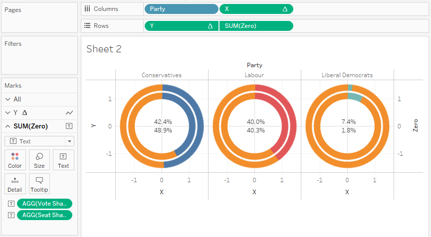
After this you should have the following:

We will now complete the visualisation by adding the central text.
- Drag Zero onto Rows
- Right-click and select Dual Axis
- Right-click on the axis bar and select Synchronize Axis
- You should have SUM(Zero) as an option on Marks, now
- Remove all objects
- Change the Marks to Text
- Drag Vote Share to Text
- Drag Seat Share to Text
- Right Click on Seat Share and Vote Share and change the Number format to 1 decimal place percentage
- Go to the Y object in Marks and removes the Measure Names; this has been added automatically.
We should now see the following:
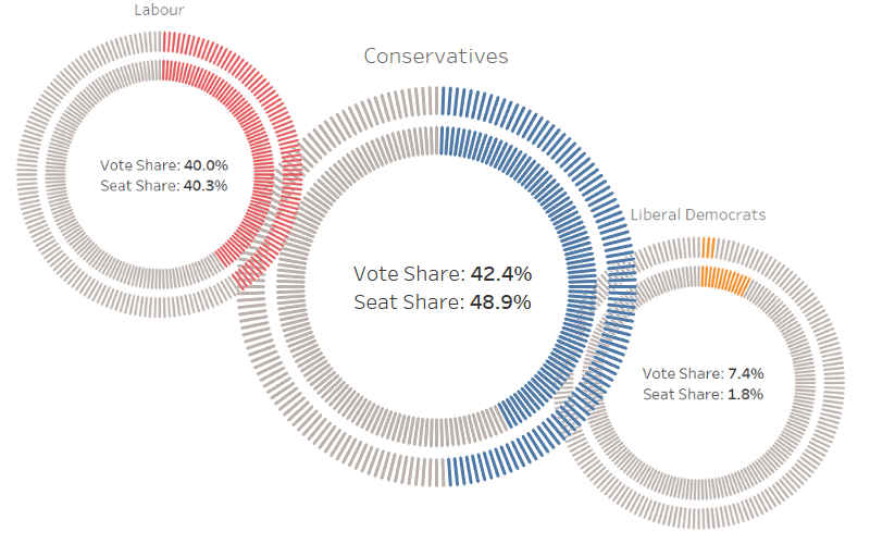
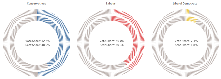
You have now built a worksheet that shows a Double-Spaced Doughnut Chart where the inner circle represents the number of votes and the outer circle represents the number of seats.
Adjusting the Visual
We will now do the following to get the look that we require:
- Remove all Grid Lines
- Edit the party Color
- Remove the Tooltips on for the Doughnut
- Hide Headers
- Format your text
- Adjust your sizes
You want to end up with the following:
and boom, you are done…
Summary
I hope you all enjoyed this article as much as I enjoyed writing it. Do let me know if you experienced any issues recreating this Visualisation, and as always, please leave a comment below or reach out to me on Twitter @Tableau_Magic.
If you like our work, do consider supporting us on Patreon, and for supporting us, we will give you early access to tutorials, exclusive videos, as well as access to current and future courses on Udemy:
- Patreon: https://www.patreon.com/tableaumagic
Also, do be sure to check out our various courses:
- Creating Bespoke Data Visualizations (Udemy)
- Introduction to Tableau (Online Instructor-Led)
- Advanced Calculations (Online Instructor-Led)
- Creating Bespoke Data Visualizations (Online Instructor-Led)