
I was browsing Pinterests for interesting visualisations and came across a visualisation that combined a Radial Bar Chart with a Rounded Bar Chart, and as such, I knew that I had to give this a try in Tableau. Initially, I considered having two separate worksheets and putting them next to each other, but trying, I want to put into one worksheet, so do enjoy.
Note: This is an alternative type of data visualisation, and sometimes pushed for by clients. Please always look at best practices for data visualisations before deploying into production.
Data
Load the following data into Tableau Desktop / Public.
| Country | Path | Sales ($ millions) |
| United States | 1 | 1500 |
| United States | 281 | 1500 |
| United Kingdom | 1 | 900 |
| United Kingdom | 281 | 900 |
| France | 1 | 800 |
| France | 281 | 800 |
| Canada | 1 | 500 |
| Canada | 281 | 500 |
| Hong Kong | 1 | 200 |
| Hong Kong | 281 | 200 |
Note: we need two records for each Country as we are going to be drawing lines and using densification to get more points on our canvas. For more information, check out our article on Data Densification.
Calculated Fields
With our data set loaded into Tableau, we are going to create the following Calculated Fields and Bins:
Create Path (bin)
- Right click on Path, go to Create and select Bins…
- In the Edit Bins dialogue window:
- Set New field name to Path (bin).
- Set Size of bins to 1.
- Click Ok.
Now let us create the following Calculated Fields:
Index
INDEX()-1TC_Sales ($ millions)
WINDOW_MAX(MAX([Sales ($ millions)]))TC_Total Sales ($ millions)
WINDOW_SUM(MAX([Sales ($ millions)]))TC_Percentage
[TC_Sales ($ millions)]/[TC_Total Sales ($ millions)]TC_Rank
RANK_DENSE([TC_Sales ($ millions)],"asc")X
IF [Index] < 181 THEN
    SIN(RADIANS([Index]))*[TC_Rank]
ELSE
    (-[Index]/10)*[TC_Percentage]
END
Y
IF [Index] < 181 THEN
    COS(RADIANS([Index]))*[TC_Rank]
ELSE
    -[TC_Rank]
END
So now that we have created a lot of Calculated fields, we will now put this together into a Worksheet.
Worksheet
We will now build our worksheet:
- Change the Mark Type to Line.
- Drag Country onto the Color Mark.
- Drag Path (bin) to Columns.
- Right-click on the object, ensure that Show Missing Values is checked.
- Drag this object onto the Path Mark.
- Drag X onto Columns
- k on the object, go to Using and select Path (bin).
- Drag Y onto Rows
- on the object, go to Compute Using and select Path (bin).
You should see the following:

It looks funny I know, but fear not, we will adjust our Calculated Fields to achieve our desired results.
- Right-click on X and select Edit Tableau Calculation.
- In Nested Calculations select TC_Rank.
- Select Specific Dimension and tick both Path (bin) and Country.
- Ensure that Path (bin) is on top.
- In Nested Calculations select TC_Total Sales ($ millions).
- Select Specific Dimension and tick both Path (bin) and Country
- e that Path (bin) is on top.
- In Nested Calculations select TC_Rank.
- Right-click on Y and select Edit Tableau Calculation.
- In Nested Calculations select TC_Rank.
- Select Specific Dimension and tick both Path (bin) and Country.
- Ensure that Path (bin) is on top.
- In Nested Calculations select TC_Total Sales ($ millions).
- Select Specific Dimension and tick both Path (bin) and Country.
- Ensure that Path (bin) is on top.
- In Nested Calculations select TC_Rank.
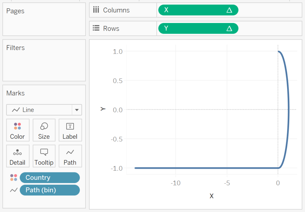
You should now see the following.

Now we will adjust the cosmetics:
- Double-click on the Y-Axis and choose Reversed.
- Double-click on the X-Axis and choose Reversed.
- Hide the X and Y Axis headers.
- Hide Grid Lines.
- Remove Zero Lines.
- Remove Row and Column Dividers.
- Drag Sales ($ millions) onto Label.
- Choose Line Ends.
- Only tick Label start of .
- Edit the Label.
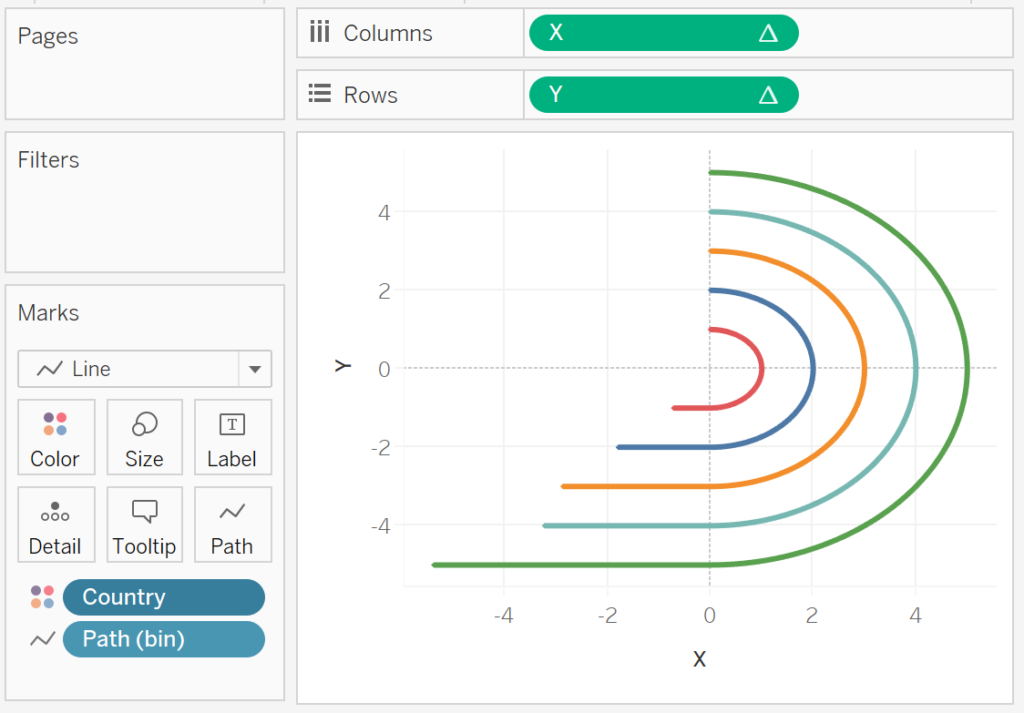
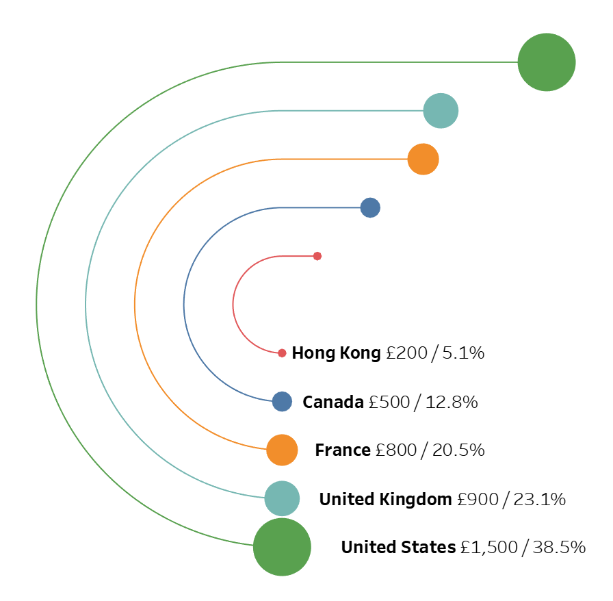
If all goes well, you would want something like the following:

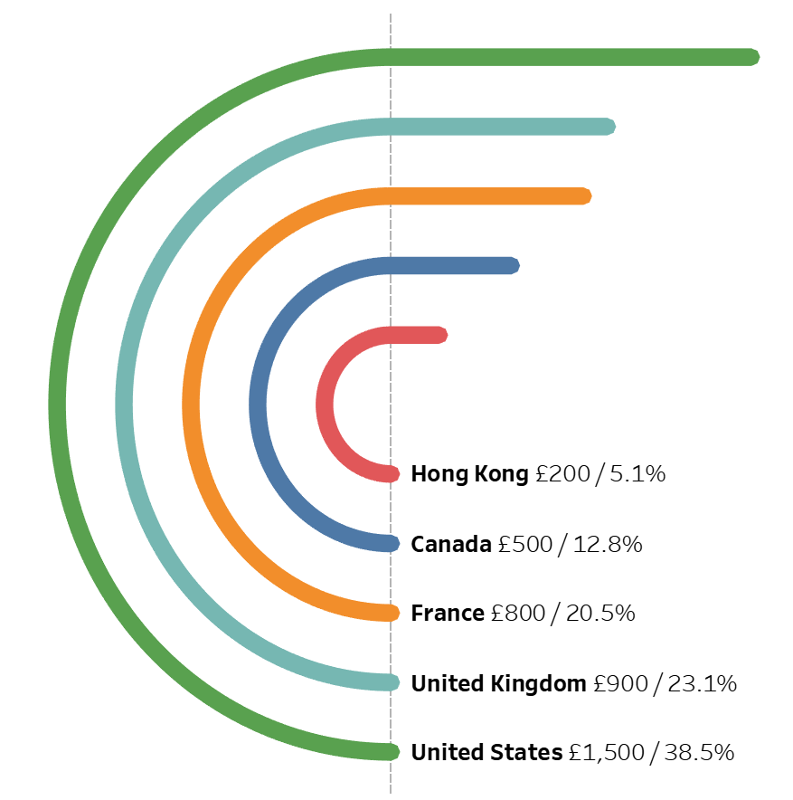
and boom we are done… we have successfully created a data visualisation combining a Radial Bar Chart and Rounded Bar Chart. You can find my data visualisation on Tableau Public at https://public.tableau.com/profile/toan.hoang#!/vizhome/RadialPlusRoundedBarChart/RadialPlusRoundedBarChart
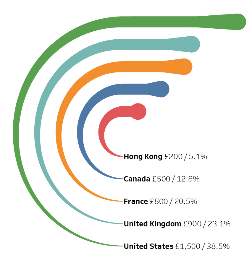
We can also have some fun with Variations. Let us drag Sales ($ millions) onto the Size Mark. We will get the following:

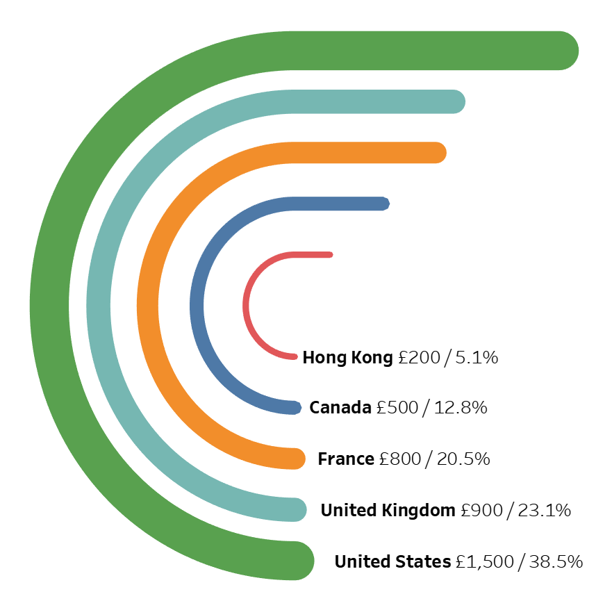
or how about we drag Index onto the Size Mark, we will get the following:

Lastly, let us drag TC_Sales ($ millions) onto the Size Mark.

Summary
I hope you all enjoyed this article as much as I enjoyed writing it and as always do share the love. Do let me know if you experienced any issues recreating this Visualisation, and as always, please leave a comment below or reach out to me on Twitter @Tableau_Magic.
If you like our work, do consider supporting us on Patreon, and for supporting us, we will give you early access to tutorials, exclusive videos, as well as access to current and future courses on Udemy:
- Patreon: https://www.patreon.com/tableaumagic
Also, do be sure to check out our various courses:
- Creating Bespoke Data Visualizations (Udemy)
- Introduction to Tableau (Online Instructor-Led)
- Advanced Calculations (Online Instructor-Led)
- Creating Bespoke Data Visualizations (Online Instructor-Led)