
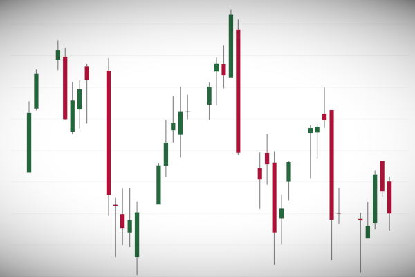
I have been doing alot of research for an article that I am writting about the Salesforce Acquisition of Tableau. As such, I was looking at the Stock Prices and thought that I would grab historical Tableau Stock Data and build a Candlestick chart, and hence, I decided to write a tutorial for you all to enjoy.
Note: As always never choose a data visualisation type and try to fit your data into it, instead, understand your data and choose the best visualization for your data consumers.
Data
We will start by downloading and loading the following data into Tableau Desktop / Tableau Public:
Note: this data comes from https://www.macrotrends.net
Calculated Fields
We will start off by creating the following Calculated Fields:
Spread – High Low
SUM([Low])-SUM([High])Spread – Open Close
SUM([Close])-SUM([Open])Yep, that is all we are going to need, so let us create our Worksheet.
Worksheet
We will now build our data visualisation:
- Change the Mark Type to Gantt Bar.
- Drag Date onto Filters.
- Select Relative Date.
- Select Last 3 Months.
- Click Ok.
- Drag Date onto Columns.
- Right-click on this object, and select Exact Date.
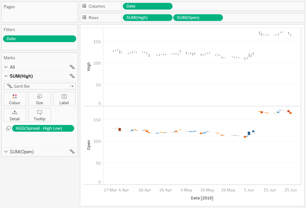
- Drag High onto Rows.
- On the SUM(High) Marks Panel, drag Spread – High Low onto the Size Mark.
- Drag Open onto Rows.
- On the SUM(Open) Marks Panel, drag Spread – Open Close onto the Color and Size Mark.
You should now have the following:

We will now finish this off by adjusting the cosmetics:
- On the SUM(High) Marks Panel.
- Change the Color to Dark Grey.
- Reduce the Size to the smallest possible.
- On the SUM(Open) Marks Panel.
- Click on Color and Edit Colour.
- Select the Red-Green Diverging Palette.
- Set Stepped Colour to be 2 Steps.
- Click on Advanced and check Centre and set the value to Zero.
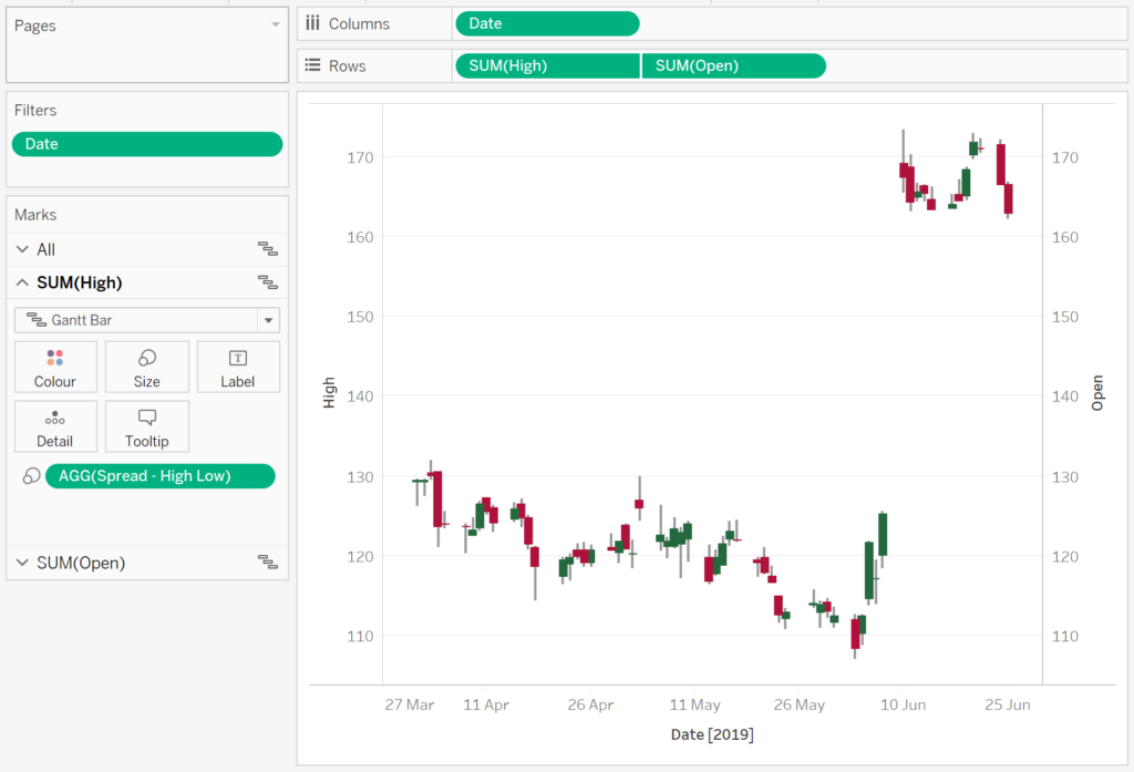
- Right-click on SUM(Open) on Rows and select Dual Axis.
- Right-click on the High Axis Headers and select Synchronize Axis.
- Double-click on the High Axis Header and uncheck Include zero.
If all goes well, you should now see the following:
Now for the final touches:
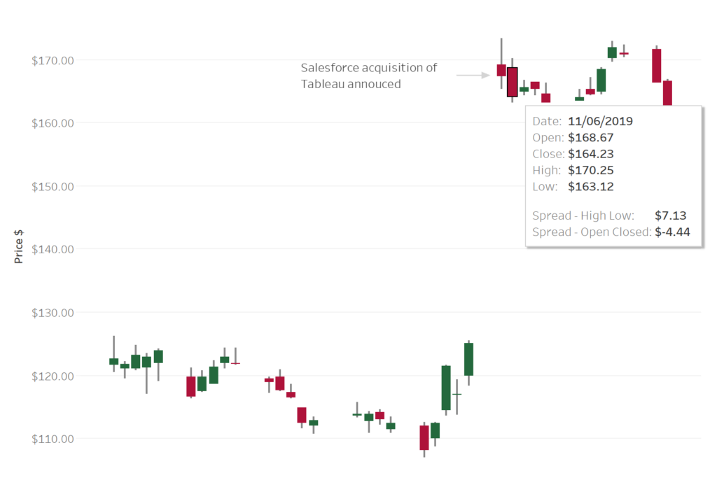
- Hide the High Open Axis Header.
- Rename High Axis Header to Price.
- Add Tooltips
- Change the formats to currency for
- Close
- High
- Low
- Open
- Spread – High Low
- Spread – Open Close
And you should have the following, yep, I added an annotation for when Salesforce acquired Tableau.

and boom we are done, we can now browse the Tableau Stock price with this nice and nifty visualisation; you can find my visualisation on Tableau Public here: https://public.tableau.com/profile/toan.hoang#!/vizhome/CandlestickCharts/CandlestickChart
Summary
I hope you all enjoyed this article as much as I enjoyed writing it. Do let me know if you experienced any issues recreating this Visualisation, and as always, please leave a comment below or reach out to me on Twitter @Tableau_Magic.
If you like our work, do consider supporting us on Patreon, and for supporting us, we will give you early access to tutorials, exclusive videos, as well as access to current and future courses on Udemy:
- Patreon: https://www.patreon.com/tableaumagic
Also, do be sure to check out our various courses:
- Creating Bespoke Data Visualizations (Udemy)
- Introduction to Tableau (Online Instructor-Led)
- Advanced Calculations (Online Instructor-Led)
- Creating Bespoke Data Visualizations (Online Instructor-Led)