
I was having a quiet weekend and thought I would have a little fun with some bar chart variations, as such, I played around with creating Curved Bar Charts in Tableau. This is a bespoke version of a standard Bar Chart, but it does have a cool visual appeal to it, I hope you have fun and enjoy this quick tutorial.
Note: This is an alternative type of data visualisation, and sometimes pushed for by clients. Please always look at best practices for data visualisations before deploying this into production.
Data
Load the following data into Tableau Desktop / Tableau Public.
Country,Value
United States,60
United Kingdom,70
India,50
Australia,60
France,30
Once your data is copied into Tableau, right-click on the data source and click on Edit Data Source… with the Data Source Editor open, paste the following:
Path
0
200
Note: If you are using Tableau 2020.2 or great i.e. have access to new Relationship Model, you will need to double-click on the originally pasted data source to open up before pasting in the Path Data.
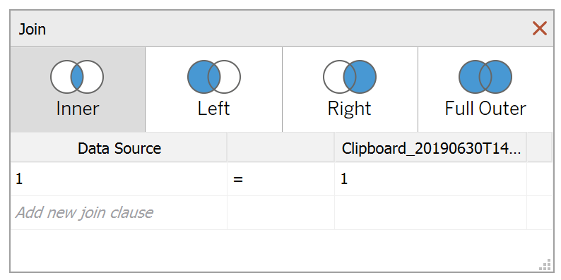
You should get an error as there is no joining column, however, click on Add new join clause, go to Create Join Calculation, type 1 and click OK. Do this for the right-hand side as well. Ensure that you have Inner join selected and you should see the following:

Note: we need two records for each Country as we are going to be drawing lines and using densification to get more points on our canvas. For more information, check out our article on Data Densification.
Calculated Fields
With our data set loaded into Tableau, we are going to create the following Calculated Fields, Parameters and Bins:
Create a Distance Parameter
- Set Name as Distance.
- Set Data type to Integer.
- Set Current value to 10.
- Click Ok.
Create Path (bin)
- Right-click on Path, go to Create and select Bins…
- In the Edit Bins dialogue window:
- Set New field name to Path (bin).
- Set Size of bins to 1.
- Click Ok.
Index
-6+((INDEX()-1)*0.12)Note: this is to implement the Sigmoid Curve function.
TC_Value
WINDOW_MAX(MAX([Value]))Y
IF [Index] <= 6 THEN
    (1/(1+EXP(-[Index])))
ELSE
    (1/(1+EXP(-(12-[Index]))))
END
* [TC_Value]
TC_Country Rank
RANK_UNIQUE([TC_Value])X
[Index]+([TC_Country Rank]*[Distance])With this done, let us start creating our data visualisation.
Worksheet
We will now build our first worksheet:
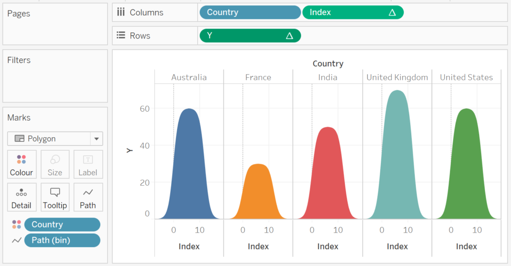
- Change the Mark Type to Polygon.
- Drag Path (bin) onto Columns.
- Right-click on this object and ensure that Show Missing Values is checked.
- Drag this object onto the Path Mark.
- Drag Country onto the Colour Mark.
- Drag Country onto Columns.
- Drag Index onto Columns.
- Right-click on this object, go to Compute Using and select Path (bin).
- Drag Y onto Rows.
- Right-click on this object, go to Compute Using and select Path (bin).
If all goes well, you should have the following:

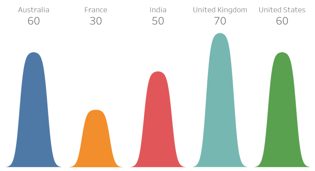
So we are almost there, let us adjust the cosmetics:
- Hide the Y-Axis Header.
- Hide the Index Header.
- Hide the Zero Lines.
- Hide Grid Lines.
- Hide the Row Dividers.
- Hide the Column Dividers.
- Edit the Tooltip.
- Add Labels.
If all goes well you should end up with the following Curved Bar Chart.

This is normally where I would say boom, I am done, but not quite yet. Upon special request, a friend asked me if I can make these overlapping for a cosmetic effect.
Curved Overlapping Bar Charts
Note: use this version with extreme caution. I would go as far as say use this for fun only.
Create a new Worksheet:
- Change the Mark Type to Polygon.
- Drag Path (bin) onto Columns.
- Right-click on this object and ensure that Show Missing Values is checked.
- Drag this object onto the Path Mark.
- Drag Country onto the Colour Mark.
- Drag X onto Columns.
- Right-click on this object, go to Compute Using and select Path (bin).
- Right-click on this object, go to Edit Table Calculations…
- In Nest Calculations select TC_Country Rank, select Specific Dimensions and ensure that only Country is checked.
- Drag Y onto Rows.
- Right-click on this object, go to Compute Using and select Path (bin).
- Right-click on the Distance Parameter and select Show Parameter Control.
Adjust the cosmetics in the same way as before (and add a little transparency), and if all goes well you should see the following:

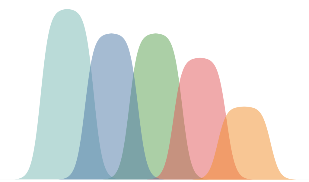
Try adjusting the Distance parameter and see what you can come up with. and now, we are done, you can find my data visualisation on Tableau Public at https://public.tableau.com/profile/toan.hoang#!/vizhome/CurvedBarCharts/CurvedBarCharts
Summary
I hope you all enjoyed this article as much as I enjoyed writing it and as always do share the love. Do let me know if you experienced any issues recreating this Visualisation, and as always, please leave a comment below or reach out to me on Twitter @Tableau_Magic.
If you like our work, do consider supporting us on Patreon, and for supporting us, we will give you early access to tutorials, exclusive videos, as well as access to current and future courses on Udemy:
- Patreon: https://www.patreon.com/tableaumagic
Also, do be sure to check out our various courses:
- Creating Bespoke Data Visualizations (Udemy)
- Introduction to Tableau (Online Instructor-Led)
- Advanced Calculations (Online Instructor-Led)
- Creating Bespoke Data Visualizations (Online Instructor-Led)