
On my way home from the London Tableau User Group (TUG) I was looking at Twitter and got inspiration from Kevin Flerlage (@FlerlageKev) and Rajeev Pandey (@rajvivan), so I thought I would design and write up my own version of this visualisation, please welcome the Daisy Chart.
Note: This is an alternative type of data visualisation, and sometimes pushed for by clients. Please always look at best practices for data visualisations before deploying into production.
Data
Load the following data into Tableau Desktop / Public.
| Metric | Path | Value | Position |
| United States | 1 | 0.8 | 1 |
| United States | 360 | 0.8 | 1 |
| United States | 1 | 0.8 | 1.5 |
| United States | 360 | 0.8 | 1.5 |
| United Kingdom | 1 | 0.2 | 1 |
| United Kingdom | 360 | 0.2 | 1 |
| United Kingdom | 1 | 0.2 | 1.5 |
| United Kingdom | 360 | 0.2 | 1.5 |
| Canada | 1 | 0.55 | 1 |
| Canada | 360 | 0.55 | 1 |
| Canada | 1 | 0.55 | 1.5 |
| Canada | 360 | 0.55 | 1.5 |
Note: we need four records for each Country as we are going to be drawing lines and using densification to get more points on our view. For more information, check out our article on Data Densification.
Calculated Fields
With our data set loaded into Tableau, we are going to create the following Calculated Fields and Bins:
Create Path (bin)
- Right click on Path, go to Create and select Bins…
- In the Edit Bins dialogue window:
- Set New field name to Path (bin).
- Set Size of bins to 10.
- Click Ok.
Index
INDEX()-1TC_Value
WINDOW_MAX(MAX([Value]))TC_Position
WINDOW_MAX(MAX([Position]))X
SIN(RADIANS([Index]*(360/WINDOW_MAX([Index]))))*[TC_Position]Y
COS(RADIANS([Index]*(360/WINDOW_MAX([Index]))))*[TC_Position]Zero
0Color
IF [Index] < (WINDOW_MAX([Index])*[TC_Value]) THEN
    IF [TC_Value] >= 0.8 THEN
        "Green"
    ELSEIF [TC_Value] <= 0.2 THEN
        "Red"
    ELSE
        "Amber"
    END
ELSE
    "Grey"
END
Note: We are hardcoding the colors thresholds.
So now that we have created a lot of Calculated fields, we will now put this together into a Worksheet.
Worksheet
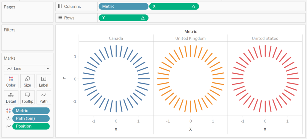
We will now build our worksheet:
- Change the Mark Type to Line.
- Drag Metric onto the Color Mark.
- Drag Metric onto the Columns Mark.
- Drag Path (bin) onto Columns.
- Right-click onto this object and ensure that Show Missing Values is checked.
- Drag this object onto the Detail Mark.
- Drag Position onto the Path Mark.
- Right-click on this object and select Dimension.
- Drag X onto Columns.
- Right-click on the object, go to Using and select Path (bin).
- Drag Y onto Rows.
- Right-click on the object, go to Using and select Path (bin).
If all goes well, you should have the following:

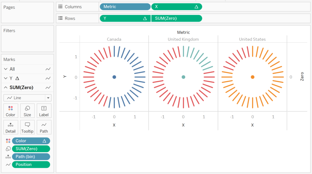
We will now make a few adjustments.
- Drag Color onto the Color Mark.
- Right-click on the object, go to Using and select Path (bin).
- Drag Zero onto Rows.
- Right-click on the object and select Dual Axis.
- In the Y Mark Panel.
- Remove Measure Names from the Color Mark.
- In the SUM(Zero) Mark Panel.
- Change the Mark Type to Circle.
- Remove Measure Names from the Color Mark.
- Drag Zero onto the Size Mark.
You should now see the following:

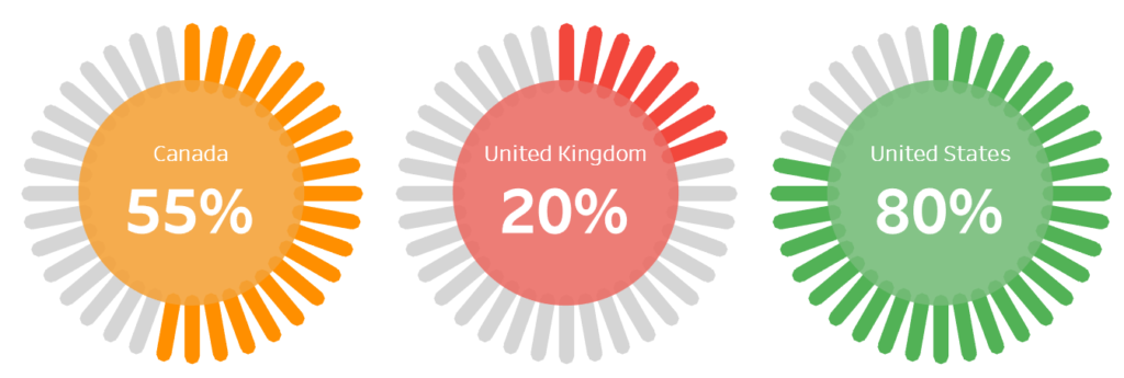
Now we will adjust the cosmetics:
- Set the Grid Lines to None.
- Set the Row Divider to None.
- Set the Column Divider to None.
- Hide the X-Axis.
- Hide the Y-Axis.
- Edit the Colors.
- Increase the Size of the Circle.
- Add a Label to the Circle.
- Add Transparency to the Circle.
If all goes well, you want to end up with the following:

and boom we are done… we have successfully created this fun data visualisation. You can find my data visualisation on Tableau Public at https://public.tableau.com/profile/toan.hoang#!/vizhome/DaisyCharts/DaisyChart
Extra Credit: Try changing the value Path (bin) and see the results, and adjust the size of the Line Mark.
Summary
I hope you all enjoyed this article as much as I enjoyed writing it and as always do share the love. Do let me know if you experienced any issues recreating this Visualisation, and as always, please leave a comment below or reach out to me on Twitter @Tableau_Magic.
If you like our work, do consider supporting us on Patreon, and for supporting us, we will give you early access to tutorials, exclusive videos, as well as access to current and future courses on Udemy:
- Patreon: https://www.patreon.com/tableaumagic
Also, do be sure to check out our various courses:
- Creating Bespoke Data Visualizations (Udemy)
- Introduction to Tableau (Online Instructor-Led)
- Advanced Calculations (Online Instructor-Led)
- Creating Bespoke Data Visualizations (Online Instructor-Led)