


")


In this tutorial, we are going to have some fun and draw two overlapping Radar Charts, use transparency, and show dynamic labels. The main thing here is to have some fun and check out some of the features of Tableau, so I hope you do enjoy it.
Note: As always never choose a data visualisation type and try to fit your data into it, instead, understand your data and choose the best visualization for your data consumers.
Data
Load the following data into Tableau Desktop / Public.
| Region | Metric | Value |
| Europe | Sales Revenue | 1,500,000 |
| Europe | Operating Cost | 500,000 |
| Europe | Profit | 1,000,000 |
| Europe | Quantity Sold | 80,000 |
| Europe | Average Discount | 10 |
| Europe | Total Headcount | 200 |
| Europe | Sales Headcount | 80 |
| APAC | Sales Revenue | 1,000,000 |
| APAC | Operating Cost | 400,000 |
| APAC | Profit | 600,000 |
| APAC | Quantity Sold | 50,000 |
| APAC | Average Discount | 8 |
| APAC | Total Headcount | 220 |
| APAC | Sales Headcount | 150 |
Calculated Fields
With our data set loaded into Tableau, we are going to create the following Calculated Fields:
Prefix
IF
    [Metric] = "Sales Revenue"
    OR [Metric] = "Operating Cost"
    OR [Metric] = "Profit"
THEN
    "£"
ELSE
    ""
END
Suffix
IF [Metric] = "Average Discount" THEN
    "%"
ELSE
    ""
END
Note: As we have different numeric types in our data, we are going to manually add the current prefix, or the percentage suffix.
Index
INDEX()-1TC_Max Value
WINDOW_MAX(MAX([Value]))TC_Metric Count
WINDOW_COUNT(COUNTD([Metric]))Degrees
360/[TC_Metric Count]TC_Value
MAX([Value])/[TC_Max Value]Note: As we are dealing with various different numeric types and hugely different scales, We want to plot the percentage of the Maximum value based on the individual metric. That way the maximum distance from the center will always be 1.
X
SIN(RADIANS([Index]*[Degrees]))*[TC_Value]Y
COS(RADIANS([Index]*[Degrees]))*[TC_Value]X (Background)
SIN(RADIANS([Index]*[Degrees]))*1.5Y (Background)
COS(RADIANS([Index]*[Degrees]))*1.5Now that we have our Calculated Fields created, let us start creating our Worksheet.
Worksheet
We are going to build two worksheets and make them overlap each other. So to build our first worksheet:
- Drag Metric onto the Filters Card.
- Select all Metrics.
- Right-click on the object, go to Apply to Worksheets and select All Using This Data Source.
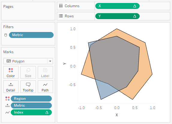
- Change the Marks Type to Polygon.
- Drag Region onto Color.
- Drag Metric onto Detail.
- Drag Index onto Path.
- Right-click on the object, go to
Compute Using and select Metric.
- Right-click on the object, go to
- Drag X onto Columns.
- Right-click on the object and go to Edit Table Calculations.
- In Nested Calculations choose Index.
- In Compute Using select Specific Dimensions.
- Ensure that only Metric is checked.
- In Nested Calculations choose TC_Metric Count.
- In
Compute Using select Specific Dimensions. - Ensure that only Metric is checked.
- In
- In Nested Calculations choose TC_Max Value.
- In Compute Using select Specific Dimensions.
- Ensure that Metric and Region are both checked and ensure that Metric is on top.
- In Restarting Every select Metric.
- Drag Y onto Rows.
- Right-click on the object and go to Edit Table Calculations.
- In Nested Calculations choose Index.
- In Compute Using select Specific Dimensions.
- Ensure that only Metric is checked.
- In Nested Calculations choose TC_Metric Count.
- In Compute Using select Specific Dimensions.
- Ensure that only Metric is checked.
- In Nested Calculations choose TC_Max Value.
- In Compute Using select Specific Dimensions.
- Ensure that Metric and Region are both checked and ensure that Metric is on top.
- In Restarting Every select Metric.
- Click on Color and change the Opacity to 50%.
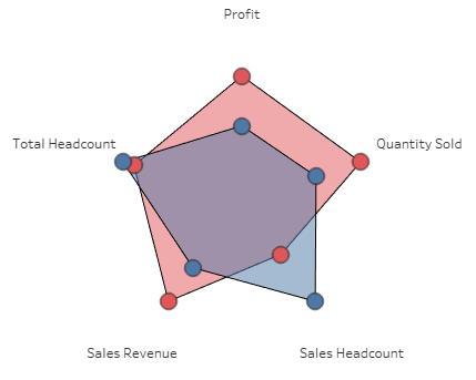
If you have completed the above you should see the following:
Now we are going to finish off the first worksheet by:
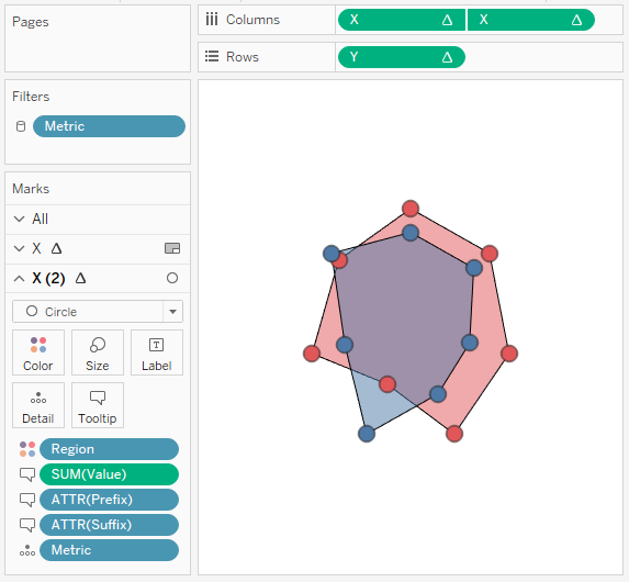
- Keep your hand on Ctrl and select the X pill in Rows and Drag to the right to copy it.
- We have set up the Table Calculation and don’t want to do this again, Ctrl-drag is the quickest way of copying an object.
- Right-click on the newly copied object and select Dual Axis.
- Right-click on the X-Axis header and select Synchronize Axis.
- In Marks, select X (2).
- Change the Mark Type to Circle.
- Click on Color and change Opacity to 100%.
- Drag Value, Prefix and Suffix onto Tooltip. Note: we only want tooltips when the user hovers over a Circle.
- Double-click on the X-Axis and set the Range to be -2 to 2.
- Double-click on the Y-Axis and set the Range to be -2 to 2.
- Adjust the cosmetics by:
- Hiding the Axis Headers.
- Removing Grid and Zero lines.
- Adjusting the Tooltip for the Circles.
- Remove the Tooltip for the Polygon.
- Adjusting the Color.
- Lastly, we are going to right-click on the view and select Format.
- Go to Shading and set the Worksheet to None. Note: this will add our transparency.
If all goes according to plan we have completed our first Worksheet.
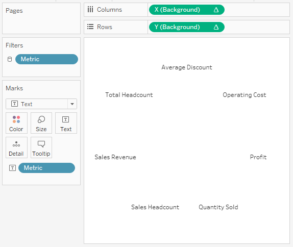
Now we are going to create a new worksheet for the background labels.
- Create a new worksheet and call it Labels.
- Change the Mark Type to Text.
- Drag X (Background) onto Columns.
- Right-click on the object, go to
Compute Using and select Metric.
- Right-click on the object, go to
- Drag Y (Background) onto Rows
. Right-clic k on the object, go toCompu te Using and select Metric.
- Drag Metric onto Text.
- Double-click on the X-Axis and set the Range to be -2 to 2.
- Double-click on the Y-Axis and set the Range to be -2 to 2.
- Adjust the cosmetics.
- Hide Headers.
- Remove Grid and Zero lines.
- Remove Tooltips.
You should have the following.
Now we will finish off our visualisation by creating a new Dashboard and, using floating type, dragging the Labels Worksheet onto the dashboard followed by the Radar Worksheet.
Note: Please use the Layout to size and position your worksheets to be exactly the same size and have the same X and Y coordinates.
Show the Legend and Filters and you should now see the following:
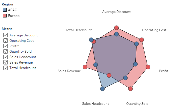
and boom, we have created an interactive Radar Chart where we can add or remove metric values and see our Radar change. Now take a moment to think about what we have done, and more interesting, if there are any use cases where this may be valuable to you.
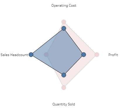
5 Metrics
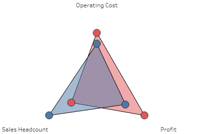
3 Metrics
Region Highlighted
You can see and interact with my visualisation on Tableau Public at https://public.tableau.com/profile/toan.hoang#!/vizhome/RadarCharts_2/RadarChart
Summary
I hope you all enjoyed this article as much as I enjoyed writing it, if so, please do share this article with fellow Tableau addicts and spread the love. Do let me know if you experienced any issues recreating this Visualisation, and as always, please leave a comment below or reach out to me on Twitter @Tableau_Magic.
If you like our work, do consider supporting us on Patreon, and for supporting us, we will give you early access to tutorials, exclusive videos, as well as access to current and future courses on Udemy:
- Patreon: https://www.patreon.com/tableaumagic
Also, do be sure to check out our various courses:
- Creating Bespoke Data Visualizations (Udemy)
- Introduction to Tableau (Online Instructor-Led)
- Advanced Calculations (Online Instructor-Led)
- Creating Bespoke Data Visualizations (Online Instructor-Led)
 Table Calculation")


Hi Toan,
first of all great work! Is it possible to show the values next to the circles?
Thanks and bests,
Enzo
Yes, you just need to add the value to the label, and align.
Hi. This is great. Looking at using radars to show soccer player attributes against average min / max values, where each attribute has a different scale. From the looks of your example I could overlay each player’s relative value in respect of the min / max, e.g. min 30 / max 70…player A 40 (25% of max minus min 10/40), player B 48 (45% of max minus min 18/40). I could then plot player A, B and Max. Would that work?
Yes, I think it should be possible. Using the tutorial, you will need to ensure that your data is prepped correctly.
Thanks, yes, just doing that now, trying to mimic your layout.
Thanks for your tutorial – created this, which is just what I was after.
https://public.tableau.com/views/GoalkeeperRadar/Dashboard1?:embed=y&:display_count=yes&:origin=viz_share_link
Now to make my workflow more efficient!!
Very nice work Dave 🙂
Dave/ Toan, How did you create the circles in the background (like a target dart board)? I want to create sth like that. thanks
You can use an image, or you can try to draw the lines to create this effect. Check out our Sunburst Chart tutorial.
thanks a lot Toan! your works are really inspiring!
Hi Toan looks awesome to follow your tutorial. You point out to Chloe that one can draw a back ground image in Tableau. I checked with your https://toanhoang.com/sunburst/ but was not able to find the right hint to manage. Could you help ? Cheers Gernot
Hi, this is awesome, thanks so much for sharing. I have about 20 “regions”. Would it be possible to lock the maximum comparison at two “regions” at a time and for the colors to always be red and blue, no matter the regions’s selected?
Bumping this! I have the same question.
I have 1000+ items and I was able to restrict to 2 selections by using parameters:
Item 1
Item 2
Then I created a calculated field to use as filter. On the filter, I set to just show when this calc field is 1
Calculated Field:
IF
[Items] = [Item 1]
OR
[Items] = [Item 2]
THEN
1
END
Hi Toan,
Very awesome tutorial! I followed the steps and complete the most.
Just my bad question. When I put the 2 worksheets onto the dashboard layout, I followed the rules on setting the same on the 2 worksheet layout of X, Y, width, height.
However, that causes the overlap and cannot show both.
I could only show both when the radar chart width/height is set to smaller (and really small compared to your version)
Do you have any idea? Thanks again!
Hi Nigel, did you set the top most Worksheet as transparent? And did you increase the range of the x and y axis for the label Worksheet to be greater than the radar?
Hi Toan, it works perfect now! Thanks!
Hi Nigel,
Thank you for your tutorial, I successfully created a spider chart like yours. Question, it works perfectly on tableau desktop, showing the radar and the labels but as soon as I upload it to the server, the labels disappear. I’ve tried several things like making the worksheet transparent, floating order etc etc.
Any tips?
Thanks,
LJ
Which version of the see we do you have? And does that version support transparent background? It is a strange issue.
Hi Toan,
This is a great tutorial. Thanks for writing it.
I am using this for a visualization that shows 5 metrics for each country in the world. I use parameters to select two countries at a time for comparison. I’d like to show the percentile for each country within each metric. For example, on hover of a particular vertex, the tooltip would show the value of the metric in addition to a percentile to show where that country falls on that particular metric in relation to all countries in the world. I’m having trouble setting up my table calculation to calculate the percentile based on all countries in the dataset and not just the countries selected by the parameter. Any advice would be appreciated!
[…] it would be a great idea to do the same to compare metrics. So, I searched online and got a good blog post Toan Hoang, on creating a radar chart. I used Alteryx to prep the data and then followed the blog […]
I have 9 measures to implement spider chart. What should i do to implement the same.
Hi Piyush, all you have to do is to prepare your data and add each of the measures into the column in the same format as the sample data in this tutorial. Kind Regards, Toan
Hi Toan,
Nice work! However, something is going on , not a single chart is working for me, Specially the X axis. Is it possible to have you number I can call to discuss or your email if I send you one email about the problem.
Cheers
Hi there, please send me an email and/or your Tableau packaged workbook to admin@tableau.toanhoang.com. and I will have a look.
Hey Toan.
When i try to create the calculations i get an error when plotting in the tc_value (“Can’t divide value by string value”)
What am i doing wrong?
Hi Jim,
Can you send a sample workbook to admin@tableau.toanhoang.com and I will try to have a look at it this weekend when I am back from my travels. Or, can you post this on our Facebook Group Tableau Magicians?
Kind Regards,
Toan
Hi Toan…i have followed your steps and everything goes fine…but there is always a gap between first and last metrices..i have almost 87 metrices to do…can u help me out in this…
Hi Sai, 87 metrics is a lot to show. What do you mean by a gap? Can you please send me a screenshot (remove labels) to toan.hoang@tableau.toanhoang.com. I will see if I can find a moment to take a look. Kind Regards, Toan
Hi Toan,
Great example of your work. I was able to replicate the same and apply this to my requirement.
But I ran into a very specific problem. Since the difference between my values is not huge, the final product is not representing the values effectively.
All the values in my data are between 6 to 7 in steps of 0.25. Hence the difference being shown is very small.
Is there any way to change the scale of the axes such that, instead of starting from Zero, it starts from a specific value ?
Yes, you can create a Calculated Field to take the Max Value from the Radar and then work out a percentage.
We have already done that in your tutorial, haven’t we ?
The calculated field name TC_Value is already showing a percentage value.
What I want to show in my radar is the small difference magnified.
Can you send me a screenshot of what you want to achieve (or better yet a Packaged Workbook) to toan.hoang@tableau.toanhoang.com
Toan, thanks so much for this. It was very easy compare to other solutions for getting a balance radar/spider points. Because my variance of data points is very small, if I use polygon you can barely see the graph, so I decided to change to line, but now I can’t end the polygon, my last dot/point do not connect to the first one. I searched and some people are using a dummy value in the database, but I can’t added directly to it, do you have an idea how to solve it? I can add the dummy based on the metric because users can filter, there for the metric could be or not in the selection.
Hi Toan,
Thanks for the useful guide, however I’ve got a few question.
I followed all the steps and reviewed a couple of times, the problem is that the value are not in order, for example value 100 for metric 1 is closer to the center than value 25 for the same metric 1 How is that possible ?
Second one is it possible to take the max and the average and compare it with a certain region ?
Thanks a lot!!!
Hello,
Thanks for a great tutorial. However, once I copy the X from columns to rows, press dual axis, and synchronize the axis the graphic which was there disappears. Have any experienced something similar?
I don’t know if this is relevant or not, but I have many rows of data which are aggregated.
How can I change the aggregation to average values instead of sum?
Hi,
Thanks for a great tutorial! I think I have done something wrong, but can not understand what. The right side of the chart the placement is wrong, because lower values are further away. On the left side it is working correctly.
Hi Toan,
Great explanation! Is there a way to create the axis lines also in the radar chart so that for each metric you have used as dimension there is a line drawn from center to the maximum value across metrices?