

In this tutorial, we are going to have some fun and draw two overlapping Radar Charts, use transparency, and show dynamic labels. The main thing here is to have some fun and check out some of the features of Tableau, so I hope you do enjoy it.
Note: As always never choose a data visualisation type and try to fit your data into it, instead, understand your data and choose the best visualization for your data consumers.
Data
Load the following data into Tableau Desktop / Public.
| Region | Metric | Value |
| Europe | Sales Revenue | 1,500,000 |
| Europe | Operating Cost | 500,000 |
| Europe | Profit | 1,000,000 |
| Europe | Quantity Sold | 80,000 |
| Europe | Average Discount | 10 |
| Europe | Total Headcount | 200 |
| Europe | Sales Headcount | 80 |
| APAC | Sales Revenue | 1,000,000 |
| APAC | Operating Cost | 400,000 |
| APAC | Profit | 600,000 |
| APAC | Quantity Sold | 50,000 |
| APAC | Average Discount | 8 |
| APAC | Total Headcount | 220 |
| APAC | Sales Headcount | 150 |
Calculated Fields
With our data set loaded into Tableau, we are going to create the following Calculated Fields:
Prefix
IF
    [Metric] = "Sales Revenue"
    OR [Metric] = "Operating Cost"
    OR [Metric] = "Profit"
THEN
    "£"
ELSE
    ""
END
Suffix
IF [Metric] = "Average Discount" THEN
    "%"
ELSE
    ""
END
Note: As we have different numeric types in our data, we are going to manually add the current prefix, or the percentage suffix.
Index
INDEX()-1TC_Max Value
WINDOW_MAX(MAX([Value]))TC_Metric Count
WINDOW_COUNT(COUNTD([Metric]))Degrees
360/[TC_Metric Count]TC_Value
MAX([Value])/[TC_Max Value]Note: As we are dealing with various different numeric types and hugely different scales, We want to plot the percentage of the Maximum value based on the individual metric. That way the maximum distance from the center will always be 1.
X
SIN(RADIANS([Index]*[Degrees]))*[TC_Value]Y
COS(RADIANS([Index]*[Degrees]))*[TC_Value]X (Background)
SIN(RADIANS([Index]*[Degrees]))*1.5Y (Background)
COS(RADIANS([Index]*[Degrees]))*1.5Now that we have our Calculated Fields created, let us start creating our Worksheet.
Worksheet
We are going to build two worksheets and make them overlap each other. So to build our first worksheet:
- Drag Metric onto the Filters Card.
- Select all Metrics.
- Right-click on the object, go to Apply to Worksheets and select All Using This Data Source.
- Change the Marks Type to Polygon.
- Drag Region onto Color.
- Drag Metric onto Detail.
- Drag Index onto Path.
- Right-click on the object, go to Using and select Metric.
- Drag X onto Columns.
- Right-click on the object and go to Edit Table Calculations.
- In Nested Calculations choose Index.
- In Compute Using select Specific Dimensions.
- Ensure that only Metric is checked.
- In Nested Calculations choose TC_Metric Count.
- In Using select Specific Dimensions.
- Ensure that only Metric is checked.
- In Nested Calculations choose TC_Max Value.
- In Compute Using select Specific Dimensions.
- Ensure that Metric and Region are both checked and ensure that Metric is on top.
- In Restarting Every select Metric.
- Drag Y onto Rows.
- Right-click on the object and go to Edit Table Calculations.
- In Nested Calculations choose Index.
- In Compute Using select Specific Dimensions.
- Ensure that only Metric is checked.
- In Nested Calculations choose TC_Metric Count.
- In Compute Using select Specific Dimensions.
- Ensure that only Metric is checked.
- In Nested Calculations choose TC_Max Value.
- In Compute Using select Specific Dimensions.
- Ensure that Metric and Region are both checked and ensure that Metric is on top.
- In Restarting Every select Metric.
- Click on Color and change the Opacity to 50%.
If you have completed the above you should see the following:

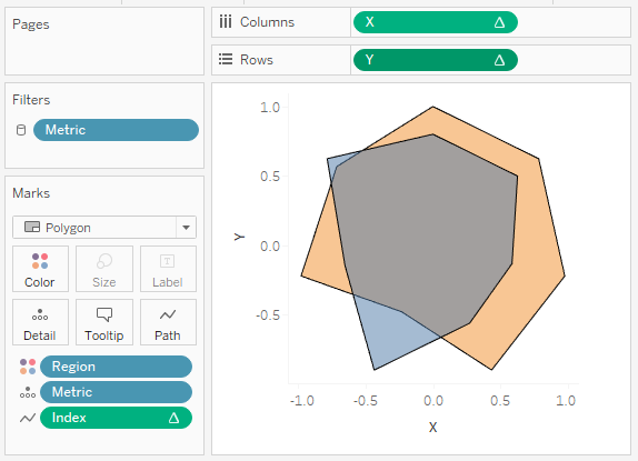
Now we are going to finish off the first worksheet by:
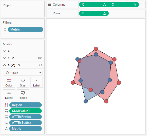
- Keep your hand on Ctrl and select the X pill in Rows and Drag to the right to copy it.
- We have set up the Table Calculation and don’t want to do this again, Ctrl-drag is the quickest way of copying an object.
- Right-click on the newly copied object and select Dual Axis.
- Right-click on the X-Axis header and select Synchronize Axis.
- In Marks, select X (2).
- Change the Mark Type to Circle.
- Click on Color and change Opacity to 100%.
- Drag Value, Prefix and Suffix onto Tooltip. Note: we only want tooltips when the user hovers over a Circle.
- Double-click on the X-Axis and set the Range to be -2 to 2.
- Double-click on the Y-Axis and set the Range to be -2 to 2.
- Adjust the cosmetics by:
- Hiding the Axis Headers.
- Removing Grid and Zero lines.
- Adjusting the Tooltip for the Circles.
- Remove the Tooltip for the Polygon.
- Adjusting the Color.
- Lastly, we are going to right-click on the view and select Format.
- Go to Shading and set the Worksheet to None. Note: this will add our transparency.
If all goes according to plan we have completed our first Worksheet.

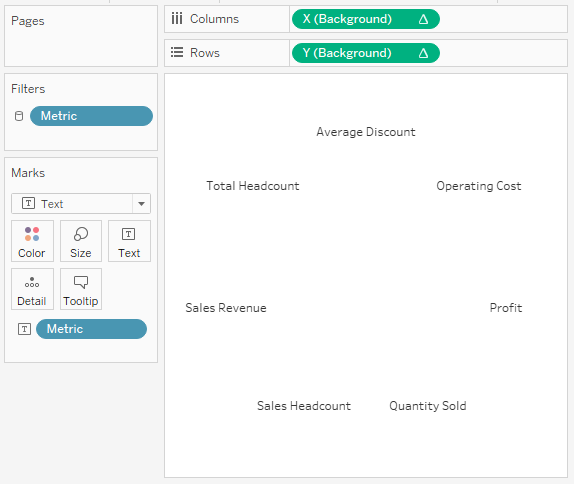
Now we are going to create a new worksheet for the background labels.
- Create a new worksheet and call it Labels.
- Change the Mark Type to Text.
- Drag X (Background) onto Columns.
- Right-click on the object, go to Using and select Metric.
- Drag Y (Background) onto Rows
- k on the object, go to te Using and select Metric.
- Drag Metric onto Text.
- Double-click on the X-Axis and set the Range to be -2 to 2.
- Double-click on the Y-Axis and set the Range to be -2 to 2.
- Adjust the cosmetics.
- Hide Headers.
- Remove Grid and Zero lines.
- Remove Tooltips.
You should have the following.

Now we will finish off our visualisation by creating a new Dashboard and, using floating type, dragging the Labels Worksheet onto the dashboard followed by the Radar Worksheet.
Note: Please use the Layout to size and position your worksheets to be exactly the same size and have the same X and Y coordinates.
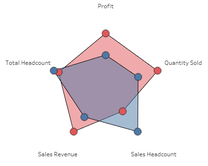
Show the Legend and Filters and you should now see the following:

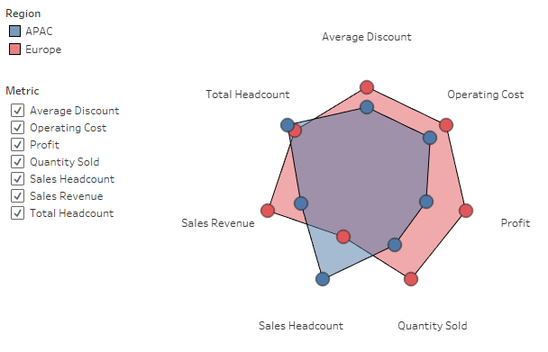
and boom, we have created an interactive Radar Chart where we can add or remove metric values and see our Radar change. Now take a moment to think about what we have done, and more interesting, if there are any use cases where this may be valuable to you.
5 Metrics

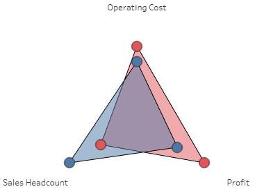
3 Metrics

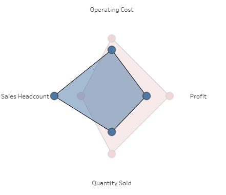
Region Highlighted

You can see and interact with my visualisation on Tableau Public at https://public.tableau.com/profile/toan.hoang#!/vizhome/RadarCharts_2/RadarChart
Summary
I hope you all enjoyed this article as much as I enjoyed writing it, if so, please do share this article with fellow Tableau addicts and spread the love. Do let me know if you experienced any issues recreating this Visualisation, and as always, please leave a comment below or reach out to me on Twitter @Tableau_Magic.
If you like our work, do consider supporting us on Patreon, and for supporting us, we will give you early access to tutorials, exclusive videos, as well as access to current and future courses on Udemy:
- Patreon: https://www.patreon.com/tableaumagic
Also, do be sure to check out our various courses:
- Creating Bespoke Data Visualizations (Udemy)
- Introduction to Tableau (Online Instructor-Led)
- Advanced Calculations (Online Instructor-Led)
- Creating Bespoke Data Visualizations (Online Instructor-Led)