

A lot of the articles written have either come from browsing bespoke designs or through client requests. I am normally the one that is called in when a client requests a very bespoke data visualisation, and will not be moved. A few companies ago a client wanted me to plot out their data universe and representing his key performance indicators as Satellites. I was confused but once he drew it out for me, I got to work.
Note: This is an alternative type of data visualisation, and sometimes pushed for by clients. Please always look at best practices for data visualisations before deploying satellite charts into production.
Data
Load the following data into Tableau Desktop / Public.
| KPI | Path | Value |
| Sales Revenue as a % of Global | 1 | 0.80 |
| Sales Revenue as a % of Global | 361 | 0.80 |
| Headcount as a % of Global | 1 | 0.55 |
| Headcount as a % of Global | 361 | 0.55 |
| Operational Cost as a % of Global | 1 | 0.27 |
| Operational Cost as a % of Global | 361 | 0.27 |
Note: we need two records for each KPI as we are going to be drawing lines and using densification to get more points on our canvas.
Calculated Fields
With our data set loaded into Tableau, we are going to create the following Calculated Fields and Bins:
Path (bin)
- Right click on Path, go to Create and select Bins…
- In the Edit Bins dialogue window:
- Set New field name to Path (bin)
- Set Size of bins to 1
- Click Ok
Index
INDEX()-1
TC_Value
WINDOW_MAX(MAX([Value]))
X
SIN([Index]*PI()/180)
Y
COS([Index]*PI()/180)
Size
IF [Index]>=(360*[TC_Value]) AND [Index]<(360*[TC_Value])+1 THEN 1 ELSE 0 END
Text
0
So now that we have created a lot of Calculated fields, we will now put this together into a Worksheet.
Worksheet
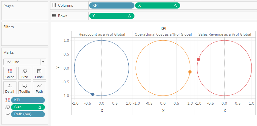
We will now build our worksheet:
- Drag KPI onto Rows.
- Drag KPI onto Color.
- Change Mark Type to Line.
- Drag Path (bin) onto Columns.
- Right-click on Path and make sure Show Missing Values is checked.
- Drag Path object onto the Path Mark.
- Drag X onto Columns.
- Right-click X, go to Using and select Path (bin).
- Drag Y onto Rows.
- Right-click Y, go to Using and select Path (bin).
- Drag Size onto Size.
- Right-click Size, go to Using and select Path (bin).
If all goes well, you should have something like the following:
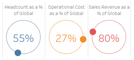
Let us get the text into the center of the circle:
- Drag Text onto Rows.
- Right-click on Text and Select Dual Axis.
- In the Y Mark Panel, remove the Measure Names.
- In the SUM(Text) Mark Panel, remove all pills.
- Drag TC_Value onto Text.
- Right-click on TC_Value, go to Compute Using and select Cell.
- Drag TC_Value onto Text.
You should see the following:

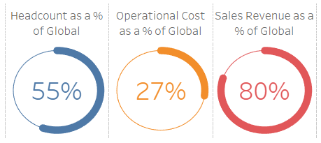
Now we need to adjust the visualisation by:
- Editing tooltips.
- Editing colours.
- Editing fonts.
- Removing gridlines.
- Hiding headers.
And you should then end up with something like the following:
Note: if you combine this type of visualisation with our tutorial on creating a Dot Matrix Visualisation, which is what we did for our client, you can get something quite nice looking.
Because I do not want to write additional tutorials of similar designs, we will create some interesting variations by modifying a few of the Calculated Fields.
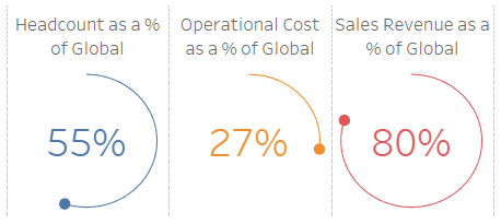
Variation 1
Take the original and change Size to IF [Index]<(360*[TC_Value])+1 THEN 1 ELSE 0 END for the following:
Variation 2
Take the original and change:
- X to
SIN([Index]*[TC_Value]*PI()/180) - Y to
COS([Index]*[TC_Value]*PI()/180) - Size to
IF [Index] = 360 THEN 1 ELSE 0 ENDfor the following:
There are quite a few more fun variations you can put together with this type of visualisation or potentially to have multiple rings. As we mentioned at the start, a Universe style of Visualisation was what the client wanted.
Summary
I hope you all enjoyed this article as much as I enjoyed writing it and as always do share the love. Do let me know if you experienced any issues recreating this Visualisation, and as always, please leave a comment below or reach out to me on Twitter @Tableau_Magic.
If you like our work, do consider supporting us on Patreon, and for supporting us, we will give you early access to tutorials, exclusive videos, as well as access to current and future courses on Udemy:
- Patreon: https://www.patreon.com/tableaumagic
Also, do be sure to check out our various courses:
- Creating Bespoke Data Visualizations (Udemy)
- Introduction to Tableau (Online Instructor-Led)
- Advanced Calculations (Online Instructor-Led)
- Creating Bespoke Data Visualizations (Online Instructor-Led)