
I created this data visualisation in Tableau when I was exploring Sunburst charts, and drawing polygons, but never did release an article on it. But given I just finished my article series on creating Tableau Extensions, I thought it would be a good time to give this a try.
Disclaimer: This tutorial goes through several techniques which will hopefully help you in your journey. However, and as always, try to find the most appropriate visualisation for specific data visualisation and dashboard requirements.
Data
We will start by loading the following data into Tableau.
| Segment | Path | Profit | Quantity |
| A | 1 | 800 | 200 |
| A | 202 | 800 | 200 |
| B | 1 | 1000 | 1000 |
| B | 202 | 1000 | 1000 |
| C | 1 | 600 | 500 |
| C | 202 | 600 | 500 |
| D | 1 | 2000 | 400 |
| D | 202 | 2000 | 400 |
| E | 1 | 800 | 800 |
| E | 202 | 800 | 800 |
| F | 1 | 100 | 800 |
| F | 202 | 100 | 800 |
| G | 1 | 50 | 100 |
| G | 202 | 50 | 100 |
| H | 1 | 200 | 200 |
| H | 202 | 200 | 200 |
| I | 1 | 800 | 800 |
| I | 202 | 800 | 800 |
Note: We have two records per segment as we are going to use data densification to give us additional points for drawing.
Calculated Fields
With our data set loaded into Tableau, we are going to create the following Calculated Fields and Bins:
Path (bin)
- Right click on Path, go to Create and select Bins…
- In the Edit Bins dialogue window:
- Set New field name to Path (bin)
- Set Size of bins to 1
- Click Ok
Index
INDEX()-1
TC_Profit
WINDOW_MAX(MAX([Profit]))
TC_Total Profit
WINDOW_SUM(SUM([Profit]))/2
TC_Total Profit (Previous)
(RUNNING_SUM([TC_Percentage of Total Profit])-[TC_Percentage of Total Profit])*360
TC_Percentage of Total Profit
WINDOW_SUM(SUM([Profit]))/[TC_Total Profit]/2
TC_Total Quantity
WINDOW_MAX(MAX([Quantity]))
TC_Percentage of Total Quantity
WINDOW_SUM(SUM([Quantity]))/[TC_Total Quantity]/2
X
IF [Index]<101 THENSIN((([Index]*[TC_Percentage of Total Profit]*3.6)+[TC_Total Profit Previous])*PI()/180)ELSESIN((((201-[Index])*[TC_Percentage of Total Profit]*3.6)+[TC_Total Profit Previous])*PI()/180)*(1+[TC_Percentage of Total Quantity])END
Let us spend a little time here explaining how we are using our other Calculated Fields:
- Using our Path (Bins) we are going to use densification to get additional points
- We will draw the inside line, where the Index is less than 101.
- As we have 100 points per side, we need to scale up by multiplying by 3.6 to give us a completed circle.
- We scale the size of each point by multiplying by the TC_Percentage of Total Profits.
- We need to convert percentages to Radians by multiplying by PI() and then dividing by 180.
- To give us the distance from the centre we multiply by the TC_Percentage of Total Quantity.
Y
IF [Index]<101 THENCOS((([Index]*[TC_Percentage of Total Profit]*3.6)+[TC_Total Profit Previous])*PI()/180)ELSECOS((((201-[Index])*[TC_Percentage of Total Profit]*3.6)+[TC_Total Profit Previous])*PI()/180)*(1+[TC_Percentage of Total Quantity])END
So now that we have created a lot of Calculated fields, we will now put this together into a Worksheet.
Worksheet
We will now build our worksheet:
- Drag Segment onto the Color Mark
- Drag Path (Bin) onto the Columns
- Right click on Path (Bin) and check Show Missing Values
- Drag Path (Bin) onto the Detail Mark
- Change the Mark Type to Polygon
- Drag Index onto Path
- Right click on Index, go to Compute Using, select Path (Bin)
- Drag X onto Rows
- Right click on X, go to Compute Using, select Path (Bin)
- Drag Y onto Columns
- Right click on Y, go to Compute Using, select Path (Bin)
You should see something like the following:
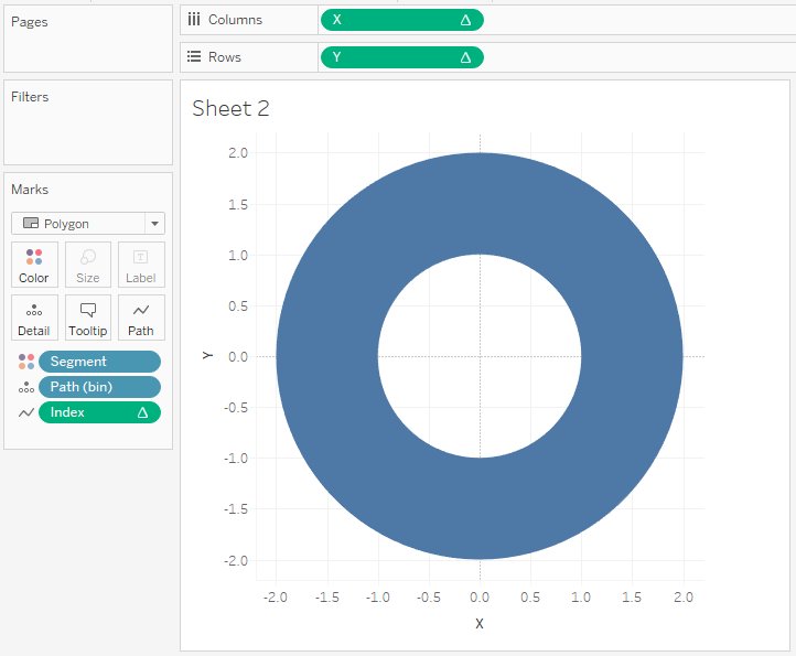
You can see that we have drawn a full 100% doughnut per Segment, need not worry, we will adjust the Table Calculation to get the visualisation we require:
- Right click on X and select Edit Table Calculations
- In Nested Calculation select TC_Total Profit
- Click on Specific Dimensions and select Path (Bin) and Segment
- Ensure Path (Bin) is on top
- In Nested Calculation select TC_Total Profit Previous
- Click on Specific Dimensions and select Segment only
- In Nested Calculation select TC_Total Quantity
- Click on Specific Dimensions and select Path (Bin) and Segment
- Ensure Path (Bin) is on top
- In Nested Calculation select TC_Total Profit
- Right click on Y and select Edit Table Calculations
- In Nested Calculation select TC_Total Profit
- Click on Specific Dimensions and select Path (Bin) and Segment
- Ensure Path (Bin) is on top
- In Nested Calculation select TC_Total Profit Previous
- Click on Specific Dimensions and select Segment only
- In Nested Calculation select TC_Total Quantity
- Click on Specific Dimensions and select Path (Bin) and Segment
- Ensure Path (Bin) is on top
- In Nested Calculation select TC_Total Profit
If you have done this correctly you should now see the following:
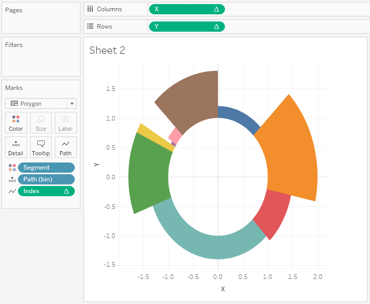
and boom, you have now built a worksheet that shows a doughnut with two metrics. the distance around the Circle represents the percentage of Profit, the Distance from the centre represents the percentage of Total Quantity.
Adjusting the Visual
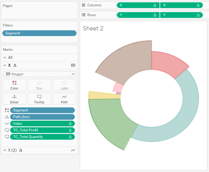
We will now do the following to get the look that we require:
- Remove all Grid Lines
- Edit the Color transparency of the polygon to 30%
- Keep your finger on Ctrl, and click and drag the X to the right to duplicate
- Right click on the newly created object and select Dual Axis
- In the canvas, select on the axis and select Synchronize Axis
- Untick Show Header
- Keep your finger on Ctrl, and click and drag the Y to the right to duplicate
- Right click on the newly created object and select Dual Axis
- In the canvas, select on the axis and select Synchronize Axis
- Untick Show Header
- In Marks under X (2)
- Change the Mark Type to Line
- Click on the Size Mark and reduce
- In Marks under X
- Drag TC_Total Profits onto the Tooltip Mark
- Right click on TC_Total Profits, go to Compute Using, select Path (Bin)
- Drag TC_Total Quantity onto the Tooltip Mark
- Right click on TC_Total Quantity, go to Compute Using, select Path (Bin)
- Click on the Tooltip Mark and format as appropriate
- Drag TC_Total Profits onto the Tooltip Mark
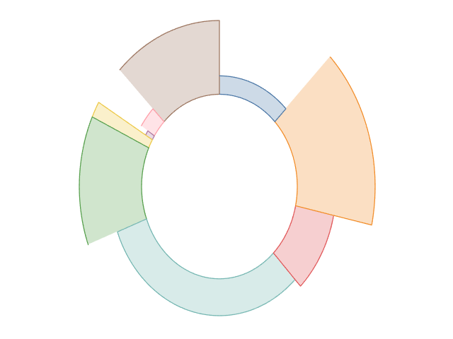
- Add Segment to the Filters and apply some filters.
You should have something like the following (I filtered some some segments):
and that’s a wrap… and here is the Tableau Public link: https://public.tableau.com/profile/toan.hoang#!/vizhome/Dual-MetricDoughnut/Dual-MetricDoughnut
Summary
I hope you all enjoyed this article as much as I enjoyed writing it. Do let me know if you experienced any issues recreating this Visualisation, and as always, please leave a comment below or reach out to me on Twitter @Tableau_Magic.
If you like our work, do consider supporting us on Patreon, and for supporting us, we will give you early access to tutorials, exclusive videos, as well as access to current and future courses on Udemy:
- Patreon: https://www.patreon.com/tableaumagic
Also, do be sure to check out our various courses:
- Creating Bespoke Data Visualizations (Udemy)
- Introduction to Tableau (Online Instructor-Led)
- Advanced Calculations (Online Instructor-Led)
- Creating Bespoke Data Visualizations (Online Instructor-Led)