
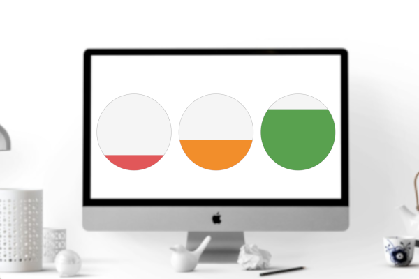
I created this tutorial a little while ago, but the math did not quite add up, so I had to remove the tutorial. After a little while decided to revisit this, and as such, here is my latest version of my Filled Circle Tableau data visualisation tutorial.
Note: This is an alternative type of data visualisation, and sometimes pushed for by clients. Please always look at best practices for data visualisations before deploying this into production.
Data
Load the following data into Tableau Desktop / Public.
Metric,Path,Value
Global Sales,1,0.8
Global Sales,361,0.8
Global Costs,1,0.7
Global Costs,361,0.7
Global Profits,1,0.4
Global Profits,361,0.4
Global Headcount,1,0.2
Global Headcount,361,0.2
Note: we need two records for each Metric as we are going to be drawing lines and using densification to get more points on our canvas. For more information, check out our article on Data Densification.
Calculated Fields
With our data set loaded into Tableau, we are going to create the following Calculated Fields and Bins:
Create Path (bin)
- Right click on Path, go to Create and select Bins…
- In the Edit Bins dialogue window:
- Set New field name to Path (bin).
- Set Size of bins to 1.
- Click Ok.
Index
INDEX()-1TC_Value
WINDOW_MAX(MAX([Value]))X
IF (COS(RADIANS([Index]))+1)/2 < [TC_Value] THEN
    SIN(RADIANS([Index]))
ELSE
    SIN(RADIANS([Index]))
END
Y
IF (COS(RADIANS([Index]))+1)/2 < [TC_Value] THEN
    (COS(RADIANS([Index]))+1)/2
ELSE
    [TC_Value]
END
Y (Full Circle)
(COS(RADIANS([Index]))+1)/2Color
IF [TC_Value] >= 0.8 THEN
    "Green"
ELSEIF [TC_Value] <= 0.2 THEN
    "Red"
ELSE
    "Orange"
END
So now that we have created a lot of Calculated fields, we will now put this together into a Worksheet.
Worksheet
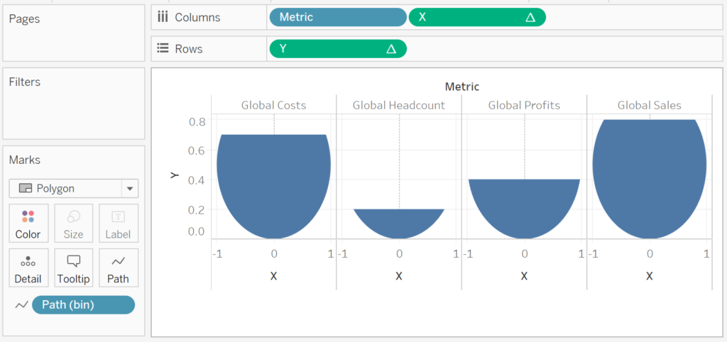
We will now build our first worksheet:
- Change the Mark Type to Polygon.
- Drag Path (bin) onto Columns.
- Right-click on this object and ensure that Show Missing Values is checked.
- Drag this object on the Path Mark.
- Drag Metric onto Columns.
- Drag X onto Columns.
- Right-click on this object, go to Compute Using and select Path (bin).
- Right-click on this object, go to Compute Using and select Path (bin).
- Drag Y onto Rows.
- Right-click on this object, go to Compute Using and select Path (bin).
If all goes well, you should have the following:

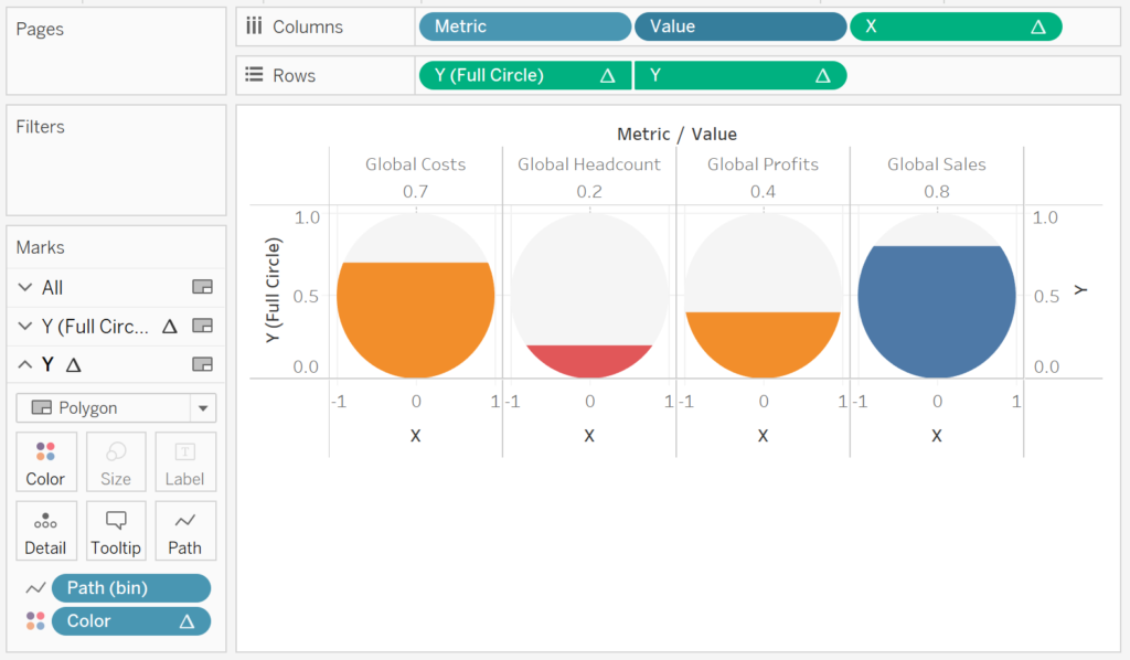
Now we will add our outer circle:
- Drag the Y (Full Circle) onto Rows, to the left of Y.
- Right-click on this object, go to Compute Using and select Path (bin).
- Right-click on Y (Full Circle) and select Dual Axis.
- Right-click on the Y-Axis Header and select Synchronize Axis.
- For the Y Mark Panel.
- Drag Color onto the Color Mark.
- Right-click on Color, go to Compute Using and select Path (bin).
- Drag Value onto Columns and drop this between Metric and X.
- Right-click on this object and change this to a Discrete Dimension.
You should now have the following:

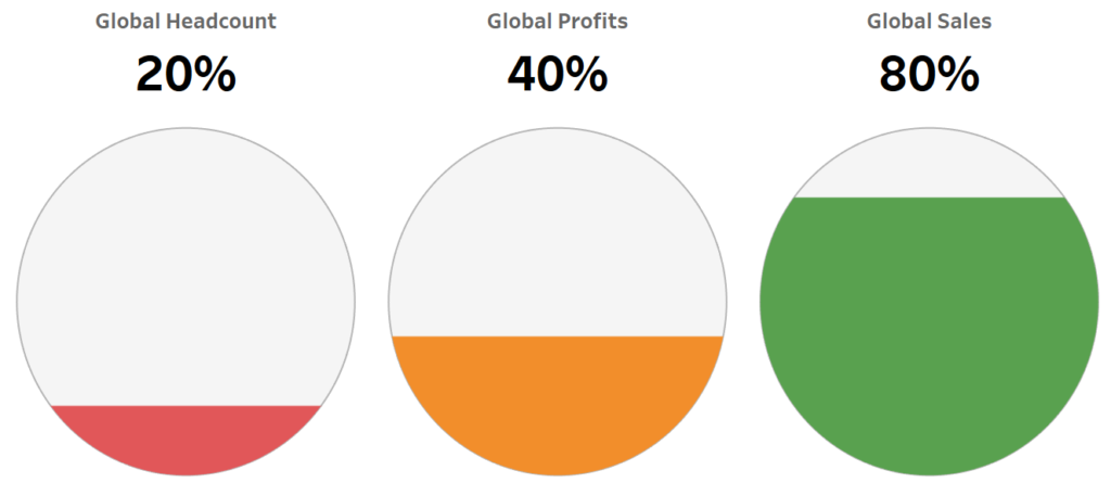
Now we will adjust the cosmetics:
- Hide the Headers.
- Hide the Grid Lines.
- Hide the Zero Lines.
- Format Value.
- Edit the Color.
- Adjust the Tooltips.
and you want to end up with the following:

and boom we are done, I really like this simple type of visualisation, and you can find my version on Tableau Public here:
https://public.tableau.com/profile/toan.hoang#!/vizhome/FilledCircles_15569875631450/FilledCircleCharts
Summary
I hope you all enjoyed this article as much as I enjoyed writing it and as always do share the love. Do let me know if you experienced any issues recreating this Visualisation, and as always, please leave a comment below or reach out to me on Twitter @Tableau_Magic.
If you like our work, do consider supporting us on Patreon, and for supporting us, we will give you early access to tutorials, exclusive videos, as well as access to current and future courses on Udemy:
- Patreon: https://www.patreon.com/tableaumagic
Also, do be sure to check out our various courses:
- Creating Bespoke Data Visualizations (Udemy)
- Introduction to Tableau (Online Instructor-Led)
- Advanced Calculations (Online Instructor-Led)
- Creating Bespoke Data Visualizations (Online Instructor-Led)