


")


Happy new year everyone, I hope you have all had some time off and enjoyed the festive period. I wish I could switch off and during this time I was looking at different types of visualisations and came across a Packed Circle (singular) chart and thought I would kick start the year with this a tutorial on how to create these in Tableau.
Note: As always never choose a data visualisation type and try to fit your data into it, instead, understand your data and choose the best visualization for your data consumers.
Data
Load the following data into Tableau Desktop / Public.
| Circle | Path | Value |
| United States | 0 | 800 |
| United States | 360 | 800 |
| India | 0 | 550 |
| India | 360 | 550 |
| France | 0 | 400 |
| France | 360 | 400 |
| United Kingdom | 0 | 300 |
| United Kingdome | 360 | 300 |
Note: we need two records for each stage as we are going to be drawing polygons and using densification to get more points on our canvas.
Calculated Fields
With our data set loaded into Tableau, we are going to create the following Calculated Fields and Bins:
Path (Bins)
- Right click on Path, go to Create and select Bins…
- In the Edit Bins dialogue window:
- Set New field name to Path (bin).
- Set Size of bins to 1.
- Click Ok.
Index
INDEX()-1TC_Value
WINDOW_MAX(MAX([Value]))X
SIN([Index]*PI()/180)*[TC_Value]Y
COS([Index]*PI()/180)*([TC_Value])+([TC_Value])Now that we have our Calculated Fields ready, let us build our Tableau Worksheet.
Worksheet
We will now build our worksheet:
- Changing the Mark Type to Polygon.
- Drag Circle to Color.
- Right-click on the object and select Sort.
- In Sort by choose Field.
- In Field Name choose Value.
- Drag Path (Bins) to Columns.
- Right-click on the object and ensure that Show Missing Values is checked.
- Once Show Missing Values is checked, drag this object onto the Path Mark.
- Drag X onto Columns.
- Right-click on the Object, go to
Compute Using and select Path (bins).
- Right-click on the Object, go to
- Drag Y onto Rows.
- Right-click on the Object, go to
Compute Using and select Path (bins).
- Right-click on the Object, go to
You should see something like the following:
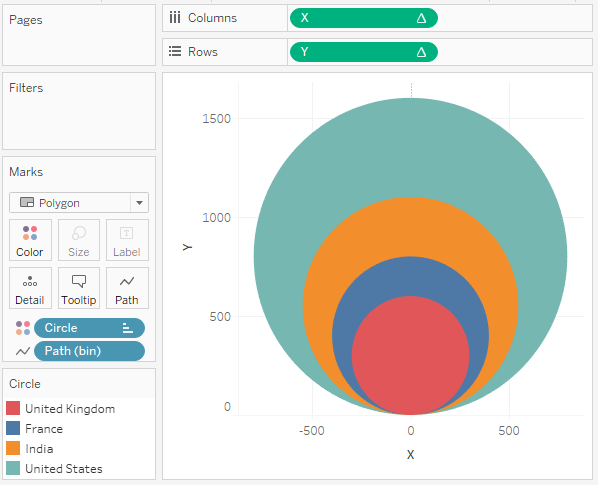
We will now adjust the look and feel for the visualisation by:
- Adding a dual axis by duplicating the X, however changing this to a Line Type.
- Removing the headers.
- Removing grid and zero lines.
- Adding a tool tip.
You want to end up with something like the following:
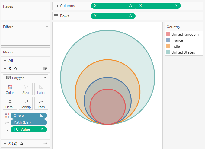
and boom, we are done, what a nice way to kick off the new year huh. When I use this visualisation type, it is normally much smaller and used to drive the rest of the dashboard.
You can see and interact with my visualisation on Tableau Public at https://public.tableau.com/profile/toan.hoang#!/vizhome/PackedCircle_0/PackedCircle
Summary
I hope you all enjoyed this article as much as I enjoyed writing it, if so, please do share this article with fellow Tableau addicts and spread the love. Do let me know if you experienced any issues recreating this Visualisation, and as always, please leave a comment below or reach out to me on Twitter @Tableau_Magic.
If you like our work, do consider supporting us on Patreon, and for supporting us, we will give you early access to tutorials, exclusive videos, as well as access to current and future courses on Udemy:
- Patreon: https://www.patreon.com/tableaumagic
Also, do be sure to check out our various courses:
- Creating Bespoke Data Visualizations (Udemy)
- Introduction to Tableau (Online Instructor-Led)
- Advanced Calculations (Online Instructor-Led)
- Creating Bespoke Data Visualizations (Online Instructor-Led)


Hi Toan,
Thank for all the effort to put things together!
If you can explain the calculated fields on what they do in each step, will definitely help to learn/understand the chart better.
Thanks again! Looking forward to learn more!!!
Hi there, I will add more details in future blogs about how it all works 🙂
Hi Toan ,
Thanks for the write ups,it would be grateful if you can explain each steps like what s that index, then max(index) do.How do you frame the formula for X and Y.
Thanks again.
Hi Parvathi,
If you search the Tableau Magic site, I have an article on index, it is a Tableau Calculation. I would also check out my article on data densification.
Regarding X and Y, this is trignometry, you can find lots of articles online about this.
[…] article is inspired by the outstanding work of Toan Hong Packed Circle blogpost. In this blogpost ,I will be explaining three different methods to prepare this chart in […]
[…] article is inspired by the outstanding work of Toan Hong Packed Circle blogpost. In this blogpost ,I will be explaining three different methods to prepare this chart in […]
[…] article is inspired by the outstanding work of Toan Hong Packed Circle blogpost. In this blogpost ,I will be explaining three different methods to prepare this chart in […]
[…] the conventional bar charts that we use. Before we start let me thank Toan Hoang for his brilliant blog where I found this […]
Hi Toan,
Is there anyway to make this chart with multiple measures?
Thanks,
I do not believe so, you cannot perform calculations using Measure Values; so if you are looking for multiple Measures, you would have to prepare and pivot your data so that the Measures are in a single column.