
I was looking for inspiration for my second Epic Viz and thus was experimenting with Tableau to see what can be done. In the process, I put together a Radial Fan (or Funnel) Chart to give a high level view of the Sales pipeline. I think this will be the basis of a really cool visualisation, but until my Epic Viz Volume 2 is released, I hope you all enjoy this tutorial.
Note: This is an alternative type of data visualisation, and sometimes pushed for by clients. Please always look at best practices for data visualisations before deploying into production.
Data
Load the following data into Tableau Desktop / Public.
Channel,Metric,Path,Value
Website,Leads,0,600
Website,Leads,201,600
Website,Qualified,0,300
Website,Qualified,201,300
Website,Proposal,0,180
Website,Proposal,201,180
Website,Sale,0,100
Website,Sale,201,100
Social Media,Leads,0,300
Social Media,Leads,201,300
Social Media,Qualified,0,270
Social Media,Qualified,201,270
Social Media,Proposal,0,200
Social Media,Proposal,201,200
Social Media,Sale,0,150
Social Media,Sale,201,150
Note: we need four records for each Country as we are going to be drawing lines and using densification to get more points on our view. For more information, check out our article on Data Densification.
Calculated Fields
With our data set loaded into Tableau, we are going to create the following Calculated Fields, Bins and Parameters:
Create Path (bin)
- Right click on Path, go to Create and select Bins…
- In the Edit Bins dialogue window:
- Set New field name to Path (bin).
- Set Size of bins to 1.
- Click Ok.
Create a parameter called Distance from Center
- Set Data type to Integer.
- Set Current value to 3.
- Set Allowable Values to Range.
- Set Range of Values
- Minimum to 3.
- Maximum to 10.
Index
INDEX()-1TC_Value
WINDOW_MAX(MAX([Value]))TC_Max Value
WINDOW_MAX(SUM([Value]))TC_Percentage
[TC_Value]/[TC_Max Value]*0.75Note: You can change the 0.75 to increase or decrease the size of the fan.
Rank
RANK_UNIQUE([TC_Value],"asc")Multiplier
IF [Channel] = "Website" THEN
    1
ELSE
    -1
END
Note: This is hardcoded, but you can make it more dynamic if you want to.
X
IF [Index] <= 100 THEN
    SIN(RADIANS([Index]*[TC_Percentage]))
    *([Rank]+[Distance from Center])
ELSE
    SIN(RADIANS((201-[Index])*[TC_Percentage]))
    *([Rank]+[Distance from Center]+1)
END*WINDOW_MAX(MAX([Multiplier]))
Y
IF [Index] <= 100 THEN
    COS(RADIANS([Index]*[TC_Percentage]))
    *([Rank]+[Distance from Center])
ELSE
    COS(RADIANS((201-[Index])*[TC_Percentage]))
    *([Rank]+[Distance from Center]+1)
END
So now that we have created a lot of Calculated fields, we will now put this together into a Worksheet.
Worksheet
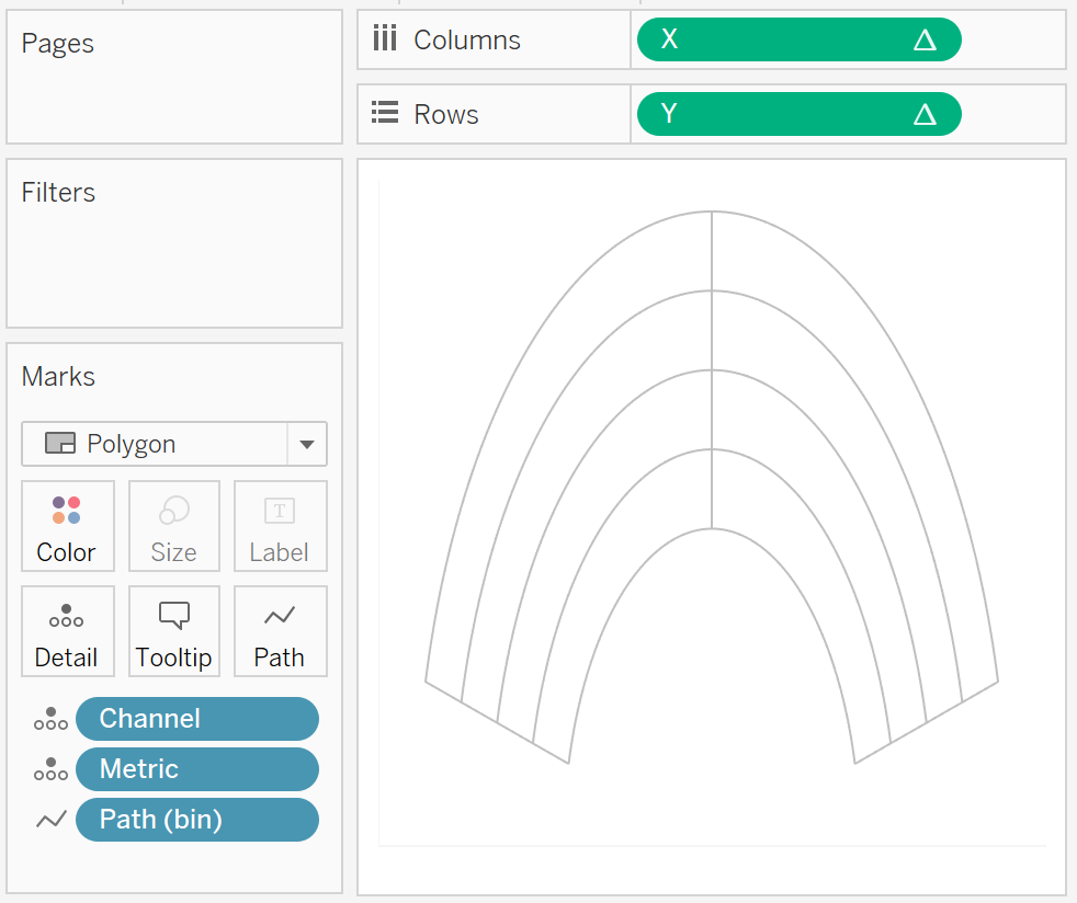
We will now build our worksheet:
- Change the Mark Type to Polygon.
- Drag Path (bin) onto Columns.
- Right-click on this object and ensure that Show Missing Values is checked.
- Drag this object onto the Path Mark.
- Drag Channel onto the Detail Mark.
- Drag Metric onto the Color Mark.
- Drag X onto Columns.
- Right-click on this object, go to Using and select Path (bin).
- Drag Y onto Rows.
- Right-click on this object, go to Using and select Path (bin).
If all goes well, you should see something like the following:

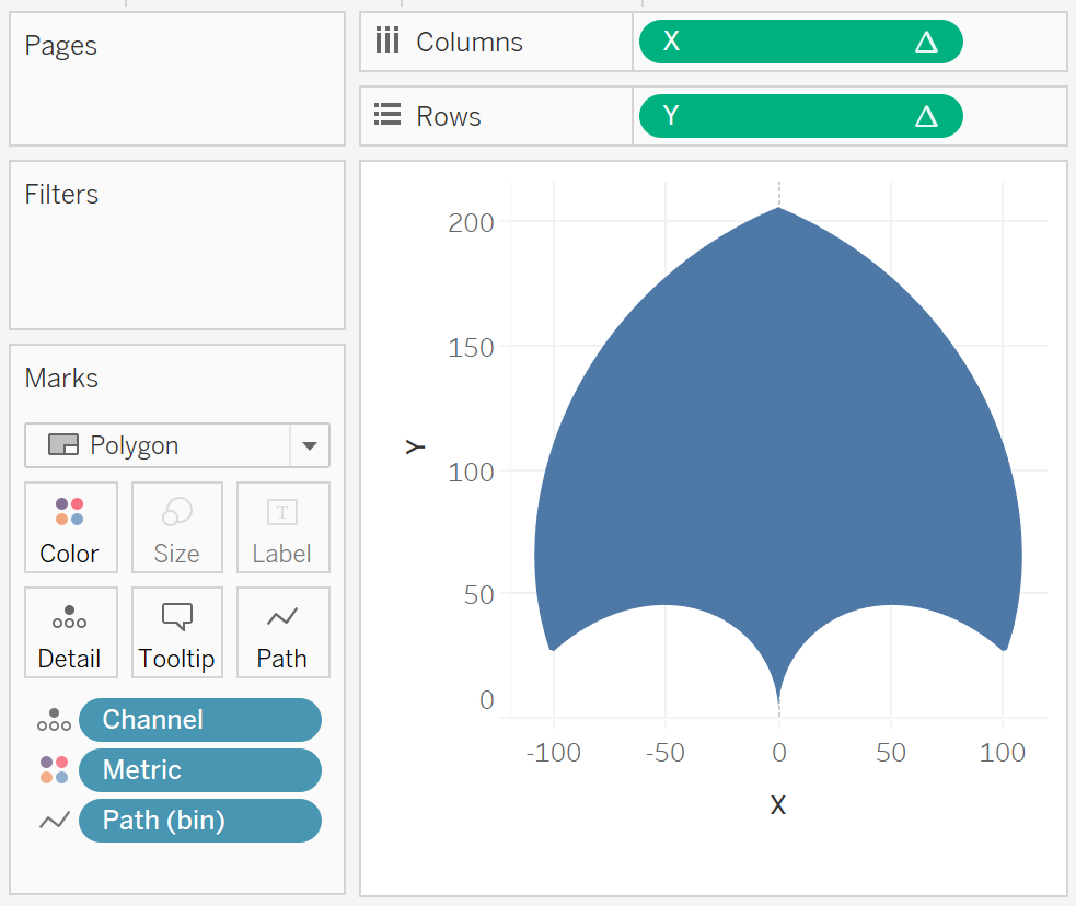
yep, we are not quite there yet, but I do love my interesting shapes in Tableau. We are now going to adjust the Table Calculation settings for X and Y to get the visualisation we desire.
- Right click on X and go to Edit Table Calculations…
- In Nested Calculations select TC_Rank.
- Set Using to Specific Dimensions.
- Ensure that only is selected.
- In Nested Calculations select TC_Max Value.
- Set Using to Specific Dimensions.
- Ensure that Path (bin), Metric and Channel are all selected.
- Ensure that Path (bin) is moved to the top, and Channel is moved to the bottom.
- In Nested Calculations select TC_Rank.
- Right click on Y and go to Edit Table Calculations…
- In Nested Calculations select TC_Rank.
- Set Using to Specific Dimensions.
- Ensure that only is selected.
- In Nested Calculations select TC_Max Value.
- Set Using to Specific Dimensions.
- Ensure that Path (bin), Metric and Channel are all selected.
- Ensure that Path (bin) is moved to the top, and Channel is moved to the bottom.
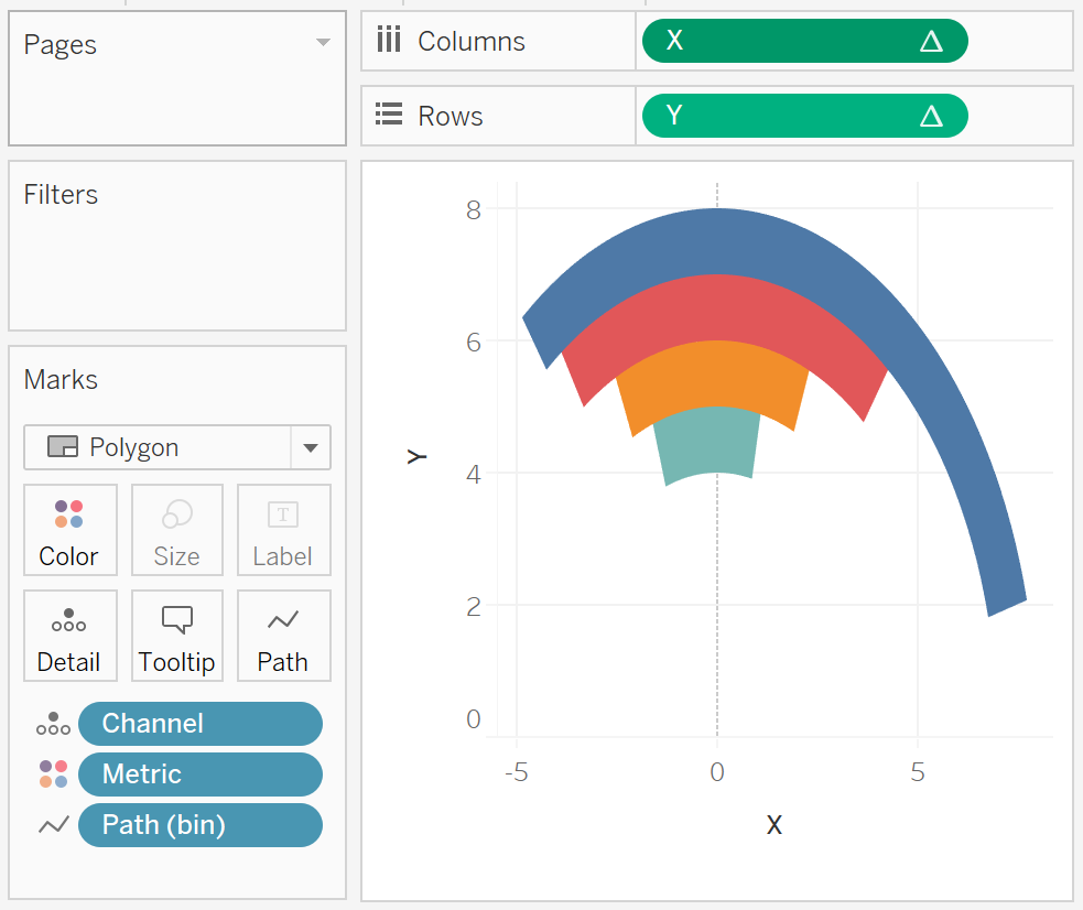
- In Nested Calculations select TC_Rank.
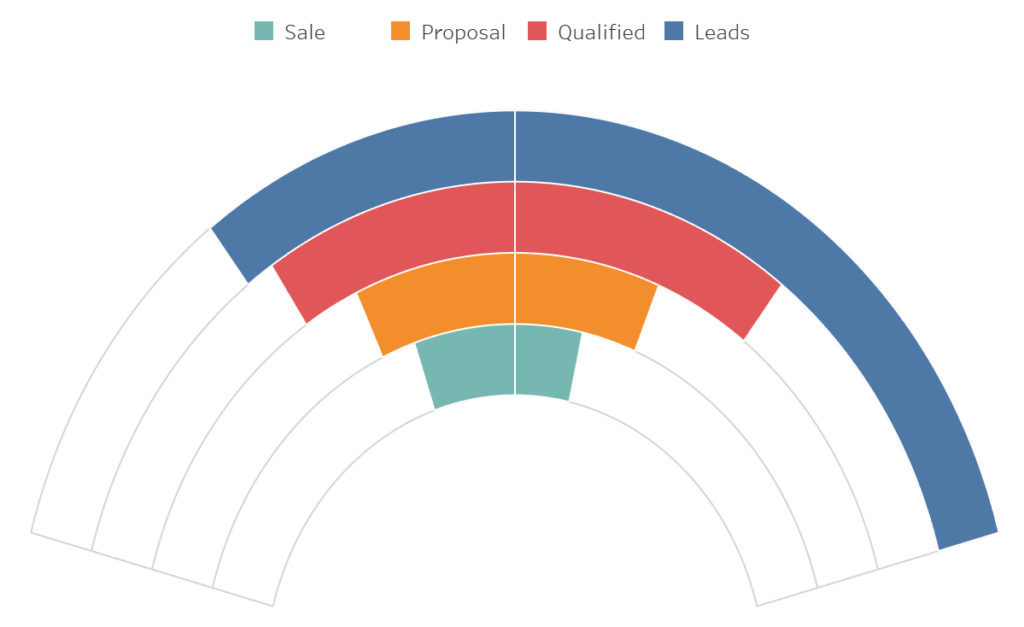
You should now see the following visualisation, and we are almost done.

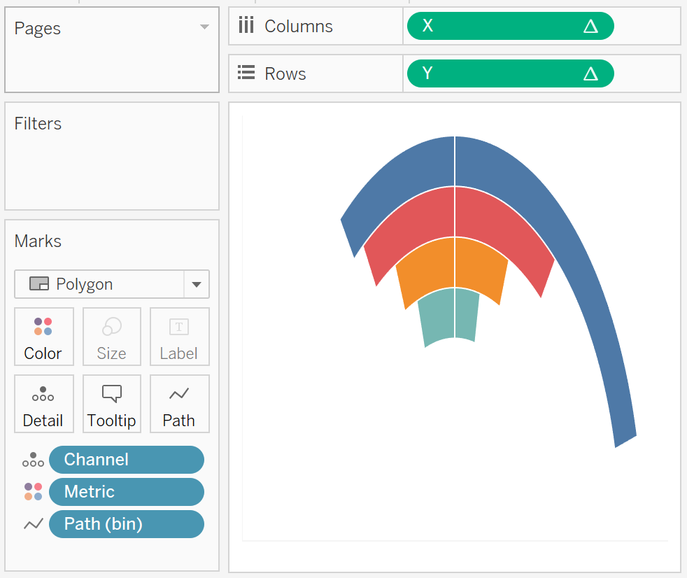
I now want us to work on the cosmetics of this data visualisation.
- Double click on the X-Axis to open the Edit Axis dialogue window.
- Set Range to Fix and to be from -9 to 9.
- Hide the X-Axis.
- Hide the Y-Axis.
- Set Grid Lines to None.
- Set Zero Lines to None.
- Remove all Row Dividers and Column Dividers.
- Click on the Color Mark and set the Border Color to White.
- Set the Default Worksheet Color to None; this will make worksheet transparent.
You should now have the following:

Now we will create the background worksheet to give us our completed guidelines.
- Right-click on your worksheet and select Duplicate; this is the biggest time saver in your Tableau journey, always duplicate.
- Rename this worksheet Background.
- Drag Metric from the Color Mark to the Detail Mark, this will remove the colours but will keep Metric in the view.
- Click on the Color Mark.
- Set the Color to White.
- Set the Border to Light Grey.
- Right-click on X in Columns and select Edit Table Calculations.
- In Nested Calculations select TC_Max Value.
- Ensure that only Path (bin) is checked.
If all goes well you should now have the following:

Now it is all about assembling our dashboard.
- Drag both worksheets onto a dashboard (as floating).
- Use the Layout Pane to ensure that they are both of the same size and position.
- Ensure that the Background worksheet is sent to the back.
and boom, you should have the following:

You can see my completed worksheet on my Tableau Public profile at:
https://public.tableau.com/profile/toan.hoang#!/vizhome/RadialFanChart/RadialFanCharts
Extra Credit: Change the multiplier in the TC_Percentage Calculated Field to see the results.
Summary
I hope you all enjoyed this article as much as I enjoyed writing it and as always do share the love. Do let me know if you experienced any issues recreating this Visualisation, and as always, please leave a comment below or reach out to me on Twitter @Tableau_Magic.
If you like our work, do consider supporting us on Patreon, and for supporting us, we will give you early access to tutorials, exclusive videos, as well as access to current and future courses on Udemy:
- Patreon: https://www.patreon.com/tableaumagic
Also, do be sure to check out our various courses:
- Creating Bespoke Data Visualizations (Udemy)
- Introduction to Tableau (Online Instructor-Led)
- Advanced Calculations (Online Instructor-Led)
- Creating Bespoke Data Visualizations (Online Instructor-Led)