In my free time I try to build a few web applications, this is an essential part of my personal learning and attempt to keep relevant. Having an application that delivers great functionality is great, but what really sells it is a great looking set of dashboards so you can monitor your business; a way to see how things are progressing. As such, I have been scouring the Google for great Dashboard designs and one thing that keeps catching my eye is the rounded progress bar, as I love playing with Tableau, I thought I would give this a shot.
The Data
The source for our data is the British Broadcasting Corporation, otherwise known as the BBC: http://www.bbc.co.uk/news/election/2017/results
I have prepared and put this data into a text file that you can download: HERE
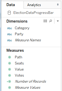
Once you import this data into Tableau you should see the following:
Calculated Fields
We will create a Path (bin) object by:
- Right-click on Path
- Go to Create, Bins…
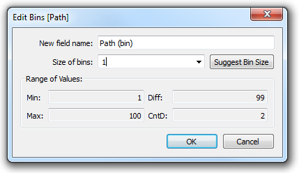
- In Edit [Path] set the Size of bins to 1
- Click Ok
The Path (bin) will allow us to use a table calculation to create additional data points between 1 and 100. If you do not get a smooth shape, by that I mean you can see the individual circles, decrease the size of the bins. Change this value to 0.5 and keep decreasing until you get what you are looking for.
Note: we are using the Path (bin) to densificate data and give us more points to work with. One thing to make sure of is that you check the Show Missing Values.
We will now create the following Calculated Fields.
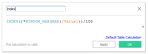
Index: This will be used for densification as well as resizing the overlapping rounded bars.
And we are done, we do not need much else to create this visualisation.
Worksheet
Let us create our worksheet.
- Drag Index onto Columns
- Drag Party onto Rows
- Drag both Party and Category onto the Color Mark
- Make sure Party is onto Top
- Keep your hand on control to select multiple objects.
- Drag Path (Bin) onto the Detail Mark
- Make sure that Path (Bin) has Show Missing Values set
- Right-click on Index, go to Compute Using and select Path (Bin)
- Click on the Mark Type and select Circle
- Right-click on Category and select Sort
- Put Values on top of Background
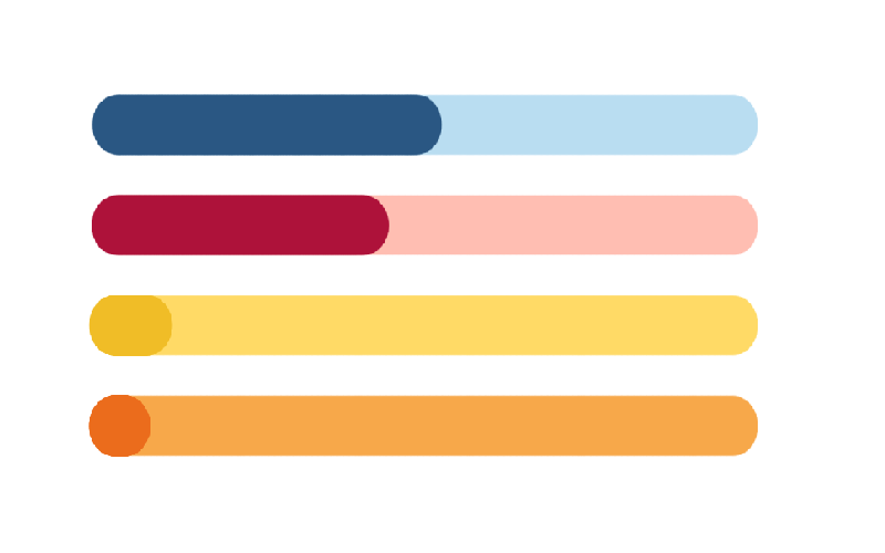
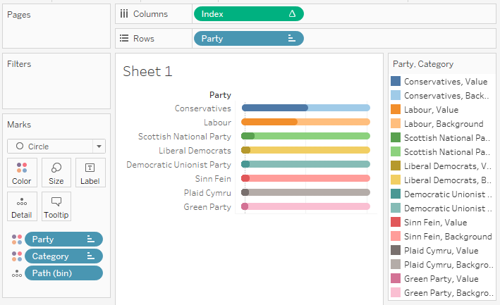
We should now see the following:
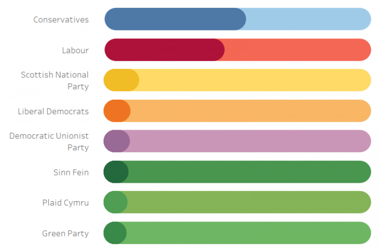
Now with a bit of formatting, we can get the following:
I hope you enjoyed this very, very, quick and simple Progress Bar in Tableau. As always please let me know your comments below.
If you like our work, do consider supporting us on Patreon, and for supporting us, we will give you early access to tutorials, exclusive videos, as well as access to current and future courses on Udemy:
- Patreon: https://www.patreon.com/tableaumagic
Also, do be sure to check out our various courses:
- Creating Bespoke Data Visualizations (Udemy)
- Introduction to Tableau (Online Instructor-Led)
- Advanced Calculations (Online Instructor-Led)
- Creating Bespoke Data Visualizations (Online Instructor-Led)





Nice article!
How do you bring Category and Party to the Color Mark? Tableau replace on by the other every time I try
Bring them over on at the same time using CTRL select.
Amazing article.
Thank you 🙂
Great Article Toan,
How to disable these Unccessary tool tips.
And show only needed data,
When hover-over the bins data is showing in tool tip ,
Just want to show party Votes
Click on the tool tip mark and then you can edit the tool tip and remove what you don’t want to see.
Great tutorial! I am looking at doing a progress bar but with multiple stages e.g. if there are 3 stages where people can be, but I’m a bit stuck as to how to adopt it from your graph, would you have some advice? thanks very much!
You would have to apply a few more techniques to achieve this, I will make a note to write a tutorial on this for October, but in the mean time, you can find the techniques to achieve this in the following: https://tableau.toanhoang.com/tableau-qt-rounded-doughnut-chart
Many thanks Toan! Looking forward to it
Hi,
Please let me know , window_max function gives undefined values when I check in data source .At the same time index (calculates field) have values in it when goes to the sheet .
Please elaborate this , I am getting so confused .
Regards
Soma
Hi Soma, windows_max is a table calculation which is based on the current views. The best way to see the table calculations is via the tooltips. Are you not able to complete the tutorial? or are you finding this challenge when applying to your own data source? If you want, you can send me an email to toan.hoang@tableau.toanhoang.com
I have created a round bar chart based on two calculated fields START avg(0), END avg(1) and progress column (the column to monitor metric value).
Now i want to color code this rounded bar chart based on progress value intervals . How cam i do this ?