
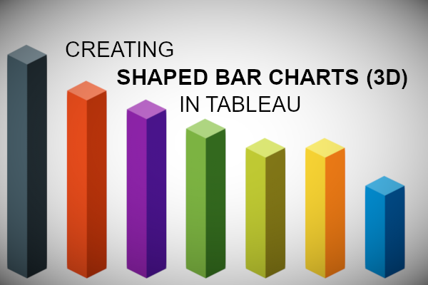
We previously had an article about creating Shaped Bar Charts in Tableau; in that previous tutorial, we used data densification to create a different look and feel for our bar charts. In this tutorial, we are going to explore using 3D shapes to create 3D Bar Charts in Tableau.
Note: 3D data visualisation is not considered best practice for data visualisations, however, I have seen these used to create interesting and engaging infographics or used for infotainment.
Data
We will start by loading the following data into Tableau.
Country,Value
United Kingdom,100
United States,80
France,60
Germany,50
Italy,30
Australia,70
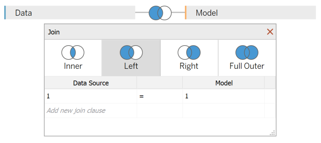
India,50Once your data is loaded into Tableau, right-click on the data source and click on Edit Data Source… with the Data Source Editor open, paste the following:
Path
0
100
You should get an error as there is no joining column, however, click on Add new join clause, go to Create Join Calculation, type 1 and click OK. Do this for the right-hand side as well. Ensure that you have Inner join selected and you should see the following:

Note: we need additional records as we are going to be drawing shapes and using densification to get more points on our canvas. For more information, check out our article on Data Densification.
Calculated Fields
With our data set loaded into Tableau, we are going to create the following Bin and Calculated Fields:
Path (bin)
- Right-click on Path, go to Create and select Bins…
- In the Edit Bins dialogue window:
- Set New field name to Path (bin).
- Set Size of bins to 1.
- Click Ok.
Index
100-INDEX()TC_Value
WINDOW_MAX(MAX([Value]))Rows
IF [Index] <= [TC_Value] THEN
    [Index]
ELSE
    NULL
END
With this done, let us start creating our data visualisation.
Worksheet
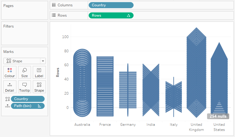
We will now build our first worksheet:
- Change the Mark Type to Shape.
- Drag Country onto the Columns Shelf.
- Drag Country onto the Marks Shelf.
- Drag Path (bin) onto Columns Shelf.
- Right-click on this object and ensure that Show Missing Values is selected.
- Drag this object onto the Detail Mark.
- Drag the Rows Object onto the Rows Shelf.
- Right-click on this object, go to Compute Using and select Path (bin).
If all goes well, you should see the following:

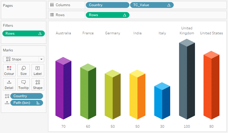
We have now created our Shaped Bar Chart, but now we will need to download, unzip, and add copy the following shapes to our Shapes directory. If you have not done this before, check out our article on Custom Shapes.
Note: These are cube objects that I have created and colored using Material Design colors.
We these shapes downloaded and ready, we will now adjust the cosmetics on our data visualisation:
- Hide the Axis Headers.
- Set Grid Lines to None.
- Set Zero Lines to None.
- Set Axis Rulers to None.
- Assign our Cube Shapes to each Country.
- Click on the 254 nulls and select Filter.
- Add a Discrete Label.
If all goes well, you should now have the following final data visualisation:

Exercise: Explore with our own objects, and let me know what you come up with.
and boom, we are done! I hope you enjoyed this tutorial, and as always, you can find this data visualisation on Tableau Public at https://public.tableau.com/profile/toan.hoang#!/vizhome/ShapedBarCharts3D/ShapedBarChart3D
Summary
I hope you all enjoyed this article as much as I enjoyed writing it and as always do share the love. Do let me know if you experienced any issues recreating this Visualisation, and as always, please leave a comment below or reach out to me on Twitter @Tableau_Magic. Do also remember to tag me in your work if you use this tutorial.
If you like our work, do consider supporting us on Patreon, and for supporting us, we will give you early access to tutorials, exclusive videos, as well as access to current and future courses on Udemy:
- Patreon: https://www.patreon.com/tableaumagic
Also, do be sure to check out our various courses:
- Creating Bespoke Data Visualizations (Udemy)
- Introduction to Tableau (Online Instructor-Led)
- Advanced Calculations (Online Instructor-Led)
- Creating Bespoke Data Visualizations (Online Instructor-Led)