
I saw this data visualisation while being a judge for #IronViz and thought that I should add this to my library of cool and interesting data visualisations. I hope you enjoy this.
Note: This is an alternative type of data visualisation, and sometimes pushed for by clients. Please always look at best practices for data visualisations before deploying this into production.
Data
We will start by loading the Sample Superstore data into Tableau Desktop / Tableau Public.
Note: If you have Tableau Desktop, you can use the Sample data source, but if you are using Tableau Public, download and load the following data source.
Calculated Fields
With our data set loaded into Tableau, we are going to create the following Bins, Calculated Fields and Parameter:
@Spacing Factor
- Set Data type to Integer
- Set Current value to 20
- Set Allowable values to Range
- Set Minimum to 0
- Set Maximum to 20
- Set Step size to 1
Path
IF [Ship Mode] = "First Class" THEN
    1
ELSE
    203
END
Path (bin)
- Right-click on Path, go to Create and select Bins…
- In the Edit Bins dialogue window:
- Set New field name to Path (bin)
- Set Size of bins to 1
- Click Ok
Index
INDEX()-1Sub-Category Index
(INDEX()-INT(WINDOW_MAX(INDEX())/2)-1)/10TC_Sales
WINDOW_SUM(SUM([Sales]))TC_Total Sales
WINDOW_SUM(SUM([Sales]))TC_Percentage
[TC_Sales] / [TC_Total Sales]TC_Spacing
[Sub-Category Index]/(21-[@Spacing Factor])TC_Starting Point
RUNNING_SUM([TC_Percentage])-[TC_Percentage]X
IF [Index] <=100 THEN
    (([Index])*0.12)-6
ELSEIF [Index] = 101 THEN
    (([Index]-1)*0.12)-6
ELSE
    ((202-[Index])*0.12)-6
END
Y
IF [Index] <=100 THEN
    1/(1+EXP(-[X]))*([TC_Spacing])
ELSEIF [Index] =101 THEN
    1/(1+EXP(-[X]))*([TC_Spacing])+([TC_Percentage]/2)
ELSE
    1/(1+EXP(-[X]))*([TC_Spacing])+[TC_Percentage]
END + [TC_Starting Point]
TC_Sales Label
IF [Index] = 101 THEN
    [TC_Sales]
ELSE
    NULL
END
TC_Percentage Label
IF [Index] = 101 THEN
    [TC_Percentage]
ELSE
    NULL
END
With this done, let us start creating our data visualisation.
Worksheet
We will now build our worksheet:
- Drag Order Date onto the Filter Pane, and filter to 2018
- Drag Sub-Category onto the Filter Pane, and filter to include: Accessories, Appliances, Art, Binders, Bookcases and Chairs
- Change the Mark Type to Polygon
- Drag Sub-Category onto the Detail Mark
- Drag Path (bin) onto the Columns Shelf
- Right-click on this pill and ensure that Show Missing Values is selected
- Drag this pill onto the Path Mark
- Drag TC_Sales onto the Colour Mark
- Right-click on this pill, go to Compute Using and select Path (bin)
- Drag X onto the Columns Shelf
- Right-click on this pill, go to Compute Using and select Path (bin)
- Drag Y onto the Rows Shelf
- Right-click on this pill, go to Compute Using and select Path (bin)
- Right-click on this pill and select Edit Table Calculations…
- In Nested Calculations, select Sub-Category Index and ensure that only Sub-Category is selected
- In Nested Calculations, select TC_Total Sales and ensure that Path (bin) and Sub-Category is selected
- In Nested Calculations, select TC_Starting Point and ensure that only Sub-Category is selected
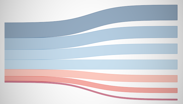
If all goes well, you should now see the following:


Now add an outline.
- Ctrl (or command) and Drag Drop the X to the right (this will duplicate the object with all of its configurations)
- In the X (2) Marks Panel
- Drag the Sub-Category from Detail Mark to the Label Mark
- Drag TC_Percentage Label onto the Label Mark
- Right-click on this pill, go to Compute Using and select Path (bin)
- Drag TC_Sales Label onto the Label Mark
- Right-click on this pill, go to Compute Using and select Path (bin)
- Click on the Label Mark
- Ensure that Show mark labels is checked
- Set Alignment to Middle Right
- Set Marks to Label as Min/Max
- Set Scope to Line/Pie
You should now see the following:


We now want to adjust the cosmetics:
- Right-click on the X pill and select Dual Axis
- Right-click X Axis Header and select Synchronise Axis
- In the X Mark Panel
- Click on the Colour Mark and set the Opacity to 40%
- Remove the Tooltips
- In the X (2) Mark Panel
- Click on the Size Mark and reduce to the minimum
- Remove the Tooltips
Note: If you can, enable animations
You should now see the following:


Add some final cosmetic tweaks to end up with our final data visualisation:


and boom, we are done! I hope you enjoyed creating this data visualization and learned some cool techniques as well. As always, you can find this data visualisation on Tableau Public at https://public.tableau.com/profile/toan.hoang#!/vizhome/SquaredDengrogram/SquaredDendrogram
Summary
I hope you all enjoyed this article as much as I enjoyed writing it and as always do share the love. Do let me know if you experienced any issues recreating this Visualization, and as always, please leave a comment below or reach out to me on Twitter @Tableau_Magic. Do also remember to tag me in your work if you use this tutorial.
If you like our work, do consider supporting us on Patreon, and for supporting us, we will give you early access to tutorials, exclusive videos, as well as access to current and future courses on Udemy: https://www.patreon.com/tableaumagic