


")


This is a Quick Tip on how to build a Connected Bar Charts in Tableau, so less reading and more jumping in. We are going to spend 5 minutes or less building our Connected Bar Chart in Tableau. I saw this at a session with Klaus Schulte (https://vizjockey.com) and Ludovic Tavernier (https://greatified.com) Tableau Conference in Berlin 2019 and thought I had to see if I could figure it out? I always try to work things out myself before looking at how others have solved the same problem; sometimes we approach the problem in the same ways, and sometimes, completely differently, it is all part of the fun. I highly recommend you checking out Klaus’ and Ludovico’s blogs and following them on Tableau Public and Twitter.
Note: As always never choose a data visualisation type and try to fit your data into it, instead, understand your data and choose the best visualization for your data consumers.
Data
Let us start by loading Orders from the Superstore data set, if you have Tableau Public you can download the dataset here:
Once you have loaded the data into Tableau Desktop / Tableau Public, we want to edit our data source:
- Click on the Data Source button to open up the Data Source Editor.
- Drag Orders onto the Query Pane and hover below the already added Orders and drop when you see the Drag table to union option.
- This will double our data, which we will require this to build our Connected Bar Chart.
Calculations
We will start by creating the following calculated fields.
Size Parameter
- Create a new Parameter with the following settings:
- Set Name to Size.
- Set Data type to Float.
- Set Current value to 0.35.
- Click ok.
Date (Month)
IIF([Table Name] = "Orders", DATEPART('month', [Order Date])-[Size],DATEPART('month', [Order Date])+[Size])*10Sales (Bar)
IIF([Table Name]="Orders", [Sales], 0)Worksheet
Now that we have created our Calculated Fields, we will build our Worksheet.
- Drag Order Date onto Filters and select a single year; I choose 2018.
- Drag Date (Month) onto Columns.
- Right-click on this object and select Dimension.
- Drag Sales onto Rows.
- Change the Mark Type to Area.
- Adjust the Colour to be a Light shade of Blue.
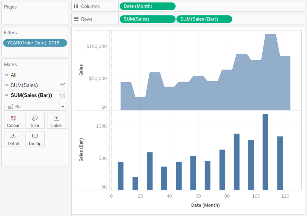
- Drag Sales (Bar) onto Rows.
- Change the Mark Type to Bar.
- Adjust the Colour to be a Dark shade of Blue.
If all goes well, you should now have the following:
Now, I want to put these ontop of each other and align.
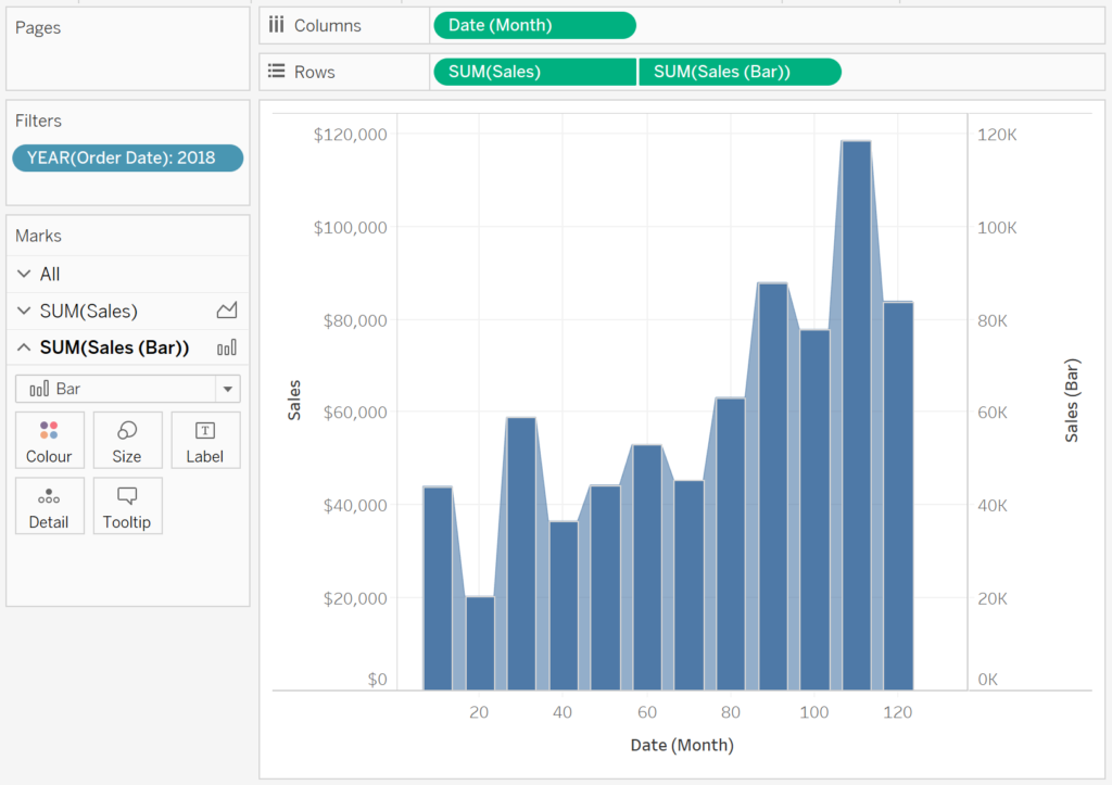
- Right click on the Sales (Bar) on the Rows and select Dual Axis
- Right-click on the Axis headers and select Synchronize Axis.
- Remove the Measure Name from Colours.
- In the Sales (Bar) Marks Pane.
- Click on Size.
- Select Fixed.
- Set the Width in Axis Units to 7.
- Set the Alignment to Left.
If all goes well, you should now see the following:
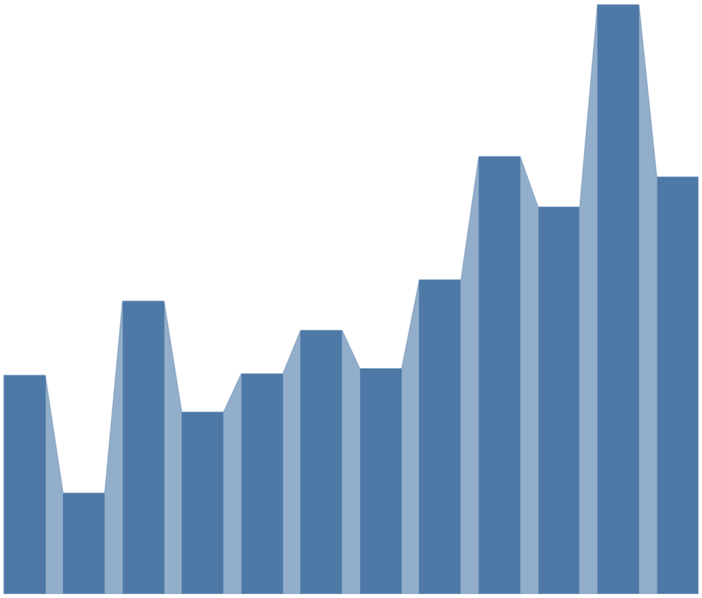
We will now adjust the cosmetics:
- Hide the All Axis Headers.
- Hide the Zero Lines
- Hide the Grid Lines
- Hide the Rows and Column Dividers
- Add Tooltips.
You will want to have the following finished product:
and boom we are done with our Connected Bar Charts. you can find my visualisation on Tableau Public here: https://public.tableau.com/profile/toan.hoang#!/vizhome/ConnectedBarCharts/ConnectedBarCharts
Summary
I hope you all enjoyed this article as much as I enjoyed writing it. Do let me know if you experienced any issues recreating this Visualisation, and as always, please leave a comment below or reach out to me on Twitter @Tableau_Magic.
If you like our work, do consider supporting us on Patreon, and for supporting us, we will give you early access to tutorials, exclusive videos, as well as access to current and future courses on Udemy:
- Patreon: https://www.patreon.com/tableaumagic
Also, do be sure to check out our various courses:
- Creating Bespoke Data Visualizations (Udemy)
- Introduction to Tableau (Online Instructor-Led)
- Advanced Calculations (Online Instructor-Led)
- Creating Bespoke Data Visualizations (Online Instructor-Led)


")
Very nice sharing , but I am unable to get the same result which you have mentioned , even I follow the all steps which you have mentioned , Specially the edges are very sharp in my picture , could you please share your email address or else guide how can I share my out put file with you.
Thanks and Regards,
Please publish to Tableau Public and send me the link, or save as a Packaged Workbook and email me at admin@tableau.toanhoang.com