
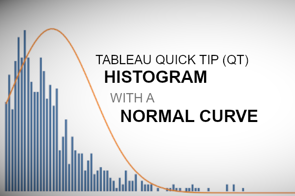
Welcome to 2020. Hopefully, this will be the start of a glorious year, and we at Tableau Magic are definitely excited for things to come. Here is our first Tableau Quick Tip on creating a Histogram with a Normal Curve in 10 minutes or less.
Data
We will start by loading the Sample Superstore data into Tableau.
Note: If you have access to Tableau Desktop and the Sample Superstore data source, please use that instead.
Calculated Fields
With our data set loaded into Tableau, we are going to create the following Calculated Fields:
Customer Count
COUNTD([Customer ID])Sales by Customer
{ FIXED [Customer Name]: SUM([Sales]) }We are using a LOD expression to get the total amount of Sales by Customer.
Mean
{ AVG([Sales by Customer]) }We have no dimension as we want the mean to be calculated across the entire data set.
Standard Deviation
{ STDEV([Sales by Customer]) }Note: I have always wanted to use the Standard Deviation in a tutorial.
Size of Sales (bin) parameter
Unfortunately, Tableau does not allow you to use out-of-the-box bin in calculations, therefore, we will be custom building our own Bins; this is simple enough to do.
- Set Name to Size of Sales (bin)
- Set Data type to Int.
- Set Current value to 500
Sales (bin)
INT([Sales by Customer] / [Size of Sales (bin)]) * [Size of Sales (bin)]Normal Curve
(
    1/MAX([Standard Deviation])*SQRT(2*PI())
)
*
EXP
(
    -SQUARE(MAX([Sales (bin)]) - MAX([Mean]))
    /
    (2 * SQUARE(MAX([Standard Deviation])))
)
Note: This is the Gaussian Distribution Function, also known as the Normal Distribution.
With this done, let us start creating our data visualisation.
Worksheet
We will now build our worksheet:
- Change the Mark Type to Bar.
- Drag Sales (bin) onto the Columns Shelf.
- Right-click on this pill and convert this to a Dimension.
- Drag Customer Count onto the Rows Shelf.
- Drag Normal Curve onto the Rows Shelf.
- Change the Mark Type to Line.
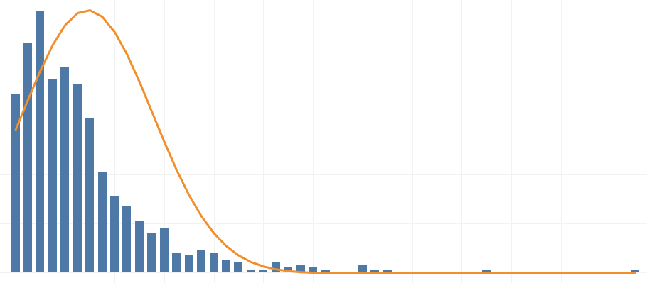
If all goes well, you should now see the following:


All we will need to do now is to work on the cosmetics:
- Dual Axis the pills on the Rows Shelf; do not Synchronize Axis.
- Adjust the colours of your View.
- Hide the Normal Curve Axis.
- Adjust the tooltip.
You would want to end up with something like the following:

See, nice and simple, please do try to experiment with different Vales (Quantity, Profit etc) and to also adjust the size of the bin to get a smoother line, and with that said, and boom, we are done! I hope you enjoyed this tutorial, and as always, you can find this data visualisation on Tableau Public at https://public.tableau.com/profile/toan.hoang#!/vizhome/HistogramwithNormalCurve/HistogramwithNormalCurve
Summary
I hope you all enjoyed this article as much as I enjoyed writing it and as always do share the love. Do let me know if you experienced any issues recreating this Visualisation, and as always, please leave a comment below or reach out to me on Twitter @Tableau_Magic. Do also remember to tag me in your work if you use this tutorial.
If you like our work, do consider supporting us on Patreon, and for supporting us, we will give you early access to tutorials, exclusive videos, as well as access to current and future courses on Udemy:
- Patreon: https://www.patreon.com/tableaumagic
Also, do be sure to check out our various courses:
- Creating Bespoke Data Visualizations (Udemy)
- Introduction to Tableau (Online Instructor-Led)
- Advanced Calculations (Online Instructor-Led)
- Creating Bespoke Data Visualizations (Online Instructor-Led)