
A lot of the dashboards I create today are Executive KPI Dashboards; this basically means KPIs and indicators. In this Tableau, Quick Tip, we are going to build a simple KPI Dashboard and use Unicode characters as the KPI Text Indicator.
Data
We will start by loading the following data into Tableau Desktop / Tableau public.
Note: If you have Tableau Desktop, you can use the Sample data source, but if you are using Tableau Public, download and load the following data source.
Calculated Fields
We only need a single Calculated Field for our Data Visualisation.
Sales (2017)
IIF(YEAR([Order Date]) = 2017,[Sales],NULL)Sales (2018)
IIF(YEAR([Order Date]) = 2018,[Sales],NULL)Sales Growth (2017 vs 2018)
ZN((SUM([Sales (2018)])-SUM([Sales (2017)]))/SUM([Sales (2017)]))Note: Yes, for our example, we have hardcoded the years, but you can make this more dynamic.
Sales Growth (Negative)
IF [Sales Growth (2017 vs 2018)] < 0 THEN
    STR(ROUND([Sales Growth (2017 vs 2018)]*100,1))+"% ⯆"
END
Note: we can use Unicode in our text, so do make full use of this.
Sales Growth (Positive)
IF [Sales Growth (2017 vs 2018)] > 0 THEN
    STR(ROUND([Sales Growth (2017 vs 2018)]*100,1))+"% ⯅"
END
Sales Growth (No Change)
IF [Sales Growth (2017 vs 2018)] = 0 THEN
    "0.0% ⯈"
END
With this done, let us start creating our data visualisation.
Worksheet
We will now build our worksheet:
- Change the Mark Type to Text
- Drag State onto the Rows Shelf
- Drag the following onto the Text Mark:
- State
- Sales (2018)
- Sales Growth (2017 vs 2018)
- Sales Growth (Negative)
- Sales Growth (Positive)
- Sales Growth (No Change)
You should see the following:


Now we will edit text, click on the Text Mark and Change change the text to the following (including colours):


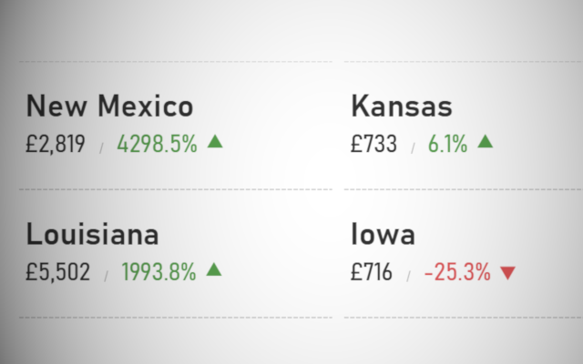
At any given time, only one of the growth rates will show, and with a little formatting, filtering, and adding versions of this sheet to a dashboard, you can end up with the following:


and boom, we are done… I hope you enjoyed this tutorial, and as always, you can find this data visualization on Tableau Public at https://public.tableau.com/profile/toan.hoang#!/vizhome/KPITextIndicator/KPIsTextIndicators
Summary
I hope you all enjoyed this article as much as I enjoyed writing it and as always do share the love. Do let me know if you experienced any issues recreating this Visualization, and as always, please leave a comment below or reach out to me on Twitter @Tableau_Magic. Do also remember to tag me in your work if you use this tutorial.
If you like our work, do consider supporting us on Patreon, and for supporting us, we will give you early access to tutorials, exclusive videos, as well as access to current and future courses on Udemy: https://www.patreon.com/tableaumagic