


")


I love Quadrants Plots as a quick way to segmenting your data, so please enjoy this Tableau Quick Tip (QT) which you can do in 5 mins or less.
Data
Let us start by loading the following data in Tableau Desktop / Public.
Note: If you have Tableau Desktop, you can use the Orders Data Source.
Calculated Fields
Create the following Calculated Fields:
TC_Percentage of Max Quantity
SUM([Quantity])/WINDOW_MAX(SUM([Quantity]))TC_Percentage of Max Sales
SUM([Sales])/WINDOW_MAX(SUM([Sales]))Color
IF [TC_Percentage of Max Sales] <0.5 AND [TC_Percentage of Max Quantity] < 0.5 THEN
    "Low Sales / Low Quantity"
ELSEIF [TC_Percentage of Max Sales] >= 0.5 AND [TC_Percentage of Max Quantity] < 0.5 THEN
    "High Sales / Low Quantity"
ELSEIF [TC_Percentage of Max Sales] >= 0.5 AND [TC_Percentage of Max Quantity] >= 0.5 THEN
    "High Sales / High Quantity"
ELSE
    "Low Sales / High Quantity"
END
and that is it, let us now build our worksheet.
Worksheet
We will now create our worksheet:
- Change the Mark Type to Circle.
- Drag Customer Name onto the Detail Mark.
- Drag TC_Percentage of Max Sales onto Columns.
- Right-click on this object, go to Compute Using and select Customer Name.
- Drag TC_Percentage of Max Quantity onto Rows.
- Right-click on this object, go to Compute Using and select Customer Name.
- Drag Color onto the Color Mark.
- Right-click on this object, go to Compute Using and select Customer Name.
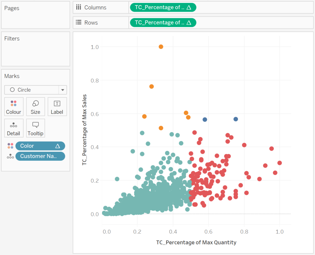
If all goes well you should now see the following:
Now we will adjust the cosmetics:
- Add a Trend Line to the X-Axis, create a parameter and set the value to 0.5.
- Add a Trend Line to the Y-Axis.
- Hide the Major Tick Marks.
- Hide the Grid Lines.
- Hide the Zero Lines.
- Adjust the Tooltips.
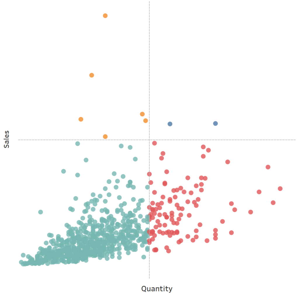
You should now have the following:
and boom, we are done. We have created our Quadrant Plots in Tableau. You can find my data visualisation Tableau Public at https://public.tableau.com/profile/toan.hoang#!/vizhome/QuadrantPlots/QuandrantPlot
Summary
I hope you all enjoyed this article as much as I enjoyed writing it. Do let me know if you experienced any issues recreating this Visualisation, and as always, please leave a comment below or reach out to me on Twitter @Tableau_Magic.
If you like our work, do consider supporting us on Patreon, and for supporting us, we will give you early access to tutorials, exclusive videos, as well as access to current and future courses on Udemy:
- Patreon: https://www.patreon.com/tableaumagic
Also, do be sure to check out our various courses:
- Creating Bespoke Data Visualizations (Udemy)
- Introduction to Tableau (Online Instructor-Led)
- Advanced Calculations (Online Instructor-Led)
- Creating Bespoke Data Visualizations (Online Instructor-Led)


 Table Calculation")


")
