
Something very nice and simple, here is a Tableau Quick Tip on Creating a Rounded Gantt Chart within 10 minutes or less.
Note: This is an alternative type of data visualisation, and sometimes pushed for by clients. Please always look at best practices for data visualisations before deploying this into production.
Data
We will start by loading the following data into Tableau Desktop / Tableau public.
Note: If you have Tableau Desktop, you can use the Sample data source, but if you are using Tableau Public, download and load the following data source.
Calculated Fields
We only need to create the following Parameters and Calculation Fields:
Order Date (Number)
MAX(DATEDIFF('day', #01-01-2000#, [Order Date]))Ship Date (Number)
MAX(DATEDIFF('day', #01-01-2000#, [Ship Date]))Days Between
[Ship Date (Number)]-[Order Date (Number)]With this done, let us start creating our data visualisation.
Worksheet
We will now build our worksheet:
- Drag Order Date onto the Filter Shelf and select 2018
- Drag Order Date onto the Filter Shelf, select Discrete Month and select January
- Drag Measure Values onto the Columns Shelf
- Right-click on the Measure Names in the Filter Shelf and filter for Order Date (Number) and Ship Date (Number)
- Change the Mark Type to Line
- Drag Measure Names onto the Path Mark
- Double click on the Axis Header and remove Include Zero
You should now see the following:


We will now adjust the cosmetics to get our final product
- Drag Days Between onto the colour mark and edit
- Drag Order Date and Ship Date onto the Tooltip Mark
- Add a Sort Order
- Hide the Value Axis Header
- Adjust the Size
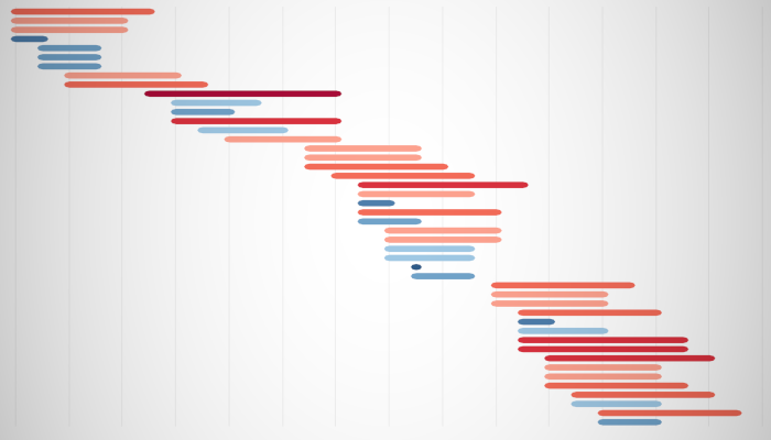
You should now see our final data visualisation:


and boom, we are done with this Tableau Quick Tip, and I hope you had some seriously good fun; as always, you can find my data visualisation on Tableau Public at https://public.tableau.com/profile/toan.hoang#!/vizhome/RoundedGanttCharts/RoundedGanttCharts
Summary
I hope you all enjoyed this article as much as I enjoyed writing it and as always do share the love. Do let me know if you experienced any issues recreating this Visualization, and as always, please leave a comment below or reach out to me on Twitter @Tableau_Magic. Do also remember to tag me in your work if you use this tutorial.
If you like our work, do consider supporting us on Patreon, and for supporting us, we will give you early access to tutorials, exclusive videos, as well as access to current and future courses on Udemy: https://www.patreon.com/tableaumagic