

I am slowly completing the second wave of Tableau Tutorials, so I hope that you enjoy this 10-min Tableau Quick Tip and a little bit of fun.
Note: I see absolutely no reason to use this in data visualisation, but it is a bit of fun and hopefully will show you a few new techniques.
Data
We will start by loading the following data into Tableau Desktop / Tableau public.
Note: If you have Tableau Desktop, you can use the Sample data source, but if you are using Tableau Public, download and load the following data source.
Calculated Fields
We only need to create the following Calculation Fields:
Index
INDEX()Random
RANDOM()*1Bar Value
{ FIXED [Category], [Sub-Category]: SUM([Sales]) }Columns
RANDOM()*[Bar Value]With this done, let us start creating our data visualisation.
Worksheet
We will now build our worksheet:
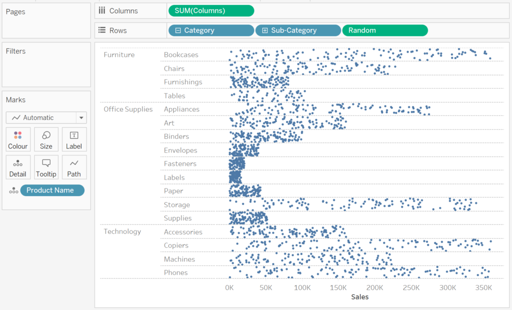
- Drag Columns onto the Columns Shelf
- Drag Category onto the Rows Shelf
- Drag Sub-Category onto the Rows Shelf
- Drag Random onto the Rows Shelf
- Drag Product Name onto the Detail Mark
You should see the following:

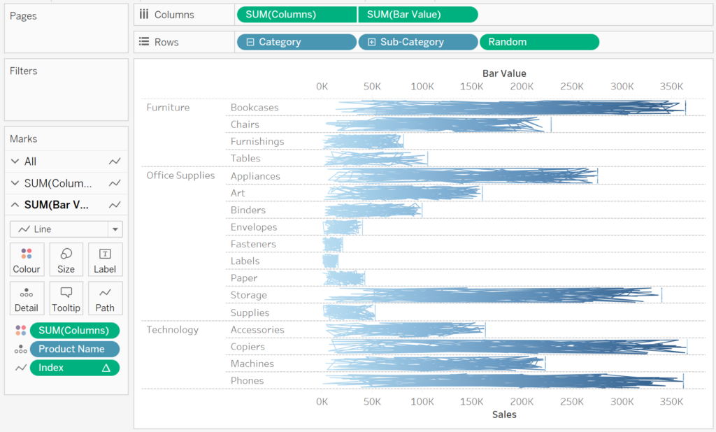
Now we will create the sketchy effect:
- Change the Mark Type to Line
- Drag Index into the Path Mark
- Drag Columns onto the Colour Mark
- Drag Bar Value onto the Columns Shelf
- Right-click on this pill and select Dual Axis
- Right-click on the Axis Header and select Synchronise Axis
You should now have the following:

Now we just need to adjust the cosmetics:
- Hide the Grid Lines
- Hide one of the Axis Headers
- Format the Text
- Hide the Tool Tips
You should now have the final data visualisation:


and boom, we are done with this Tableau Quick Tip, and I hope you had some seriously good fun; as always, you can find my data visualisation on Tableau Public at https://public.tableau.com/profile/toan.hoang#!/vizhome/SketchyBarCharts/SketchyBarCharts
Summary
I hope you all enjoyed this article as much as I enjoyed writing it and as always do share the love. Do let me know if you experienced any issues recreating this Visualization, and as always, please leave a comment below or reach out to me on Twitter @Tableau_Magic. Do also remember to tag me in your work if you use this tutorial.