
Another requested tutorial (most are being requested these days, so do get in touch if you have a tutorial request). In this Tableau quick tip, we are going to walk through the creation of a Variable Width Bar Chart in Tableau in 5 minutes or less.
Data
We will start by loading the following data into Tableau Desktop / Tableau public.
Note: If you have Tableau Desktop, you can use the Sample data source, but if you are using Tableau Public, download and load the following data source.
Calculated Fields
With our data set loaded into Tableau, we are going to create just 1 Calculated Field:
Total Sales
RUNNING_SUM(SUM([Sales]))-SUM([Sales])With this done, let us start creating our data visualisation.
Worksheet
We will now build our worksheet:
- Change the Mark Type to Bar
- Drag Sub-Category onto the Color Mark
- Drag Total Sales onto the Columns Shelf
- Right-click on this pill, go to Compute Using and select Sub-Category
- Drag Profit onto the Rows Shelf
If all goes well, you should now see the following:


Now, we will make some adjustments:
- Drag Sales onto the Size Mark
- Click on the Size Mark
- Select Fixed
- Select Alignment to Left
- Adjust the Tooltips
- Apply any additional formatting
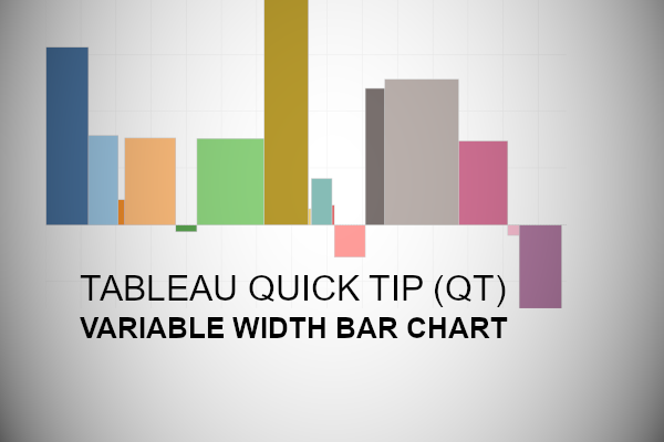
You should now have the following:

And here we are, we can see the Total Sales across all Sub-Categories, and the profit for each Sub-Category on the Y-Axis, and boom, we are done! I hope you enjoyed this tutorial, and as always, you can find this data visualization on Tableau Public at https://public.tableau.com/profile/toan.hoang#!/vizhome/VariableWidthBarCharts/VariableWidthBarCharts
Summary
I hope you all enjoyed this article as much as I enjoyed writing it and as always do share the love. Do let me know if you experienced any issues recreating this Visualization, and as always, please leave a comment below or reach out to me on Twitter @Tableau_Magic. Do also remember to tag me in your work if you use this tutorial.
If you like our work, do consider supporting us on Patreon, and for supporting us, we will give you early access to tutorials, exclusive videos, as well as access to current and future courses on Udemy:
- Patreon: https://www.patreon.com/tableaumagic
Also, do be sure to check out our various courses:
- Creating Bespoke Data Visualizations (Udemy)
- Introduction to Tableau (Online Instructor-Led)
- Advanced Calculations (Online Instructor-Led)
- Creating Bespoke Data Visualizations (Online Instructor-Led)