


")


This is a Quick Tip on how to build a Waterfall Chart in Tableau, so less reading and more jumping in. We are going to spend 5 minutes or less building our Waterfall Chart in Tableau.
Note: As always never choose a data visualisation type and try to fit your data into it, instead, understand your data and choose the best visualization for your data consumers.
Data
Load the following data into Tableau Desktop / Public.
Line Item,Year,Amount
Revenue / Licenses,2018,"555,581,000"
Revenue / Maintenance and Services,2018,"599,771,000"
Cost of Revenue / License,2018,-21407000
Cost of Revenue / Maintenance and Services,2018,-121217000
Operating Expenses / Sales and Marketing,2018,-593786000
Operating Expenses / Research and Development,2018,-382886000
Operating Expenses / General Administrative,2018,-125805000
Other Income,2018,"17,872,000"
Income Tax Expense,2018,-5165000
Revenue / Licenses,2017,429204000
Revenue / Maintenance and Services,2017,447855000
Cost of Revenue / License,2017,-13534000
Cost of Revenue / Maintenance and Services,2017,-100025000
Operating Expenses / Sales and Marketing,2017,-517446000
Operating Expenses / Research and Development,2017,-334148000
Operating Expenses / General Administrative,2017,-102871000
Other Income,2017,12266000
Income Tax Expense,2017,-6861000
The following data was taken from Tableau Investor relationship website:
https://investors.tableau.com/financial-information/default.aspx
Calculations
We only require a single Calculation:
Bar Size
-[Amount]Yep, that is all we need.
Worksheet
To start building our dashboard:
- Change the Mark Type to Gantt Bar.
- Drag Year onto the Filters and select 2018.
- Drag Line Item onto Columns.
- Right-click on this object and manually sort:
- Revenue / Licenses
- Revenue / Maintenance and Services
- Cost of Revenue / License
- Cost of Revenue / Maintenance and Services
- Operating Expenses / Sales and Marketing
- Operating Expenses / Research and Development
- Operating Expenses / General Administrative
- Other Income
- Income Tax Expense
- Right-click on this object and manually sort:
- Drag Amount to Rows
- Ensure that the aggregation is set to SUM(Amount).
- Right-click on the object, go to Quick Table Calculation and select Running Total.
- Drag Bar Size to Color.
- Drag Bar Size to Size.
- Drag Amount to Label.
- Go to the Analysis (in the file menu), go to Totals and select Show Row Grand Totals.
If all goes well, you should see the following:
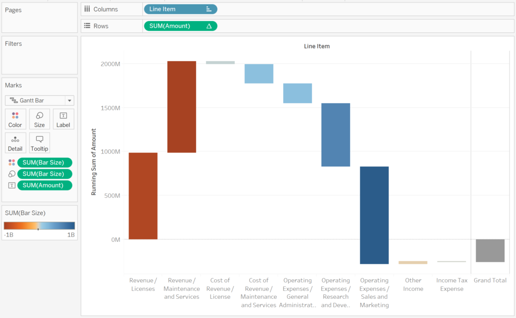
Now we will adjust the cosmetics to get the visualisation looking the way we want it.
- Adjust the Colors, I like to ensure that there are only two colors, one for positive and one for negative values.
- Add Labels to the top of the Bars.
- Remove the Grand Total Column line.
- Format the Amounts and Bar Size to be in $ and millions; as this is a financial report, set negative values to have parenthesis as opposed to a dash.
- Add Tooltips.
Hopefully, you should see the following:
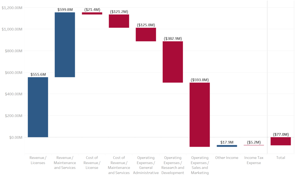
and boom, we are done, nice, simple and quick. You find my Waterfall Chart Dashboard on Tableau Public at
https://public.tableau.com/profile/toan.hoang#!/vizhome/WaterfallCharts_15545648902300/WaterfallCharts
Summary
I hope you all enjoyed this article as much as I enjoyed writing it. Do let me know if you experienced any issues recreating this Visualisation, and as always, please leave a comment below or reach out to me on Twitter @Tableau_Magic.
If you like our work, do consider supporting us on Patreon, and for supporting us, we will give you early access to tutorials, exclusive videos, as well as access to current and future courses on Udemy:
- Patreon: https://www.patreon.com/tableaumagic
Also, do be sure to check out our various courses:
- Creating Bespoke Data Visualizations (Udemy)
- Introduction to Tableau (Online Instructor-Led)
- Advanced Calculations (Online Instructor-Led)
- Creating Bespoke Data Visualizations (Online Instructor-Led)
 Table Calculation")


Hi Toan!
Do you have Tableau lesson that shows set actions for asymmetric drill down, opening only the next hierarchy level for the selected value that also does filter action on other sheets.
For instance, I have a table that has 3 categories – Furniture, Office Supplies and Technology. When clicking on, for example, the “Furniture” category, it expands to show sub category names associated with the “Furniture” category while the Office Supplies and Technology categories are not expanding, which works well because of the use of set actions for asymmetric drill down method.
However, i am interested in taking it one step further, which is when clicking on the “Furniture” category, not only it expands as described above, but it should also update other sheets in the same dashboard?
Thank you!
Best regards,
Quang,
Hi Quang, I do not have these tutorials. Lindsey Poulter has lot of tutorials regarding Set Actions. Check out her website: http://www.lindseypoulter.com/tag/set-actions