


")


This is one of the most requested tutorials, so I thought why not write it for a little fun. Yes, it a fun Waffle Chart. Now, I could use a scaffold to create the coordinates, however, and knowing me, I prefer to code this into Tableau. This tutorial should take around 15 minutes alongside the variations, so I hope you do enjoy.
Note: This is an alternative type of data visualisation, and sometimes pushed for by clients. Please always look at best practices for data visualisations before deploying this into production.
Data
Load the following data into Tableau Desktop / Public.
Metric,Path,Value
Metric 1,1,0.8
Metric 1,100,0.8
Metric 2,1,0.95
Metric 2,100,0.95
Metric 3,1,0.55
Metric 3,100,0.55
Metric 4,1,0.3
Metric 4,100,0.3
Note: we need two records for each Metric as we are going to be drawing lines and using densification to get more points on our canvas. For more information, check out our article on Data Densification.
Calculated Fields
With our data set loaded into Tableau, we are going to create the following Calculated Fields and Bins:
Create Path (bin)
- Right click on Path, go to Create and select Bins…
- In the Edit Bins dialogue window:
- Set New field name to Path (bin).
- Set Size of bins to 1.
- Click Ok.
Index
INDEX()X
IF [Index] = 1 THEN
    1
ELSEIF [Index] <= 3 THEN
    2
ELSEIF [Index] <= 6 THEN
    3
ELSEIF [Index] <= 10 THEN
    4
ELSEIF [Index] <= 15 THEN
    5
ELSEIF [Index] <= 21 THEN
    6
ELSEIF [Index] <= 28 THEN
    7
ELSEIF [Index] <= 36 THEN
    8
ELSEIF [Index] <= 45 THEN
    9
ELSEIF [Index] <= 55 THEN
    10
ELSEIF [Index] <= 64 THEN
    11
ELSEIF [Index] <= 72 THEN
    12
ELSEIF [Index] <= 79 THEN
    13
ELSEIF [Index] <= 85 THEN
    14
ELSEIF [Index] <= 90 THEN
    15
ELSEIF [Index] <= 94 THEN
    16
ELSEIF [Index] <= 97 THEN
    17
ELSEIF [Index] <= 99 THEN
    18
ELSE
    19
END
Y
IF [X] = 1 THEN
    [Index]-0
ELSEIF [X] = 2 THEN
    [Index]-1.5
ELSEIF [X] = 3 THEN
    [Index]-4
ELSEIF [X] = 4 THEN
    [Index]-7.5
ELSEIF [X] = 5 THEN
    [Index]-12
ELSEIF [X] = 6 THEN
    [Index]-17.5
ELSEIF [X] = 7 THEN
    [Index]-24
ELSEIF [X] = 8 THEN
    [Index]-31.5
ELSEIF [X] = 9 THEN
    [Index]-40
ELSEIF [X] = 10 THEN
    [Index]-49.5
ELSEIF [X] = 11 THEN
    [Index]-59
ELSEIF [X] = 12 THEN
    [Index]-67.5
ELSEIF [X] = 13 THEN
    [Index]-75
ELSEIF [X] = 14 THEN
    [Index]-81.5
ELSEIF [X] = 15 THEN
    [Index]-87
ELSEIF [X] = 16 THEN
    [Index]-91.5
ELSEIF [X] = 17 THEN
    [Index]-95
ELSEIF [X] = 18 THEN
    [Index]-97.5
ELSE
    1
END
Note: we have hardcoded the grid into a Calculated Field as opposed to Scaffolds.
Color
IF [Index]/WINDOW_MAX([Index]) <= WINDOW_MAX(MAX([Value])) THEN
    WINDOW_MAX(MAX([Metric]))
ELSE
    0
END
Size
IF [Index]/WINDOW_MAX([Index])<= WINDOW_MAX(MAX([Value])) THEN
    1
ELSE
    0
END
So now that we have created a lot of Calculated fields, we will now put this together into a Worksheet.
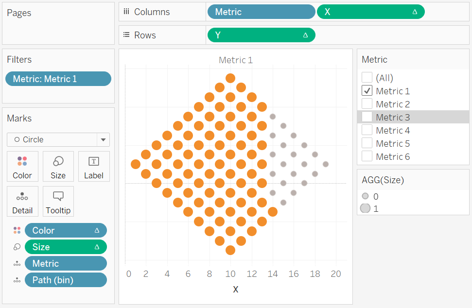
Worksheet
We will now build our first worksheet:
- Change the Mark Type to Circle.
- Drag Metric onto the Filter Pane, and filter to only show Metric 1.
- Drag Metric onto Detail.
- Drag Metric onto Columns.
- Drag Path (bin) onto Columns.
- Right-click on the object and ensure that Show Missing Values is selected.
- Drag this object onto Detail.
- Drag X onto Columns.
- Right-click on this object, go to Compute Using and select Path (bin).
- Drag Y onto Rows.
- Right-click on this object, go to Compute Using and select Path (bin).
- Drag Color onto Color Mark.
- Right-click on this object, go to Compute Using and select Path (bin).
- Drag Size onto the Size Mark.
- Right-click on this object, go to Compute Using and select Path (bin).
- Convert this to Continuous; Edit the Size and set the Start value for range as 0 and End value for range as 1.
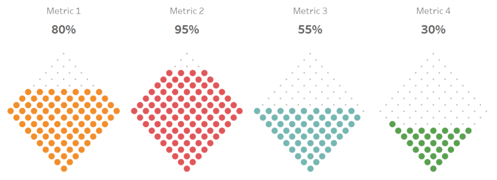
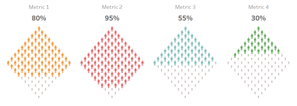
If all goes well, you should have the following:
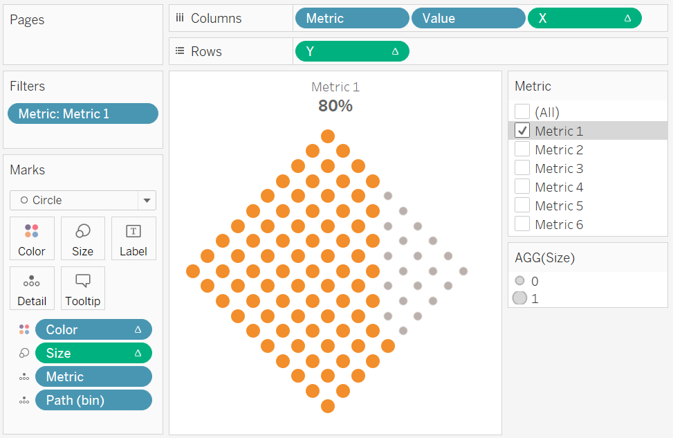
Now we are going to adjust the cosmetics.
- Hide the Grid Lines.
- Hide the Zero Lines.
- Hide the Row Dividers.
- Hide the Column Dividers.
- Hide the X-axis.
- Hide the Y-axis.
- Drag Values onto Columns.
- Format as a Percentage.
- Set this to be a Discrete Dimension.
- Hide Field Labels for Columns.
- Edit the Colors
If all goes well, you will want to have the following:
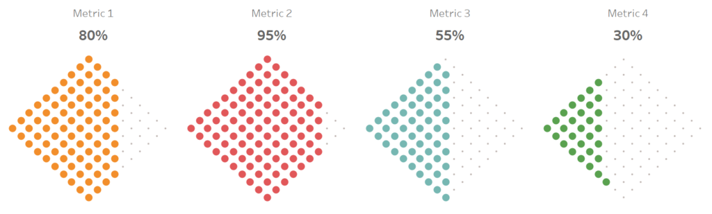
Now play with the filters and we should have the following:
Seriously, how easy was this… but before we go, I want us to have some fun with some variations.
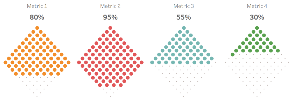
Variation 1
Move the Y from Columns to Rows, and move X from Rows to Columns.
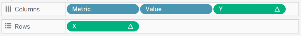
This should give us the following:
Variation 2
Click on X and Y and show Headers, double click on the Y-Axis and select Reverse. You will get the following:
Note: You can reverse the X and Y Axis to change the direction from left to right, or top to bottom.
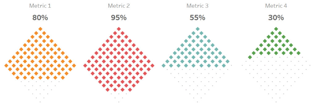
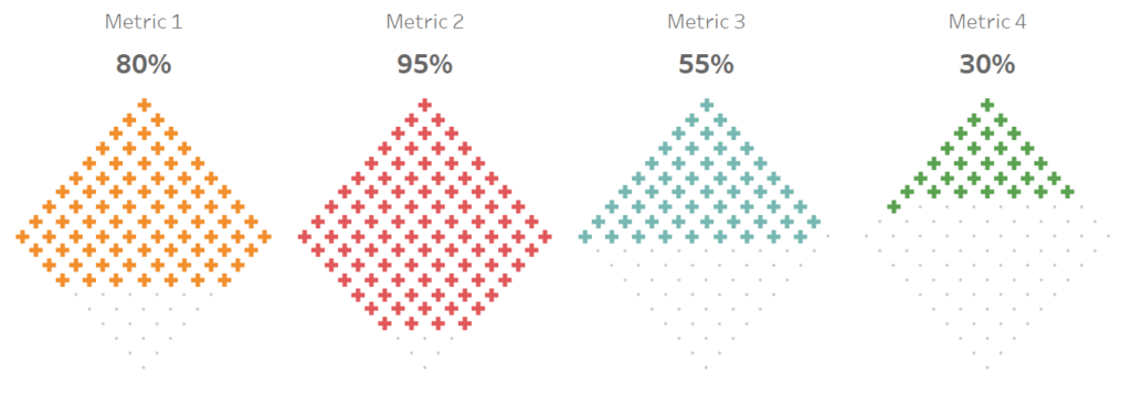
Variation 3
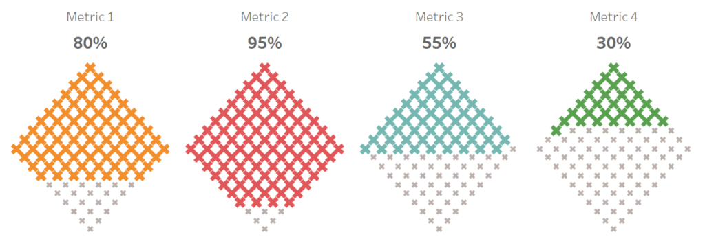
Why limit ourselves to Circles? Change the Mark Type to Shape and let us have some serious fun with this…
Diamond
Plus Sign
Human Shapes
Multiplication Sign
and boom we are done, this was a fun but challenging blog and you can see my version of this visualisation on Tableau Public at
https://public.tableau.com/profile/toan.hoang#!/vizhome/WaffleCharts_15581440681990/WaffleCharts
Summary
I hope you all enjoyed this article as much as I enjoyed writing it and as always do share the love. Do let me know if you experienced any issues recreating this Visualisation, and as always, please leave a comment below or reach out to me on Twitter @Tableau_Magic.
If you like our work, do consider supporting us on Patreon, and for supporting us, we will give you early access to tutorials, exclusive videos, as well as access to current and future courses on Udemy:
- Patreon: https://www.patreon.com/tableaumagic
Also, do be sure to check out our various courses:
- Creating Bespoke Data Visualizations (Udemy)
- Introduction to Tableau (Online Instructor-Led)
- Advanced Calculations (Online Instructor-Led)
- Creating Bespoke Data Visualizations (Online Instructor-Led)


 Table Calculation")


Toan another awesome work from you, thx a ton. I enjoyed this very much
Glad to here it 🙂
Really superb!! Thanks a lot Toan for this and other wonderful charts 🙂
You are welcome 🙂
Hi Toan, thanks for your great ideas. I wonder if you have found the patterns of row numbers
I just found out a small mistake in coloring, for example, it’s really obvious that we have one more point left out. So in calculating the variables of colors and sizes, -1 should be added behind the index. It should be ([Index]-1) /WINDOW_MAX([Index]). Please let me correct me if I am wrong.
Hi Rainbow,
Index should run from 1 to 100. Therefore, if you use -1, then when Index is equal to 100, the formula will give you 0.99 and will not colour the final dot. I will have a better look at this over the weekend.
Kind Regards,
Toan
I am new to Tableau, thanks for your explanation on the index, really appreciate it. I did try both ways but adding -1 just works for me and using [index] alone leads one dot missing (which is exactly what you described). I don’t know why.
Thanks, Toan! I love this viz and have been adapting it for use with one of our dashboards! One thing I noticed though is that when the value is equal to 100%, all of the circles are “small” like the unfilled ones for other values. I’ve tried tinkering around with the calculated fields, but nothing seems to be working. Any ideas?
Interesting, it is because the size will all become a single value when it is 100%. Try changing the size settings from automatic to fixed and see if that solves your issue.
Thanks for the quick response, Toan! Unfortunately, that did not fix the issue. I’m also having the issue that Rainbow mentioned above – i.e. the number of shapes filled in is actually one less than the percentage. It’s actually present in your examples, as well. It’s easiest to see at higher percentages. For example, in all of your screenshots of 95%, you’ll notice there are 6 grey marks instead of 5. I was able to get it right by adding [Index]-1 as stated above, but the issue at 100% is a dealbreaker for my viz. Thanks for your hard work though – if you’re able to resolve that issue in the future, I’d love to use this!
I will update the blog with index – 1 and will try to have a look at the blog over the weekend. Thank you for your comment.
I had a quick look and updated the blog; please check out the updated Calculations.
Thanks again for the quick update, Toan. Just a couple things:
1) The new ‘Color’ calculation throws an error as written because the IF result types don’t match. I updated it to this and it works as expected:
IF [Index]/WINDOW_MAX([Index])<= WINDOW_MAX(MAX([Value])) THEN
WINDOW_MAX(MAX([Metric]))
ELSE
0
END
2) Unfortunately, the size problem with 100% still exists. This may not be an issue for folks who know for certain that their results will never be exactly 100%, but it's worth noting.
Overall though, excellent work and thanks for sharing and being so responsive!
Please send me an email to admin@tableau.toanhoang.com and I will forward you my workbook when I get home tonight.
Me again! Just to follow up on this:
I totally get why this is happening, i.e. since all 100 marks are set to the same color/value, Tableau can’t make a distinction in size. My audience really likes this visualization though, so I got creative and created separate worksheets for when my metrics are exactly 100% and manually resized the marks to match the “bigger” marks for other values. Then I floated them over each other on a dashboard used the ‘sheet switcher’ method to control which one displays as needed. It’s a bit of a kludge, but still works and allows me to use this.
Again, awesome job and your willingness to work with me is very much appreciated!
Toan I’m trying to get this viz to work but stuck on the ‘Color’ formula. After tinkering it with adding -1 and not adding it, it’s still giving me the error message ‘IF expression must match. Can you please help
IF [Index]/WINDOW_MAX([Index])
Hi Samcro, please send me an email to admin@tableau.toanhoang.com
Samcro, I was able to get it working by changing the formula to:
IF [Index]/WINDOW_MAX([Index])<= WINDOW_MAX(MAX([Value])) THEN
WINDOW_MAX(MAX([Metric]))
ELSE
0
END
I also had to make a change I described above to make it work with a value of 100%.
Kyle,
I copied that exact command and I’m still getting the error message. Not sure why
If anyone is still struggling with the color calc then i suggest the below amendment….adding INT in front of the metric field…..
IF [Index]/WINDOW_MAX([Index])
Hi Toan, This is very nice tutorial. However, I am not getting correct color for my waffle chart. I am getting Null values when Path(bin) is 1 .Everything is orange and null value is in Blue. I do not see gray color in waffle.
Can you please help me with this? Also, your tableau public workbook is not downloadable.
Hi Nipa, I have made this workbook downloadable. https://public.tableau.com/profile/toan.hoang#!/vizhome/WaffleCharts_15581440681990/WaffleCharts I will disable download after the weekend. Please let me know if you are still having issues.