

This is one of the most requested tutorials, so I thought why not write it for a little fun. Yes, it a fun Waffle Chart. Now, I could use a scaffold to create the coordinates, however, and knowing me, I prefer to code this into Tableau. This tutorial should take around 15 minutes alongside the variations, so I hope you do enjoy.
Note: This is an alternative type of data visualisation, and sometimes pushed for by clients. Please always look at best practices for data visualisations before deploying this into production.
Data
Load the following data into Tableau Desktop / Public.
Metric,Path,Value
Metric 1,1,0.8
Metric 1,100,0.8
Metric 2,1,0.95
Metric 2,100,0.95
Metric 3,1,0.55
Metric 3,100,0.55
Metric 4,1,0.3
Metric 4,100,0.3
Note: we need two records for each Metric as we are going to be drawing lines and using densification to get more points on our canvas. For more information, check out our article on Data Densification.
Calculated Fields
With our data set loaded into Tableau, we are going to create the following Calculated Fields and Bins:
Create Path (bin)
- Right click on Path, go to Create and select Bins…
- In the Edit Bins dialogue window:
- Set New field name to Path (bin).
- Set Size of bins to 1.
- Click Ok.
Index
INDEX()X
IF [Index] = 1 THEN
    1
ELSEIF [Index] <= 3 THEN
    2
ELSEIF [Index] <= 6 THEN
    3
ELSEIF [Index] <= 10 THEN
    4
ELSEIF [Index] <= 15 THEN
    5
ELSEIF [Index] <= 21 THEN
    6
ELSEIF [Index] <= 28 THEN
    7
ELSEIF [Index] <= 36 THEN
    8
ELSEIF [Index] <= 45 THEN
    9
ELSEIF [Index] <= 55 THEN
    10
ELSEIF [Index] <= 64 THEN
    11
ELSEIF [Index] <= 72 THEN
    12
ELSEIF [Index] <= 79 THEN
    13
ELSEIF [Index] <= 85 THEN
    14
ELSEIF [Index] <= 90 THEN
    15
ELSEIF [Index] <= 94 THEN
    16
ELSEIF [Index] <= 97 THEN
    17
ELSEIF [Index] <= 99 THEN
    18
ELSE
    19
END
Y
IF [X] = 1 THEN
    [Index]-0
ELSEIF [X] = 2 THEN
    [Index]-1.5
ELSEIF [X] = 3 THEN
    [Index]-4
ELSEIF [X] = 4 THEN
    [Index]-7.5
ELSEIF [X] = 5 THEN
    [Index]-12
ELSEIF [X] = 6 THEN
    [Index]-17.5
ELSEIF [X] = 7 THEN
    [Index]-24
ELSEIF [X] = 8 THEN
    [Index]-31.5
ELSEIF [X] = 9 THEN
    [Index]-40
ELSEIF [X] = 10 THEN
    [Index]-49.5
ELSEIF [X] = 11 THEN
    [Index]-59
ELSEIF [X] = 12 THEN
    [Index]-67.5
ELSEIF [X] = 13 THEN
    [Index]-75
ELSEIF [X] = 14 THEN
    [Index]-81.5
ELSEIF [X] = 15 THEN
    [Index]-87
ELSEIF [X] = 16 THEN
    [Index]-91.5
ELSEIF [X] = 17 THEN
    [Index]-95
ELSEIF [X] = 18 THEN
    [Index]-97.5
ELSE
    1
END
Note: we have hardcoded the grid into a Calculated Field as opposed to Scaffolds.
Color
IF [Index]/WINDOW_MAX([Index]) <= WINDOW_MAX(MAX([Value])) THEN
    WINDOW_MAX(MAX([Metric]))
ELSE
    0
END
Size
IF [Index]/WINDOW_MAX([Index])<= WINDOW_MAX(MAX([Value])) THEN
    1
ELSE
    0
END
So now that we have created a lot of Calculated fields, we will now put this together into a Worksheet.
Worksheet
We will now build our first worksheet:
- Change the Mark Type to Circle.
- Drag Metric onto the Filter Pane, and filter to only show Metric 1.
- Drag Metric onto Detail.
- Drag Metric onto Columns.
- Drag Path (bin) onto Columns.
- Right-click on the object and ensure that Show Missing Values is selected.
- Drag this object onto Detail.
- Drag X onto Columns.
- Right-click on this object, go to Compute Using and select Path (bin).
- Drag Y onto Rows.
- Right-click on this object, go to Compute Using and select Path (bin).
- Drag Color onto Color Mark.
- Right-click on this object, go to Compute Using and select Path (bin).
- Drag Size onto the Size Mark.
- Right-click on this object, go to Compute Using and select Path (bin).
- Convert this to Continuous; Edit the Size and set the Start value for range as 0 and End value for range as 1.
If all goes well, you should have the following:

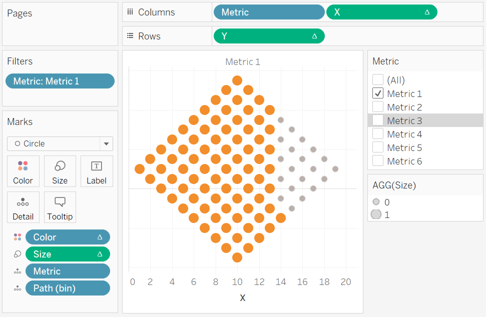
Now we are going to adjust the cosmetics.
- Hide the Grid Lines.
- Hide the Zero Lines.
- Hide the Row Dividers.
- Hide the Column Dividers.
- Hide the X-axis.
- Hide the Y-axis.
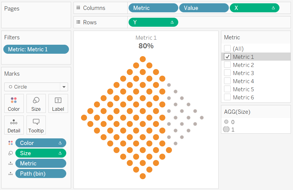
- Drag Values onto Columns.
- Format as a Percentage.
- Set this to be a Discrete Dimension.
- Hide Field Labels for Columns.
- Edit the Colors
If all goes well, you will want to have the following:

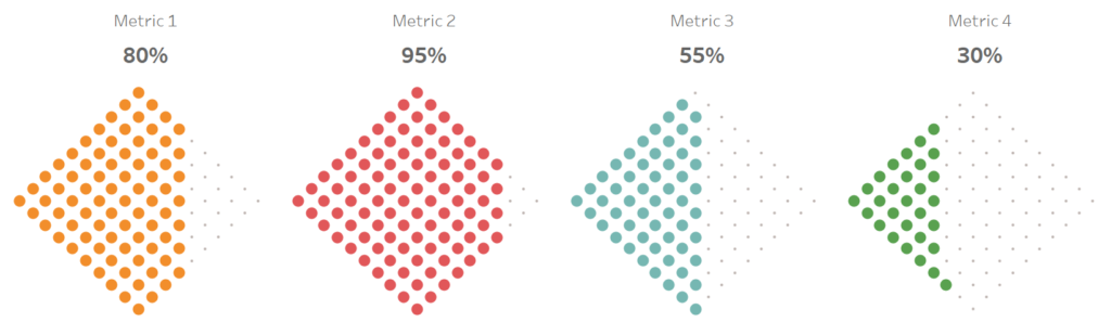
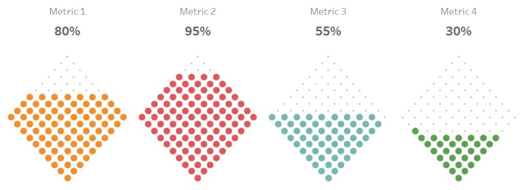
Now play with the filters and we should have the following:

Seriously, how easy was this… but before we go, I want us to have some fun with some variations.
Variation 1
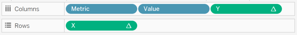
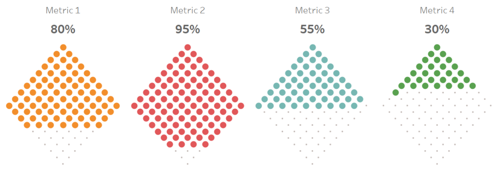
Move the Y from Columns to Rows, and move X from Rows to Columns.

This should give us the following:

Variation 2
Click on X and Y and show Headers, double click on the Y-Axis and select Reverse. You will get the following:

Note: You can reverse the X and Y Axis to change the direction from left to right, or top to bottom.
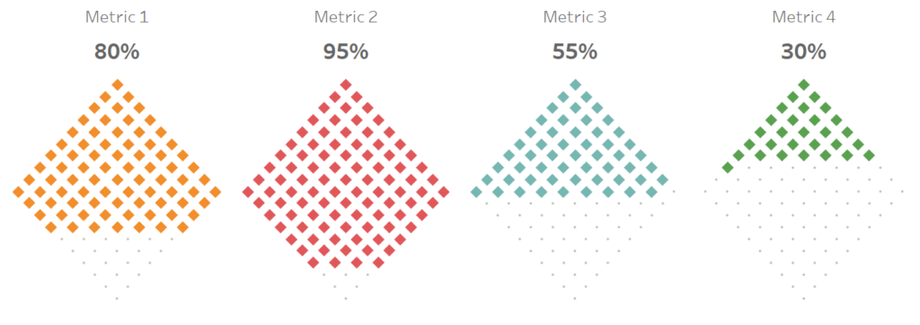
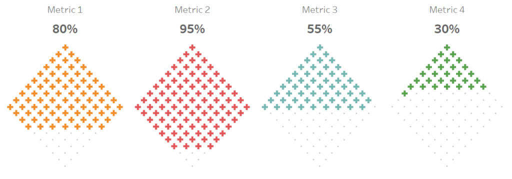
Variation 3
Why limit ourselves to Circles? Change the Mark Type to Shape and let us have some serious fun with this…
Diamond

Plus Sign

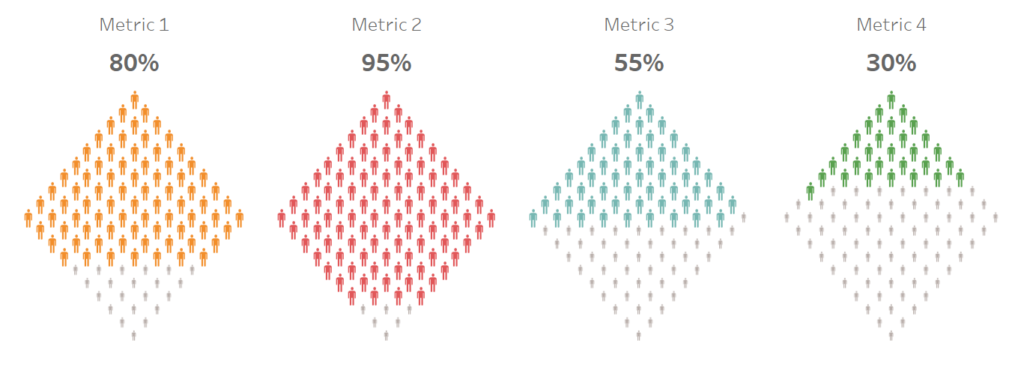
Human Shapes

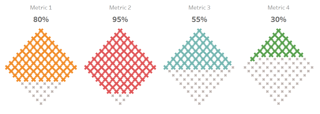
Multiplication Sign
and boom we are done, this was a fun but challenging blog and you can see my version of this visualisation on Tableau Public at
https://public.tableau.com/profile/toan.hoang#!/vizhome/WaffleCharts_15581440681990/WaffleCharts
Summary
I hope you all enjoyed this article as much as I enjoyed writing it and as always do share the love. Do let me know if you experienced any issues recreating this Visualisation, and as always, please leave a comment below or reach out to me on Twitter @Tableau_Magic.
If you like our work, do consider supporting us on Patreon, and for supporting us, we will give you early access to tutorials, exclusive videos, as well as access to current and future courses on Udemy:
- Patreon: https://www.patreon.com/tableaumagic
Also, do be sure to check out our various courses:
- Creating Bespoke Data Visualizations (Udemy)
- Introduction to Tableau (Online Instructor-Led)
- Advanced Calculations (Online Instructor-Led)
- Creating Bespoke Data Visualizations (Online Instructor-Led)