


")


After years of using Tableau, I was finally given a use case that would allow me to create an Arc Chart; I always strive to build the best visualization for the client’s requirements. The client wanted to visualize the number of issues that were being escalated from each level. In this tutorial, I will go through the steps to create an Arc Chart.
Data
Our data set will consist of:
| Step | Start Point | End Point | Path | Escalations |
| A to B | 1 | 2 | 1 | 10 |
| A to B | 1 | 2 | 181 | 10 |
| A to C | 1 | 3 | 1 | 4 |
| A to C | 1 | 3 | 181 | 4 |
| A to D | 1 | 4 | 1 | 2 |
| A to D | 1 | 4 | 181 | 2 |
| A to E | 1 | 5 | 1 | 1 |
| A to E | 1 | 5 | 181 | 1 |
| B to C | 2 | 3 | 1 | 5 |
| B to C | 2 | 3 | 181 | 5 |
| B to D | 2 | 4 | 1 | 2 |
| B to D | 2 | 4 | 181 | 2 |
| B to E | 2 | 5 | 1 | 1 |
| B to E | 2 | 5 | 181 | 1 |
| C to D | 3 | 4 | 1 | 4 |
| C to D | 3 | 4 | 181 | 4 |
| C to E | 3 | 5 | 1 | 2 |
| C to E | 3 | 5 | 181 | 2 |
| D to E | 4 | 5 | 1 | 4 |
| D to E | 4 | 5 | 181 | 4 |
Copy and paste this into Tableau and look at the data.
Note: We could have used the left and right functions to isolate the level and then use Calculated Fields to work out the Start Point and End Point, but for simplicity we I will include this in the data set. But if you want to try, use something like IF LEFT([Step],1) = “A” THEN 1…
Calculated Fields
We will create a Path (bin) object by:
- Right click on Path
- Go to Create, Bins…
- In Edit [Path] set the Size of bins to 1
- Click Ok

Create the following Calculated Fields by as follows:
Index:
INDEX()-1WC_PI:
WINDOW_MAX(MAX(PI()))WC_End Point:
WINDOW_MAX(MAX([End Point]))WC_Start Point:
WINDOW_MAX(MAX([Start Point]))WC_Step Size:
([WC_End Point]-[WC_Start Point])/2WC_Escalations:
WINDOW_MAX(MAX([Escalations]))X:
((COS([Index]*[WC_PI]/180))*[WC_Step Size])Y:
SIN([Index]*[WC_PI]/180)*[WC_Step Size]Now that we have all the Calculated fields, we will now go about building our worksheet.
The Worksheet
Let’s start by dragging our Calculated fields onto the worksheet:
- Drag Step onto Detail Mark
- Drag Path (Bin) onto Columns
- Right-click on Path (bin) to ensure the Show Missing Values is checked.
- Drag Path (bin) onto the Details Mark
- Drag X onto Columns
- Right click on X, select Compute Using and choose Path (Bin)
- Drag Y onto Rows
- Right click on Y, select Compute Using and choose Path (Bin)
- Change the Mark Type to Line
- Drag Index onto the Path Mark
- Right click on Index, select Compute Using and choose Path (Bin)
- Drag WC_Escalations onto the Size Mark
- Right click on WC_Escalations, select Compute Using and choose Path (Bin)
You should now see the following:
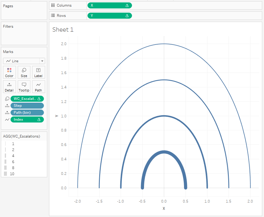
Ok, we are not quite there yet, but we are getting there.
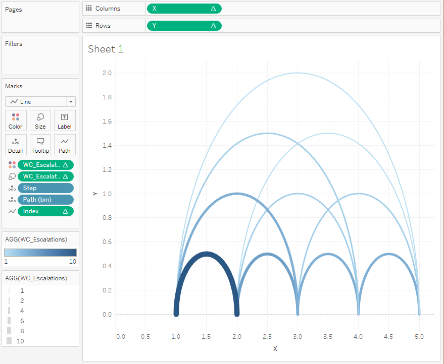
- Edit the X Calculated Field by changing it to:
- ((COS([Index]*[WC_PI]/180))*[WC_Step Size])+[WC_Step Size]+[WC_Start Point]
This will shift the half circles and will give you the following:
nd we are done, at least from a technical perspective.
Now do the following:
- Remove Gridlines and other lines, so that we get a white background
- Fix the x-axis to be from 0.75 to 5.25
- Hide the X and Y Axis
- Add some tooltips
- Add Labels underneath the visualisation in a dashboard
In the end, hopefully, you will have something that looks like this.
his type of chart can be used to highlight:
- Time spent at each stage of a manufacturing process
- Drop-offs on during an online sales process
- Visitor drop-offs for views on a website
I hope you enjoyed following this blog and, as always, let me know your comments below, or on Twitter at @Tableau_Magic.
If you like our work, do consider supporting us on Patreon, and for supporting us, we will give you early access to tutorials, exclusive videos, as well as access to current and future courses on Udemy:
- Patreon: https://www.patreon.com/tableaumagic
Also, do be sure to check out our various courses:
- Creating Bespoke Data Visualizations (Udemy)
- Introduction to Tableau (Online Instructor-Led)
- Advanced Calculations (Online Instructor-Led)
- Creating Bespoke Data Visualizations (Online Instructor-Led)


 in Tableau")


