
Requested by a student, here is a tutorial on adding Textures to Bar Charts to create a very nice and interesting effect. This uses data densification as well as images in order to help us build this Bespoke Data Visualization in Tableau.
Note: This is an alternative type of data visualisation, and sometimes pushed for by clients. Please always look at best practices for data visualisations before deploying this into production. Apart from infotainment, I do not see a strong use case for using this type of visualisation.
Data
We will start by loading the Sample Superstore data into Tableau Desktop / Tableau Public.
Note: If you have Tableau Desktop, you can use the Sample data source, but if you are using Tableau Public, download and load the following data source.
Calculated Fields
With our data set loaded into Tableau, we are going to create the following Parameter, Bin, Calculated Fields:
Path
If [Sub-Category] = "Accessories" THEN
    0
ELSE
    100
END
Path (bin)
- Right-click on Path, go to Create and select Bins…
- In the Edit Bins dialogue window:
- Set New field name to Path (bin)
- Set Size of bins to 5
- Click Ok
Index
INDEX()-1TC_Sales
WINDOW_SUM(SUM([Sales]))TC_Total Sales
WINDOW_SUM(SUM([Sales]))TC_Percentage
[TC_Sales]/[TC_Total Sales]TC_Percentage (Adjusted)
[TC_Percentage]/WINDOW_MAX([TC_Percentage])TC_Shape
IF [Index]/WINDOW_MAX([Index]) <= [TC_Percentage (Adjusted)] THEN
    WINDOW_MAX(MAX([Region]))
ELSE
    NULL
END
With this done, let us start creating our data visualisation.
Worksheet
We will now build our worksheet:
- Change the Mark Type to Shape
- Drag Path (bin) onto the Rows Shelf
- Right-click on this pill and ensure that Show Missing Values is selected
- Drag this pill onto the Detail Mark
- Drag Region onto the Rows Shelf
- Drag Index onto the Column Shelf
- Right-click on the pill, go to Compute Using and select Path (bin)
If all goes well, you should see the following:


We will now add our shapes.
- Drag TC_Shape onto the Shape Mark
- Right-click on this pill, go to Compute Using and select Path (bin)
- Right-click TC_Shape and select Edit Table Calculations…
- In Nested Calculation select TC_Total Sales
- In Compute Using select Specific Dimensions
- Ensure that Path (bin) and Region is select with Path (bin) on top
- In Nested Calculations select TC_Percentage (Adjusted)
- In Compute Using select Specific Dimensions
- Ensure that Path (bin) and Region is select with Path (bin) on top
- In Nested Calculation select TC_Total Sales
If all goes well, you should see the following:


I have prepared some shape for you to use to create the desired pattern; these have been taken from Bootstrap and then edited in Photoshop.
Download this file and unzip into you My Tableau Repository > Shapes
With the Shapes downloaded and unzipped, we can now click on the Shape Mark and apply our new shapes for each Region. Note: If the shapes are not visible, click on Reload Shapes.
After applying the shapes and adjusting the Size, I want you to filter out the null values so that you see the following:


Now we will adjust the cosmetics:
- Drag TC_Percentage onto the Rows Shelf
- Right-click on this pill and convert this to a Dimension
- Right-click on this pill and format as a Percentage
- Add a Row Divider
- Hide the Zero Line and Grid Line
- Hide the Axis Header
- Disable the Tooltip
- Adjust the Fonts
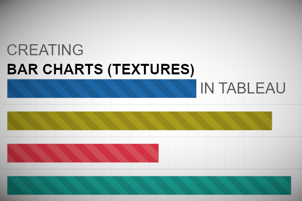
You should now see our final visualization:


and boom, we are done! I hope you enjoyed creating this data visualization and learned some cool techniques as well. As always, you can find this data visualisation on Tableau Public at https://public.tableau.com/profile/toan.hoang#!/vizhome/BarChartTextured/BarChartTextured
Summary
I hope you all enjoyed this article as much as I enjoyed writing it and as always do share the love. Do let me know if you experienced any issues recreating this Visualization, and as always, please leave a comment below or reach out to me on Twitter @Tableau_Magic. Do also remember to tag me in your work if you use this tutorial.
If you like our work, do consider supporting us on Patreon, and for supporting us, we will give you early access to tutorials, exclusive videos, as well as access to current and future courses on Udemy:
- Patreon: https://www.patreon.com/tableaumagic
Also, do be sure to check out our various courses:
- Creating Bespoke Data Visualizations (Udemy)
- Introduction to Tableau (Online Instructor-Led)
- Advanced Calculations (Online Instructor-Led)
- Creating Bespoke Data Visualizations (Online Instructor-Led)