
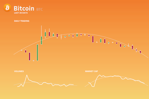
Once a month, I am going to write a full feature-length tutorial on creating an intricate multi-feature dashboard for you to work through and enjoy. We are going to start with my Cryptocurrency Dashboard that you can see on Tableau Public here: https://public.tableau.com/profile/toan.hoang#!/vizhome/Cryptocurrency-Last30Days/CryptoDashboard


This dashboard consists of several interesting key components:
- A Candlestick Chart showing the stock price for the last 30 days.
- A Line Chart showing the Volumes trend for the last 30 days.
- A Line Chart showing the Market Cap trend for the last 30 days.
- A Cryptocurrency Icons and Coin Name; we will retrieve these icons from the Tableau Magic GitHub repository.
- A Popup Menu showing allowing you to select a list of available Cryptocurrencies; this will use Parameter Filters.
- A dynamically generated Gradient Background based on the selected Cryptocurrency; this will use Data Densification.
This will be a lengthy tutorial, but hopefully, you will pick up a few techniques that you can use in your other dashboards. So let us get started by sourcing your data.
Data
We will start by sourcing our data from the CoinMarketCap website: https://coinmarketcap.com
Note: As you will be sourcing your own data, the charts will most likely look different as you are seeing this tutorial more than a month after I have written it.
On the CoinMarketCap home page:
- Click on Bitcoin.
- Click on Historical Data; you should see a table containing information for the past 30 days.
- Copy and paste this table into a Spreadsheet editor (Excel, OpenOffice, or whatever you fancy); ignore formatting if you can as we just want pure text.
- Name the Tab as Bitcoin (BTC); this is the name of the coin followed by the abbreviation.
- Repeat this for the Top 10 coins by Market Capital.
You should hopefully have the following (note that I am using Excel):

Save this file as we will use this throughout this tutorial. Now that we have our file, please we are going to load this into Tableau and Union all of the sheets:
- Open Tableau Desktop / Tableau Public
- Until To a File select Microsoft Excel and locate your file
- In the Data Source Editor window, drag Binance Coin (BNB) onto the Query Editor.
- Ctrl (or command) select the remaining 9 Sheets and drag to hover below Binance Coin (BNB); once you see the Drag table to Union, let go.
- Change the Date type to Date.
- Hide the Sheet column.
- Rename Table Name to Coin Name.
- Change the name from Binance Coin (BNB)+ (Crypto) to Crypto Data.
You should see the following:


Now we will create our data visualisations:
Candlestick Chart
Using our Crypto Data we are now going to create our Candlestick Chart by creating the following Parameter and Calculated Fields:
Coin Name Parameter
- Set Name to Coin Name Parameter
- Set Data type to String
- In Allowable values select List
- Under Fixed, go to Add values from and select Coin Name
- Click Ok
Coin Name Filter
[Coin Name] = [Coin Name Parameter]Note: we are using a parameter as we will use Parameter Actions to change this value.
Low-High
SUM([Low])-SUM([High])Close-Open
SUM([Close**])-SUM([Open*])So with these created, let us complete our Candlestick Chart:
- Rename your Sheet from Sheet 1 to Candlestick
- Drag Coin Name Filter onto the Filter Shelf and select True
- Drag Date onto the Columns Shelf
- Right-click on this pill and select Exact Date
- Change the Mark Type to Gantt
- Drag High onto the Rows Shelf
- Drag Open* onto the Rows Shelf
- On the SUM(High) Marks Panel
- Drag Low-High onto the Size Mark
- On the SUM(Open*) Marks Panel
- Drag Close-Open onto the Size Mark
- Drag Close-Open onto the Color Mark
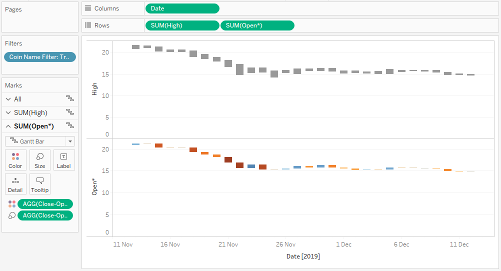
You should now see the following:

We will now adjust the Cosmetics:
- Right-click on SUM(Open*) on the Rows Shelf and select Dual Axis
- Right-click on the Axis Header and select Synchronize Axis
- Double-click on the Axis Header and untick Include zero
- Hide All Axis Headers (High, Open* and Date)
- Right-click on the view and select Format
- In Format Borders, set the Row Divider and Column Divider to None
- In Format Lines, set Zero Line and Row Grid Lines to None
- In Format Shading, set the Default Worksheet to None; this will give you a transparent background
- In the SUM(High) Marks Panel
- Set the Size to 25%
- Set the Color to the lightest Non-White; we White, but we still want to be able to see something
- In the SUM(Open*) Marks Panel
- Click on the Color Mark and select Edit Color
- In Palette select Red-Green Diverging
- Set Stepped Color to 2
- Click on Advanced and set Center to 0
- Click Ok
- In the All Marks Panel
- Drag Close**, High, Low and Open* onto the Tooltips
- Edit the text of the Tooltip
- Right-click on the view, go to Trend Lines, Show Trend Lines and select SUM(High)
- Click on the Trend Line and select Edit. In Model type select Polynomial, and set Degree to 3
- Click on the Trend Line and select Format. Edit the Trend Lines to be dashed, white and thin.
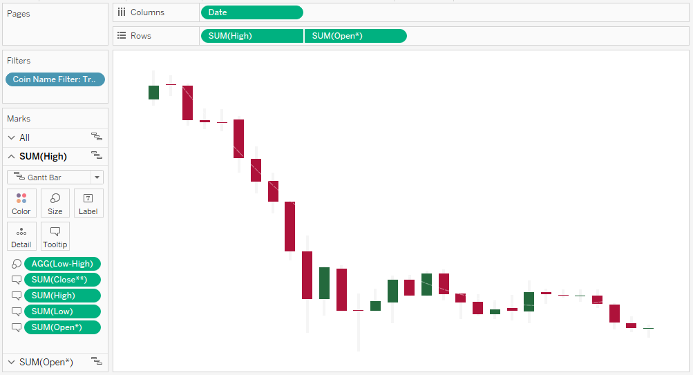
You should now have a completed Candlestick Chart where you can use a filter to change the Coin:

Do not worry if you cannot see the white lines yet, they will show up very nicely once we have our gradient background.
But to finish this off, we will create our Dashboard.
- Click on the New Dashboard button
- Set the Size to Fixed and to be 1,300 x 800
- In the Dashboard menu (menu bar), go to Format and set the Default Shading to Dark Gray.
- Select Float and Drag our Candlestick Sheet onto the Dashboard
- In Layout apply the following settings:
- Position X = 120
- Position Y = 150
- Size W = 1,050
- Size H = 350
- Set the Title to be DAILY TRADING; set the Font to Tableau Bold and Size to be 12.
You should now see the following:


Now, this is artwork for sure, but we have only just begun.
Volume and Market Cap Charts
The bottom two Worksheets are pretty simple to do, so we will create them quickly:
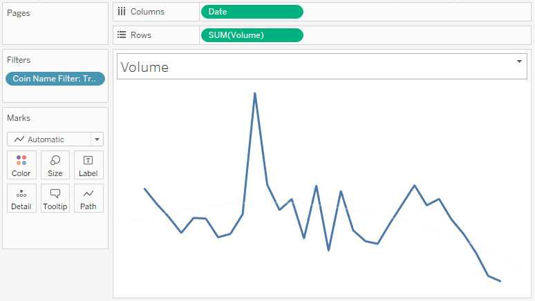
- Create a New Worksheet called Volume
- Drag Coin Name Filter onto the Filter Shelf and select True
- Drag Date onto the Columns Shelf
- Right-click on this pill and select Exact Date
- Drag Volume onto the Rows Shelf
- Double-click on the Volume Axis and ensure that Include zero is unticked
- Right-click on the view, go to Trend Lines and Show Trend Lines
- Click on the Trend Line and select Edit. In Model type select Polynomial, and set Degree to 3
- Click on the Trend Line and select Format. Edit the Trend Lines to be dashed, white and thin.
- Hide Axis Headers, Gird Lines, Rows Lines and Axis Rulers.
- Set the Worksheet colour to None
You should now see the following:

Note: if the Mark Type is automatic and you don’t see a line chart, chart the Mark Type to Line.
Now, I want you to change the line colour and add this to our dashboard:
- Click on the Color Mark and change the Color to White.
- With Floating selected, drag this Worksheet onto your Dashboard.
- In Layout apply the following settings:
- Position X = 120
- Position Y = 530
- Size W = 500
- Size H = 150
- Set the Title to be VOLUMES; set the Font to Tableau Bold and Size to be 12.
You should now see the following:


Now we are doing to create the Market Cap Trends:
- Right-click on the Volumes Sheet and select Duplicate
- Drag Market Cap on top of SUM(Volumes) in the Row Shelf
- Double-click on the Market Cap Header and ensure that Include zero is unticked; then hide the Axis Header.
- Now we will drag this Worksheet onto our Dashboard
- In Layout apply the following settings:
- Position X = 670
- Position Y = 530
- Size W = 500
- Size H = 150
- Set the Title to be MARKET CAP; set the Font to Tableau Bold and Size to be 12.
If all goes well, you should now have the following:


This is the basis of our Cryptocurrency Data Visualization. I hope you have had fun so far, and now we are going to get into the really interesting stuff.
Pop up Menu
We will now create our Popup menu, but first, we need to download some Cryptocrrecy Icons:
- Go to https://github.com/tableaumagic/tableau-icons
- Click on Cryptocurrency.zip
- Select Download
- Now Unzip the contents of this zip file to your My Tableau Repository > Shapes
This will load the Cryptocurrency icons that we will use in our dashboard.
We need to create the following Calculated Field:
Zero
0Latest Price by Coin
IF [Date] = { MAX([Date]) } THEN
    [Close**]
ELSE
    0
END
Latest Volume by Coin
IF [Date] = { MAX([Date]) } THEN
    [Volume]
ELSE
    0
END
Latest Market Cap by Coin
IF [Date] = { MAX([Date]) } THEN
    [Market Cap]
ELSE
    0
END
Now, create a New Worksheet called Menu
- Drag Coin Name onto the Rows Shelf
- Drag Zero to the Columns Shelf four times
- Each of these pills will represent a column
- On the First SUM(Zero) Marks Panel
- Change the Mark Type to Shape
- Drag Coin Name onto the Shape Mark
- Click on the Shape Mark and apply icons from the Cryptocurrency Color to the coin; if the folder does not show up, click on Reload Shapes
- Increase the Size to 75%
You should hopefully see the following:


We will now complete this menu:
- On the Second SUM(Zero) Marks Panel
- Change Mark Type to Text
- Drag Latest Price by Coin onto the Text Mark
- Click on the Text Mark and add Latest Price label
- Right-click on the SUM(Latest Price by Coin) and format the number to Dollars (2 decimal place)
- On the Third SUM(Zero) Marks Panel
- Change Mark Type to Text
- Drag Latest Volume by Coin onto the Text Mark
- Click on the Text Mark and add a Latest Volume label
- Right-click on the SUM(Latest Volume by Coin) and format the number to Dollars (2 decimal place)
- On the Fourth SUM(Zero) Marks Panel
- Change Mark Type to Text
- Drag Latest Market Cap by Coin onto the Text Mark
- Click on the Text Mark and add Latest Market Cap label
You should now see the following:


Now apply some formatting to give this a crisper look:


A few points:
- Disable Tooltips
- Add a Row Divider
- Remove Zero Lines and Grid Lines
- Use Tableau Bold Font to highlight the values
- Sort Coin Name by Market Cap
Now we will add this to our dashboard:
- Using Float, drag a Vertical Container onto the Dashboard
- In Layout apply the following settings:
- Position X = 550
- Position Y = 40
- Size W = 700
- Size H = 700
- Click on the down arrow and select Add/Show Hide Button
- Set the Button Background Color to White
- In Layout apply the following settings:
- Using Tiled, drag our Menu worksheet onto the Vertical Container
You should now have the following:


Now you can keep your hand on Alt and hide and show this menu. Cool huh… however, to finish off our Menu, we will add a Parameter Action:
- Go to the Dashboard Menu (Application Menu) and select Actions…
- Go to Add Action and select Change Parameter
- Set Name to Menu
- Only select the Menu Worksheet
- Set Run action on as Select
- Set Target Parameter to Coin Name Parameter
- Set Field to Coin Name and Aggregation as None
Now you should be able to click on a row in the Menu and have your visualisation updated.
Dashboard Header
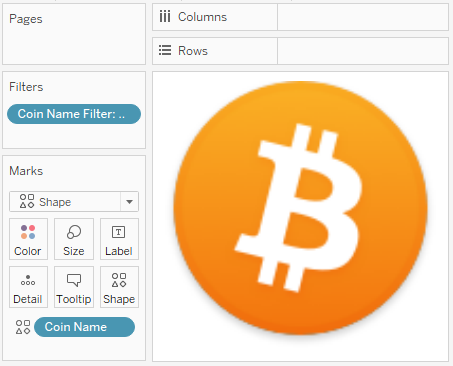
Create a New Worksheet called Icon
- Change the Mark Type to Shape
- Drag Coin Name Filter onto the Filter Shelf and select True
- Drag Coin Name onto the Shape Mark
- Adjust the Size to 50%
- Set the Worksheet Background to None
- Disable the Tooltips
You should now see the following:

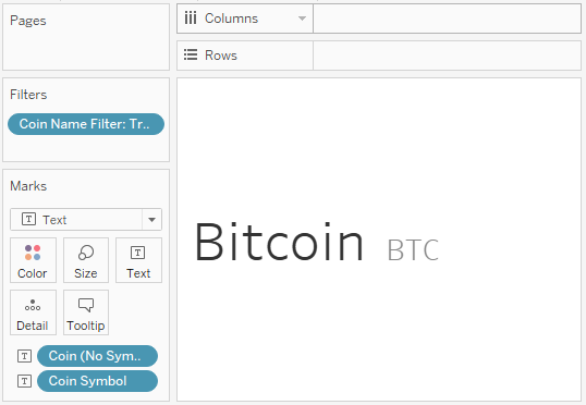
We will need to quickly create the following two Calculated Fields
Coin (No Symbol)
MID([Coin Name],0,FIND([Coin Name]," (",0))Coin Symbol
LEFT(RIGHT([Coin Name], LEN([Coin Name])-FIND([Coin Name], " (",0)-1),
LEN(RIGHT([Coin Name], LEN([Coin Name])-FIND([Coin Name], " (",0)-1))-1)
Now we will create a New Worksheet called Header
- Change the Mark Type to Text
- Drag Coin Name Filter onto the Filter Shelf and select True
- Drag Coin (No Symbol) to the Text Mark
- Drag Coin Symbol onto the Text Mark
Edit the text so that you have the following:

As you can see these are two nice and simple Worksheets. Let us add this to our dashboard:
- For the Header Worksheet, Change the Coin (No Symbol) to White
- Set the Worksheet Background to None
You will want to end up with something like the following:


As you can see we are getting really close to completing our Data visualization now, we just need to add a cool background, so let us do it!!!
Gradient Background
The final step for us is to create our Gradient Background and this will require a little data densification.
Let us start by copying and pasting this into your dashboard (this is a quick and simple way to load data into Table):
Coin
XRP (XRP)
Tether (USDT)
Stellar (XLM)
Litecoin (LTC)
Ethereum (ETH)
EOS (EOS)
Bitcoin SV (BSV)
Bitcoin Cash (BCH)
Bitcoin (BTC)
Binance Coin (BNB)
Once your data is loaded into Tableau, right-click on the data source and click on Edit Data Source… with the Data Source Editor open, paste the following:
Path,Position
100,0
0,0
100,1
0,1
You should get an error as there is no joining column, however, click on Add new join clause, go to Create Join Calculation, type 1 and click OK. Do this for the right-hand side as well. Ensure that you have Inner join selected and you should see the following:

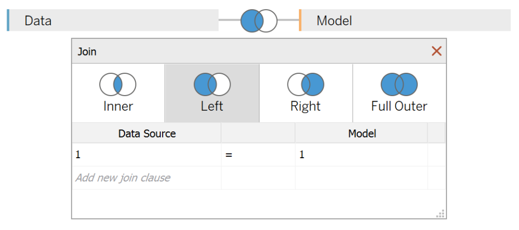
Note: we need additional records as we are going to be drawing lines and using densification to get more points on our canvas. For more information, check out our article on Data Densification.
We will now create the following Bin and Calculated Fields:
Path (bin)
- Right-click on Path, go to Create and select Bins…
- In the Edit Bins dialogue window:
- Set New field name to Path (bin).
- Set Size of bins to 1.
- Click Ok.
Coin Name Filter
[Coin] = [Coin Name Parameter]Index
INDEX()-1TC_Color
WINDOW_MAX(MAX([Coin]))+STR([Index])With these created we will create a New Worksheet called Gradient Background:
- Change the Mark Type to Line
- Drag Coin Name Filter to the Filter Shelf and select True
- Drag Position onto the Columns Shelf; right-click and convert this to Dimension
- Drag Coin onto the Detail Mark
- Drag Path (bin) onto the Rows Shelf
- Right-click on this pill and ensure that Show Missing Values is selected
- Drag this pill onto the Detail Mark
- Drag Index onto the Rows Shelf
- Right-click on this pill, go to Compute Using and select Path (bin)
You should now see the following:

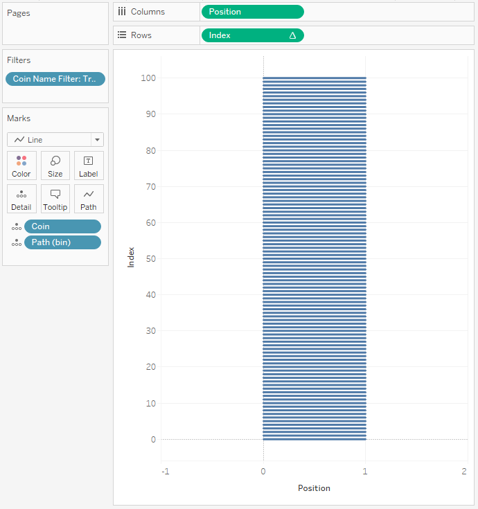
Now, this is where the fun starts.
- Drag TC_Color onto the Color Mark
- Right-click on this pill, go to Compute Using and select Path (bin)
- Click on the Color Mark and select Edit Color
- Under Select Color palette select Orange
- Click Assign Palette
- Click Ok
You should now see the following:

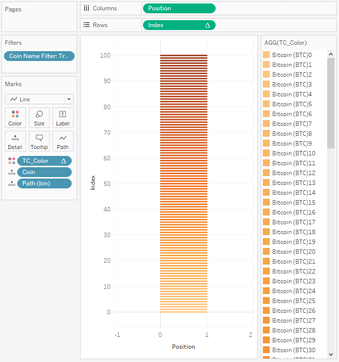
As you can see we have created a gradient effect with an Orange Color for Bitcoin. We will need to change the Parameter and set the appropriate colours for each coin, but before that, let us adjust our cosmetics:
- Edit the Path (bin) by setting the Size of bin to 0.2
- Fix the Index Axis Header to be from 0 to 500
- Fix the Position Axis Header to be from 0 to 1
- Hide Grid Lines and Zero Lines
- Disable Tooltips
You should now have the following:


So once we have gone through all the Cryptocurrencies and set the colour, we can now add this sheet to our dashboard.
- Using Tiled, drop the Gradient Background Worksheet to the topmost container
You should now have the following examples:


Note: you can change your button icons, I have found white buttons
now you can tweak this as much as you fancy, however, we are now done with this long, but hopefully fun End-to-End Tableau tutorial. As always, you can find my data visualisation here: https://public.tableau.com/profile/toan.hoang#!/vizhome/Cryptocurrency-Last30Days/CryptoDashboard
Summary
I hope you all enjoyed this article as much as I enjoyed writing it and as always do share the love. Do let me know if you experienced any issues recreating this Visualization, and as always, please leave a comment below or reach out to me on Twitter @Tableau_Magic. Do also remember to tag me in your work if you use this tutorial.
If you like our work, do consider supporting us on Patreon, and for supporting us, we will give you early access to tutorials, exclusive videos, as well as access to current and future courses on Udemy:
- Patreon: https://www.patreon.com/tableaumagic
Also, do be sure to check out our various courses:
- Creating Bespoke Data Visualizations (Udemy)
- Introduction to Tableau (Online Instructor-Led)
- Advanced Calculations (Online Instructor-Led)
- Creating Bespoke Data Visualizations (Online Instructor-Led)