
Since releasing our popular Satellite Chart Tutorial, see Drawing Satellite Charts and Variations in Tableau, I have received numerous request for help in creating a layered version of this chart, or an Orbit Chart. As such, in this tutorial, we will go through the process of creating an Orbit Chart in Tableau.
Note: This is an alternative type of data visualisation, and sometimes pushed for by clients. Please always look at best practices for data visualisations before deploying into production.
Data
Load the following data into Tableau Desktop / Public.
| Country | Path | Percentage of Sales |
| United Kingdom | 1 | 0.4 |
| United Kingdom | 361 | 0.4 |
| United States | 1 | 0.3 |
| United States | 361 | 0.3 |
| Germany | 1 | 0.2 |
| Germany | 361 | 0.2 |
| France | 1 | 0.1 |
| France | 361 | 0.1 |
Note: we need two records for each Country as we are going to be drawing lines and using densification to get more points on our canvas. For more information, check out our article on Data Densification.
Calculated Fields
With our data set loaded into Tableau, we are going to create the following Calculated Fields, Bins and Parameters:
Path (bin)
- Right click on Path, go to Create and select Bins…
- In the Edit Bins dialogue window:
- Set New field name to Path (bin).
- Set Size of bins to 1.
- Click Ok.
Distance from Center
Create the following parameter with:
- Set Name as Distance from Center.
- Set Data type as Integer.
- Set Current value as 3.
- Set Allowable values as Range.
- Set Minimum as 3.
- Set Maximum as 10.
Index
INDEX()-1TC_Percentage of Sales
WINDOW_MAX(MAX([Percentage of Sales]))TC_Rank
RANK_UNIQUE([TC_Percentage of Sales],'asc')X
SIN(RADIANS([Index]))*([Distance from Center]+[TC_Rank])Y
COS(RADIANS([Index]))*([Distance from Center]+[TC_Rank])Size
IF [Index]>=(360*[TC_Percentage of Sales]) AND [Index]<(360*[TC_Percentage of Sales])+1 THEN
    [TC_Percentage of Sales]
ELSE
    0
END
So now that we have created a lot of Calculated fields, we will now put this together into a Worksheet.
Worksheet
We will now build our worksheet:
- Change the Mark Type to Line.
- Drag Country onto the Color Mark.
- Drag Path (bin) onto Columns.
- Right-click on the object, ensure that Show Missing Values is checked.
- Drag this object onto th Path Mark.
- Drag Size on Size Mark.
- Right-click on the object, go to Using and select Path (bin).
- Adjust the Size to 75%.
- Drag TC_Percentage of Sales onto Tooltip.
- Right-click on the object, go to Using and select Path (bin).
- Drag X onto Columns.
- Right-click on the object, go to Using and select Path (bin).
- Drag Y onto Rows.
- Right-click on the object, go to Using and select Path (bin).
If all goes well you should see something like the following:

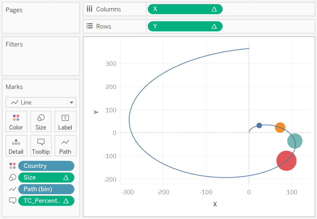
Now, you have to admit, this looks pretty cool, but we are now going to update the Table Calculations for X and Y.
- Right-click on X and click on Edit Table Calculation…
- With Nested Calculations set to TC_Rank.
- Set Using to Specified Dimensions.
- Ensure that only Country is checked.
- With Nested Calculations set to TC_Rank.
- Right-click on Y and click on Edit Table Calculation…
- With Nested Calculations set to TC_Rank.
- Set Using to Specified Dimensions.
- Ensure that only Country is checked.
- With Nested Calculations set to TC_Rank.
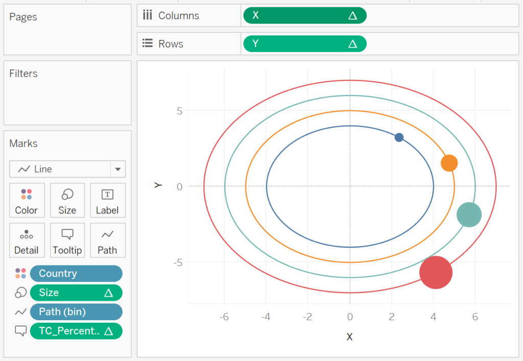
If all goes well, you should see the following:

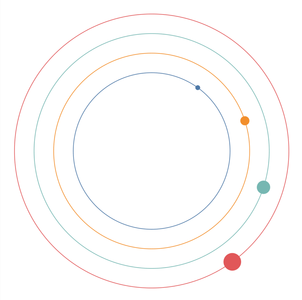
And now we need to adjust the cosmetics by:
- Remove the Headers.
- Remove the Grid and Zero Lines.
- Adjust the Tool Tips.
- Adjust the Distance from parameter.
You should now see the following:

and boom, we are done… nice and simple and a small adjustment from the previous tutorial on drawing Satellite Charts in Tableau. And like the previous tutorial, let us have some fun with some variations.
Orbit Chart / Variable 1
Change the Mark Type to Circle.


Also try changing the Mark Type to Shape and exploring what can be done, literally, load an image of a comet and see what it looks like, or potentially a planet. Now that I think about it, set the background as transparent and have an image of the Sun in the background.
Orbit Chart / Variation 2
Take the original and change Size to IF [Index]<(360*[TC_Percentage of Sales])+1 THEN 1 ELSE 0 END for the following:


are we having fun yet? This is a variation of a Radial Chart Chart.
Orbit Chart / Variation 3
For our final variation, take the original data visualisation and change:
X
SIN(RADIANS([Index]*[TC_Percentage of Sales]))*([Distance from Center]+[TC_Rank])Y
COS(RADIANS([Index]*[TC_Percentage of Sales]))*([Distance from Center]+[TC_Rank])Size
IF [Index] = 360 THEN 1 ELSE 0 ENDYou should now see the following:

I was going to write a blog on Radial Lollipop Charts, so here you go.
Summary
I hope you all enjoyed this article as much as I enjoyed writing it and as always do share the love. Do let me know if you experienced any issues recreating this Visualisation, and as always, please leave a comment below or reach out to me on Twitter @Tableau_Magic.
If you like our work, do consider supporting us on Patreon, and for supporting us, we will give you early access to tutorials, exclusive videos, as well as access to current and future courses on Udemy:
- Patreon: https://www.patreon.com/tableaumagic
Also, do be sure to check out our various courses:
- Creating Bespoke Data Visualizations (Udemy)
- Introduction to Tableau (Online Instructor-Led)
- Advanced Calculations (Online Instructor-Led)
- Creating Bespoke Data Visualizations (Online Instructor-Led)