Animated Chess Tutorial in Tableau
I was looking for a new hobby during the COVID lockdowns, so I decided to go back to my childhood and to check out Magic the Gathering; if you do not...
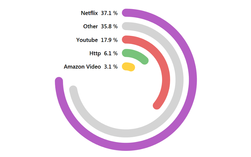
Creating Circular KPIs in Tableau
After the Barcelona vs Bayern Munich Semi-Finals for the Champions League 2020, I was browsing Twitter to see reactions and saw a circular KPI visualisation and thought that I would create...
INDEX() Table Calculation
The INDEX() function returns the index of the current row in the partition, without any sorting with regard to value. The first-row index starts at 1. For example, the table below...
Flow Chart Template
As a Tableau Zen Master, I volunteered time to support non-profit organisations. One of the organisations had an interesting requirement, and as this was static one-off data visualisation, I decided to...
Creating a Multi-Level Dendrogram Charts in Tableau
Since I released my Dendrogram tutorial I have been inundated with requests on how to a multi-level version. So, in this tutorial, we are going to leverage some interesting techniques to...
Tableau QT: Wilkinson Plot
I wanted to have some fun, so I put together a quick tutorial for creating a Wilkinson Plot in Tableau, and within 10 minutes or less.
Note: This is an alternative type...
Cryptocurrency Dashboard Full Tutorial
Once a month, I am going to write a full feature-length tutorial on creating an intricate multi-feature dashboard for you to work through and enjoy. We are going to start with...
Tableau Viz Catalogue
I started reposting my tutorials and got some very interesting feedback, one that stuck was that people did not know that these tutorials even existed as it was buried deep down...
Tableau QT: Jitter Stacked Bar Chart
I wanted to work on creating a tutorial on a Jitter Pie Chart but I was getting creative block, so therefore, I decided to take a step back and try for...
Tableau QT: Podium Bar Chart
Thinking about the olympics and podiums, so here is a Tableau Quick Tip on Creating a Podium Bar Chart within 10 minutes or less.
Note: This is an alternative type of data...

