Sunburst Chart Tutorial
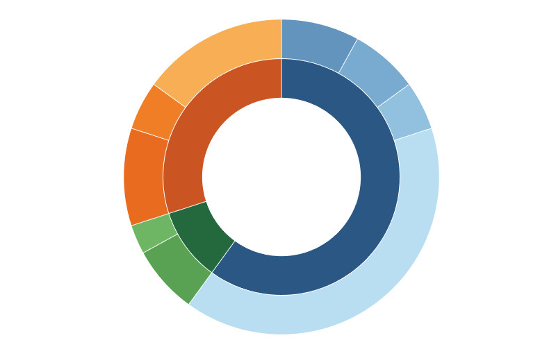
When I started to learn Tableau, I remember being completely amazed and confused about how to build Bora Beran’s blog on Sunbursts; I could not believe that this was possible in Tableau...
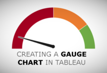
Creating Half Circle Gauge Charts in Tableau
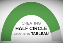
Requested from a friend, here is a nice and simple tutorial on creating Half Circle Gauge Charts in Tableau. In this tutorial, we are going to show the colour-coded percentage out...
Creating Dendrogram with Rounded Bar Charts in Tableau
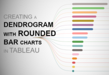
I am really having a fun moment with Dendrogram Charts, and in this tutorial, we are going to combine a Dendrogram Chart with Rounded Bar Charts to create a very nice...
Creating a Multi-Level Dendrogram Charts in Tableau
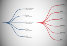
Since I released my Dendrogram tutorial I have been inundated with requests on how to a multi-level version. So, in this tutorial, we are going to leverage some interesting techniques to...
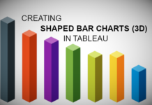
Shaped Bar Charts (3D) in Tableau
We previously had an article about creating Shaped Bar Charts in Tableau; in that previous tutorial, we used data densification to create a different look and feel for our bar charts....
Creating Gradient Backgrounds in Tableau
When I created my Cryptocurrency Dashboard, I decided to have some fun with gradient backgrounds. When combined with animations, this creates a very cool effect, so here you go, a nice...
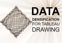
Data Densification for Tableau Drawing
If you have looked at the various tutorials on drawing in Tableau, you would have noticed a commonly used technique called Data Densification. While I used this topic, the vast majority...
Gauge Chart (With Arrow)
As of the time of this article, I am a two-time Tableau Zen Master, and, as such, I am afforded several different types of opportunities from Tableau. One such opportunity is...
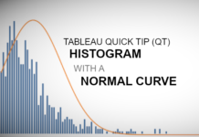
Tableau QT: Histogram with Normal Curve
Welcome to 2020. Hopefully, this will be the start of a glorious year, and we at Tableau Magic are definitely excited for things to come. Here is our first Tableau Quick...
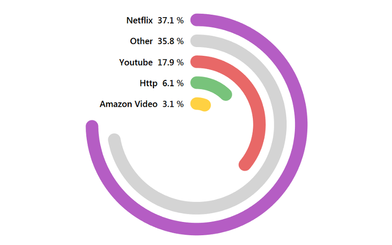
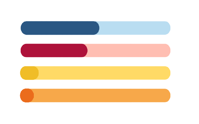
Rounded Progress Bar Tutorial
In my free time I try to build a few web applications, this is an essential part of my personal learning and attempt to keep relevant. Having an application that delivers great functionality is great, but...

