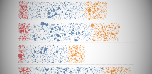
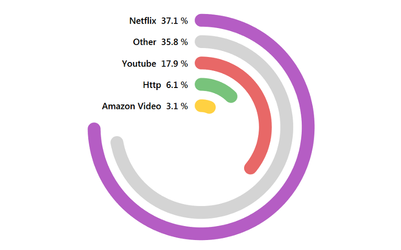
Creating Radial Jitter Bar Charts in Tableau
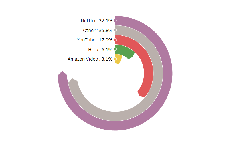
I created this a while ago, and only now have had a chance to write a tutorial on creating Radial Jitter Bar Charts. Truth be told, I spent time digesting the...
Video: Tableau with Music / Square Bump Chart
Tableau with Music / Square Bump Chart. This awesome variation of your standard Bump Chart (League Table) using Data Densification and Table Calculations to create this using the Sample Superstore Data...
Marketing Dashboards: The Do’s & Don’ts
Analytics dashboards are a critical resource for marketing teams that help support their roles and responsibilities, strategic planning, and data-driven decision-making in their daily routines.
With rich data to glean, marketers—especially CMOs—now...
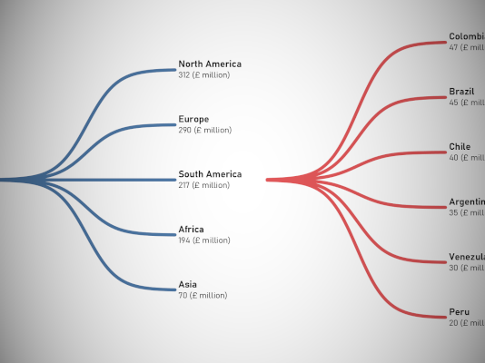
Creating a Single Level Dendrogram in Tableau
My initial name for this tutorial was the Orgasmatron (head massager company name out of Australia), the name is fun, strange as hell but we have to have some fun right?...
Tableau QT: Table Pagination
Something nice and simple. In this Tableau quick tip, we are going to walk through a simple technique for Table Pagination in Tableau, in 5 minutes or less.
Data
We will start by...
Color Your Viz
"Colors are perhaps the visual property that people most often misuse in visualisation without being aware of it“. Robert Kosara, Senior Research Scientist at Tableau Software
In my last blog article, I...
Drawing Google Logos
I do not believe that everything you do in Tableau has to be serious, and sometimes, just sometimes, it is good to have some fun. As such, we are going to...
Pointed Radial Bar Chart Tutorial
In September 2016, I wrote a tutorial titled Tableau Rings which was a step-by-step guide to create a Radial Bar Chart. To my surprise, this tutorial went on to be my...
Tableau QT: Variable Width Bar Chart
Another requested tutorial (most are being requested these days, so do get in touch if you have a tutorial request). In this Tableau quick tip, we are going to walk through...
Creating Parallel Sets in Tableau
I want to end my second wave of Tableau Tutorials with something a little special. I have to admit that to create the following data visualisation, I had to make several...

