This is a Quick Tip on how to build Arrow Bar Charts in Tableau, so less reading and more jumping in. We are going to spend 5 minutes or less building our Arrow Bar charts.
Data
Load the following data into Tableau Desktop / Public.
| Canadian Province | 2017 Population (Millions) |
| British Columbia | 4.817 |
| Manitoba | 1.338 |
| New Brunswick * | 0.754 |
| Nova Scotia | 0.953 |
| Newfoundland and Labrador | 0.529 |
| Ontario | 14.19 |
| Prince Edward Island | 0.152 |
| Québec | 8.394 |
| Saskatchewan | 1.164 |
| Alberta | 4.286 |
* New Brunswick figures are for 2014.
Worksheet
- Drag Canadian Province onto Rows.
- Drag 2017 Population (Millions) onto Columns, Twice.
- Right-click on the second 2017 Population (Millions) in the Columns Shelf and select Dual Axis.
- In the Canvas:
- Right-click on the 2017 Population (Millions) and select Synchronized Axis.
- Double-click on the 2017 Population (Millions) header to open the Edit Axis window.
- Select Fixed, Fixed Start and set the value to 0.
- In the All Mark Panel:
- Drag Canadian Province onto Color.
- In the SUM(2017 Population (Millions)) Mark Panel:
- Change the Mark Type to Bar.
- Change the Size to be 75%.
- In the SUM(2017 Population (Millions))(2) Mark Panel:
- Change the Mark Type to Shape.
- Click on Shape and select the Diamond, bottom left icon.
- Change the Size of the shape to be around 37% to match the size of the bar. Adjust as necessary.
- Change the Mark Type to Shape.
Now we need to adjust the visualisation by:
- Editing tooltips.
- Editing colours.
- Remove gridlines.
- Hide headers.
- Add the value to the Column header.
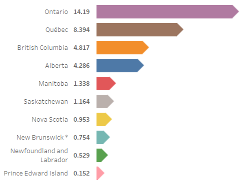
And you should then end up with something like the following:

Note: This is just a Bar Chart with an arrow tip to give your bar charts a different look.
Summary
I hope you all enjoyed this article as much as I enjoyed writing it. Do let me know if you experienced any issues recreating this Visualisation, and as always, please leave a comment below or reach out to me on Twitter @Tableau_Magic.
If you like our work, do consider supporting us on Patreon, and for supporting us, we will give you early access to tutorials, exclusive videos, as well as access to current and future courses on Udemy:
- Patreon: https://www.patreon.com/tableaumagic
Also, do be sure to check out our various courses:
- Creating Bespoke Data Visualizations (Udemy)
- Introduction to Tableau (Online Instructor-Led)
- Advanced Calculations (Online Instructor-Led)
- Creating Bespoke Data Visualizations (Online Instructor-Led)


Hoang,
Thank you for this quick and wonderful tutorial on building an arrow bar chart. I was just wondering if at step-2 ‘Drag 2017 Population (Millions) onto Rows, Twice’ did you mean to say Columns instead of Rows?
Good spot 🙂