This information has been taken from the official Google Material Design Website. For more information click HERE
Material Design Goals
Create a visual language that synthesizes classic principles of good design with the innovation and possibility of technology and science.
Develop a single underlying system that allows for a unified experience across platforms and device sizes. Mobile precepts are fundamental, but touch, voice, mouse, and keyboard are all first-class input methods.
Material Design Principles
Material is the metaphor
A material metaphor is the unifying theory of a rationalized space and a system of motion. The material is grounded in tactile reality, inspired by the study of paper and ink, yet technologically advanced and open to imagination and magic.
Surfaces and edges of the material provide visual cues that are grounded in reality. The use of familiar tactile attributes helps users quickly understand affordances. Yet the flexibility of the material creates new affordances that supersede those in the physical world, without breaking the rules of physics.
The fundamentals of light, surface, and movement are key to conveying how objects move, interact, and exist in space and in relation to each other. Realistic lighting shows seams, divides space and indicates moving parts.
Bold, graphic, intentional
The foundational elements of print-based design – typography, grids, space, scale, colour, and use of imagery – guide visual treatments. These elements do far more than pleasing the eye. They create a hierarchy, meaning, and focus. Deliberate colour choices, edge-to-edge imagery, large-scale typography, and intentional white space create a bold and graphic interface that immerse the user in the experience.
An emphasis on user actions makes core functionality immediately apparent and provides waypoints for the user.
Motion provides meaning
Motion respects and reinforces the user as the prime mover. Primary user actions are inflection points that initiate motion, transforming the whole design.
All action takes place in a single environment. Objects are presented to the user without breaking the continuity of experience even as they transform and reorganize.
Motion is meaningful and appropriate, serving to focus attention and maintain continuity. Feedback is subtle yet clear. Transitions are efficient yet coherent.
Material Design Color Palette
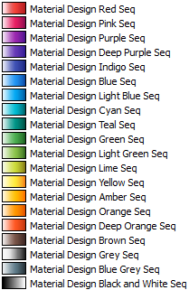
The Google Material Design colour palette comprises primary and accent colours that can be used for illustration or to develop your brand colours. They have been designed to work harmoniously with each other. The colour palette starts with primary colours and fills in the spectrum to create a complete and usable palette for Android, Web, and iOS. Google suggests using the 500 colours as the primary colours in your app and the other colours as accents colours.
Website: https://www.google.com/design/spec/style/color.html
Color Palette for Tableau
I have created a preference.tps file that captures the Material Design Colors for use within Tableau; this Custom Palette for Tableau can be downloaded HERE.
To use this palette unzip the contents of the download and copy the file here to the following location:
C:\Users\<Your Username>\Documents\My Tableau Repository











I’ve just found out about above palettes from your Udemy course. Thank you very much for all above information and the enjoyable course:)
Your welcome, I am glad you are enjoying the course 🙂
Yeah, just found this right now from your Udemy course, what a great resource!
Thank you Akky.
Thank you. Great work Toan.