On Thursday 12th December the UK had a General Election. On Wednesday 27th November YouGov released its MRP poll which gave a break down of the estimated votes shared by Constituency by Party. These values came with an estimated vote share, high estimate and low estimate, or a an an estimate with an Error Margin. You can find the full report here: https://yougov.co.uk/uk-general-election-2019/
The Guardian also released a list of 50 constituencies where tactical voting could stop the Conservative Party. https://www.theguardian.com/politics/2019/dec/08/tactical-voting-guide-2019-keep-tories-out-remain-voter-general-election
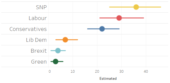
In this quick tip, we will build a data visualization for these 50 Constituencies and show the Party, Estimated Votes, Error Margins, and we will do this in 10 minutes or less.
Data
We will start by loading the follow data into Tableau Desktop / Tableau public.
Worksheet
With our data loaded, we can now look to build our worksheet, yep, we do not need any additional Calculated Fields.
- Drag Constituency onto the Filter Shelf
- Filter for Kirkcaldy and Cowdenbeath
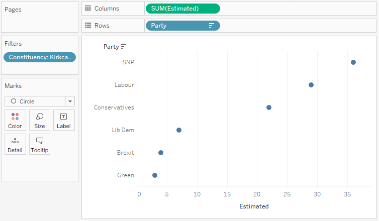
- Drag Estimated onto the Columns Shelf
- Drag Party onto the Rows Shelf
- Right-click on this pill and select Sort…
- Sort by Field in Descending order by and Estimated
You should see the following:
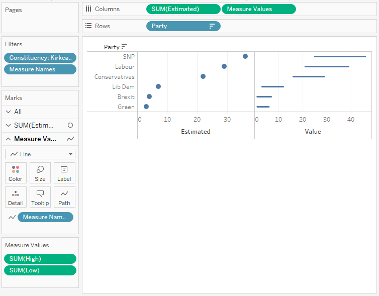
Now we will add our Error Margins:
- Drag Measure Values onto the Columns Shelf
- Drag Measure Names onto the Filter Shelf and only select Low and High.
- In the Measure Values Mark panel
- Change the Mark Type to Line
- Drag Measure Names onto the Path Mark
You should see the following:
With this done, we will adjust the cosmetics to get our desired visualization:
- Right-click on the Measure Values (on the Columns Shelf) and select Dual Axis
- Right-click on the Axis header and select Synchronized Axis
- Hide one of the Axis headers
- Drag Party onto the Color Mark and adjust for each party
- Drag Estimated, High and Low onto the Tooltip Mark and adjust the text.
You will want to end up with the following:
and boom, we are done! I hope you enjoyed this tutorial, and as always, you can find this data visualization on Tableau Public at https://public.tableau.com/profile/toan.hoang#!/vizhome/ErrorMarginCharts/MarginofError
Summary
I hope you all enjoyed this article as much as I enjoyed writing it and as always do share the love. Do let me know if you experienced any issues recreating this Visualization, and as always, please leave a comment below or reach out to me on Twitter @Tableau_Magic. Do also remember to tag me in your work if you use this tutorial.
If you like our work, do consider supporting us on Patreon, and for supporting us, we will give you early access to tutorials, exclusive videos, as well as access to current and future courses on Udemy:
- Patreon: https://www.patreon.com/tableaumagic
Also, do be sure to check out our various courses:
- Creating Bespoke Data Visualizations (Udemy)
- Introduction to Tableau (Online Instructor-Led)
- Advanced Calculations (Online Instructor-Led)
- Creating Bespoke Data Visualizations (Online Instructor-Led)

