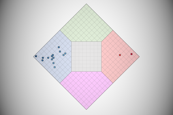
I have been following the 2020 US election very closely, yes, it is still in the primary season, but I saw a Nolan Chart and thought that I had to create this in Tableau. So found this quite interesting, so hopefully, you will do as well.
Data
We will start by loading the following data into Tableau Desktop / Tableau Public.
| Politician | Social Issue Score | Economic Issue Score |
| Joe Biden | 80 | 15 |
| Mike Bloomberg | 80 | 30 |
| Pete Buttigieg | 73 | 30 |
| Tulsi Gabbard | 85 | 33 |
| Elizabeth Warren | 88 | 5 |
| Bernie Sanders | 98 | 3 |
| Amy Klobuchar | 70 | 10 |
| Donald Trump | 20 | 83 |
| Mike Pence | 10 | 95 |
| Andrew Yang | 83 | 20 |
| Marianne Williamson | 90 | 8 |
| Tom Steyer | 83 | 18 |
| Bill de Blasio | 85 | 13 |
| Julian Casto | 75 | 13 |
| Howard Schultz | 73 | 33 |
| Cory Booker | 80 | 18 |
This information has been collated from the On The Issues website, where they have tracked the positions of politicians and given it a score. You can read more about this here: https://www.ontheissues.org
Calculated Fields
With our data set loaded into Tableau, we are going to create the following Calculated Fields:
Hypotenuse
SQRT(SQUARE([Social Issues Score])+SQUARE([Economic Issues Score]))Yes, we get to use the Pythagorean theorem, I did not think I would ever have a need to use this.
Angle (Degrees)
DEGREES(ACOS(ZN([Economic Issues Score])/ZN([Hypotenuse])))Angle (Degree+45)
ZN([Angle (Degrees)]+45)Note: We are going to rotate the angle of the point by 45 degrees (we can make this dynamic, but for a Nolan Chart, 45 degrees is what we are looking for).
X
COS(RADIANS([Angle (Degree+45)]))*[Hypotenuse]Y
(SIN(RADIANS([Angle (Degree+45)]))*[Hypotenuse])-70.7Note: We subtract 70.7 to move the centre point to zero. For me, it just makes things a bit neater.
With this done, let us start creating our data visualisation.
Worksheet
We will now build our worksheet:
- Change the Mark Type to Circle
- Drag Politician to the Detail Mark
- Drag X onto the Column Shelf
- Drag Y onto the Rows Shelf
- Drag Social Issue Score onto the Color Mark
- Click on the Color Mark and select Edit Color
- Set Palette to Red-Blue Diverging
- Set Stepped Color to 2
- Click on Advanced and set Centre to 50
If all goes well, you should now see the following:

Now I want you to download the following background image:
This was created using a combination of Excel and GIMP, but we can use this forevermore. With the file downloaded, we will not apply this.
- In the menu go to Map, Background Images and then select your data source.
- Click on Add Image…
- In File or URL browse to the nolan-chart-background
- In X Field select X
- Make sure X is selected
- Set Left to -75
- Set Right to 75
- In Y Field select Y
- Make sure Y is selected
- Set Left to -75
- Set Right to 76
- Set the Washout to 50%
- Click Ok
You should now see the following:

With this, we now have our Data Visualisation functionally built. So now we will work on cosmetics:
- Fix the Y-Axis to be from -90 to 90
- Fix the X-Axis to be from -90 to 90
- Hide the X and Y-Axis Headers
- Remove all Grid Lines
- Remove all Zero Lines
- Edit the Tooltips
You should now want to end up with the following:

and boom, we are done! I hope you enjoyed creating this data visualization and learned some cool techniques as well. As always, you can find this data visualisation on Tableau Public at https://public.tableau.com/profile/toan.hoang#!/vizhome/NolanChart/NolanCharts
Summary
I hope you all enjoyed this article as much as I enjoyed writing it and as always do share the love. Do let me know if you experienced any issues recreating this Visualization, and as always, please leave a comment below or reach out to me on Twitter @Tableau_Magic. Do also remember to tag me in your work if you use this tutorial.
If you like our work, do consider supporting us on Patreon, and for supporting us, we will give you early access to tutorials, exclusive videos, as well as access to current and future courses on Udemy:
- Patreon: https://www.patreon.com/tableaumagic
Also, do be sure to check out our various courses:
- Creating Bespoke Data Visualizations (Udemy)
- Introduction to Tableau (Online Instructor-Led)
- Advanced Calculations (Online Instructor-Led)
- Creating Bespoke Data Visualizations (Online Instructor-Led)


